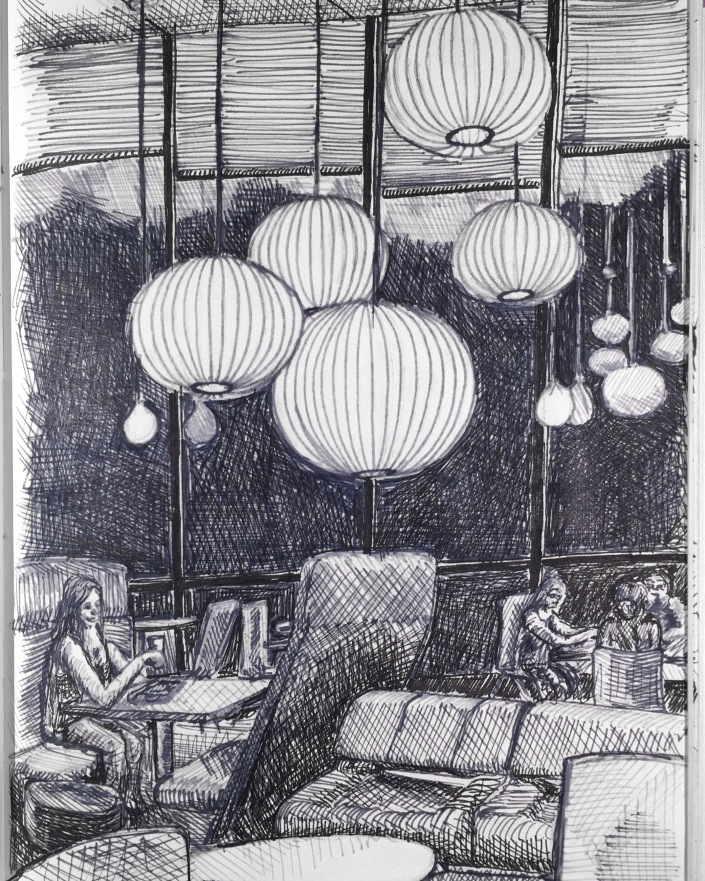
Showcase at RAW ARTIST: Impact
Exciting development for me!: I was scouted to be a featured artist at IMPACT: the first showcase held by RAW Artists in Salt Lake City. They are an international organization which organizes local art shows in Australia, The US, Canada and Mexico. I’m very excited. The show is at the Depot on Tuesday April 30 from 19:00-23:00. There will be other local artists, musicians, dancers, fashion designers and filmmakers showcasing their work as well. It’s an honor to be sought out to be part of Salt Lake’s local art scene. Here are just a few of the pieces I’ll be showing and selling prints of at the show.
About these Pieces:
***
This piece I made specifically as a test to sell something on my recently opened Etsy online store. I sold it and mailed it to my parents. Thanks for the support guys! – The image is form a photograph I took while on vacation in Riga, Latvia. I quite liked the cat shaped weathervane on top of the wood shingled, conical roof. The reflectiveness came through well using the chalk pencil.
-
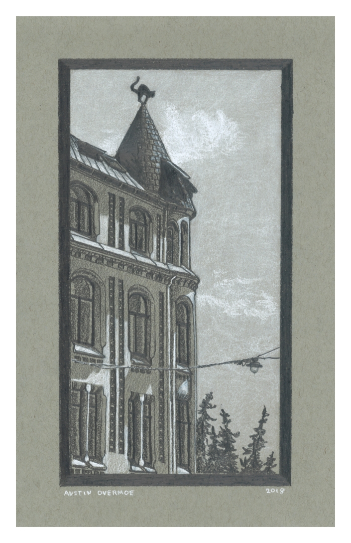
Riga, 2018, Chalk and Graphite on toned Paper
***
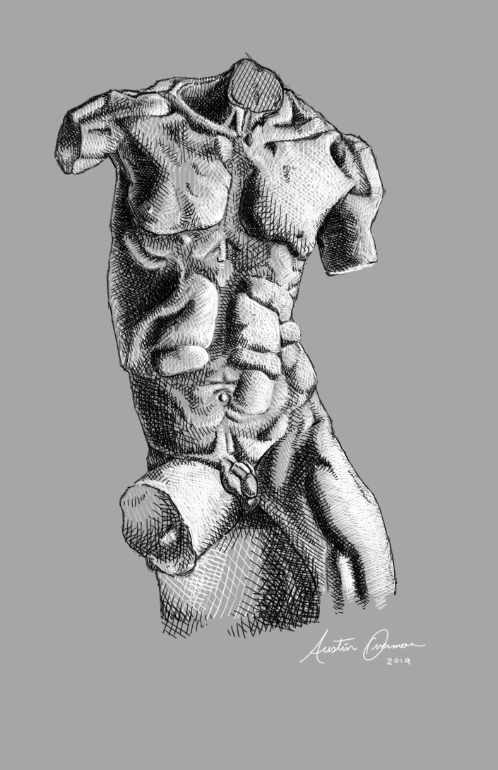
This torso study is based on a sculpture by Marusia Nita, an Italian Sculptor in Florence. Find their work on instagram at @marusianita. This is one of my very first digital works, and certainly the one I’m most proud of so far. I’ve been teaching my self to use Krita, a digital art software and drawing on my surface pro, which I highly recommend for doing this type of work.
***
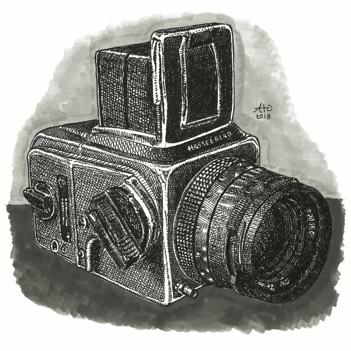
My dear friend and ex teacher, Paul Ramsey asked me to draw some of his cameras; well, as he put it, he had “a number of cameras who would love to pose for me”. This is the first, I plan to draw more of his cameras when I get the time.
- ***
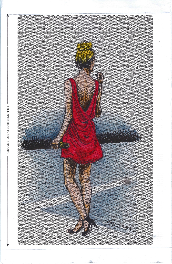
Perhaps one of my favorite drawings in recent months, I found a piece of a security envelope in my apartment building’s recycle bin (I am consistently stealing and hoarding ‘trash’ for art purposes) and the printed pattern on it begged me to draw on it. Hopefully the first in a series of many pieces created with up cycled and found materials.
***
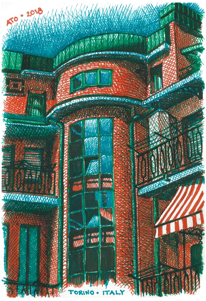
I drew this ink drawing of my hotel I stayed at, in Torino, Italy, (Otherwise known as Turin) while I was waiting for my flight home at the airport. I think this piece was so successful because I used a limited color palette, and the colors all work very well together. The deep tones are made by layering the orange, blue, and green ink. This has the effect of making the shadows read as genuine darker tones of the same colors. If i were to have used brown, purple, or black ink for the shadows, the effect would not be the same. Even though shadows appear as those colors to our naked eye, there are still complex tones that we don’t pick up on. A shadow may be brown, but any brown pen is not likely to be the exact mix of colors, or the exact brown, that you see when a lighter colored surface is in shadow.
P.S. for those of you who don’t know, the series of three asterisks (***) is called an asterism. It’s a typographical symbol used to divide sections or segments of text. I’ve always found it to be an attractive typographic ornament.
***
Thanks for reading!
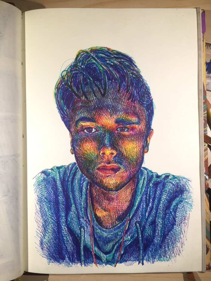
Julie, Colored Pencil Portrait, 2017
I’m excited I’ve finally finished this portrait that my Uncle Scooter commissioned me to do over a year ago.
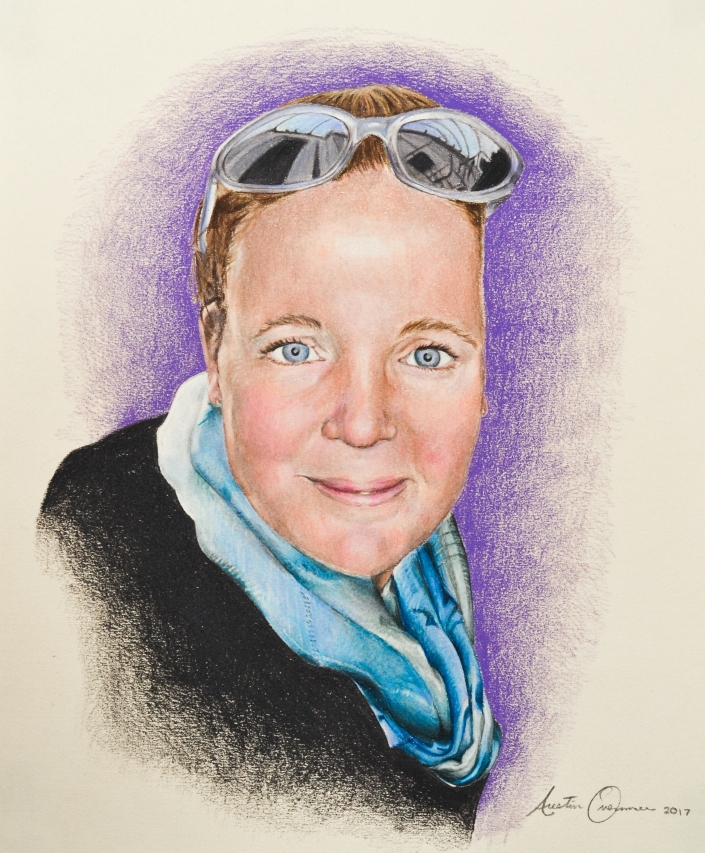
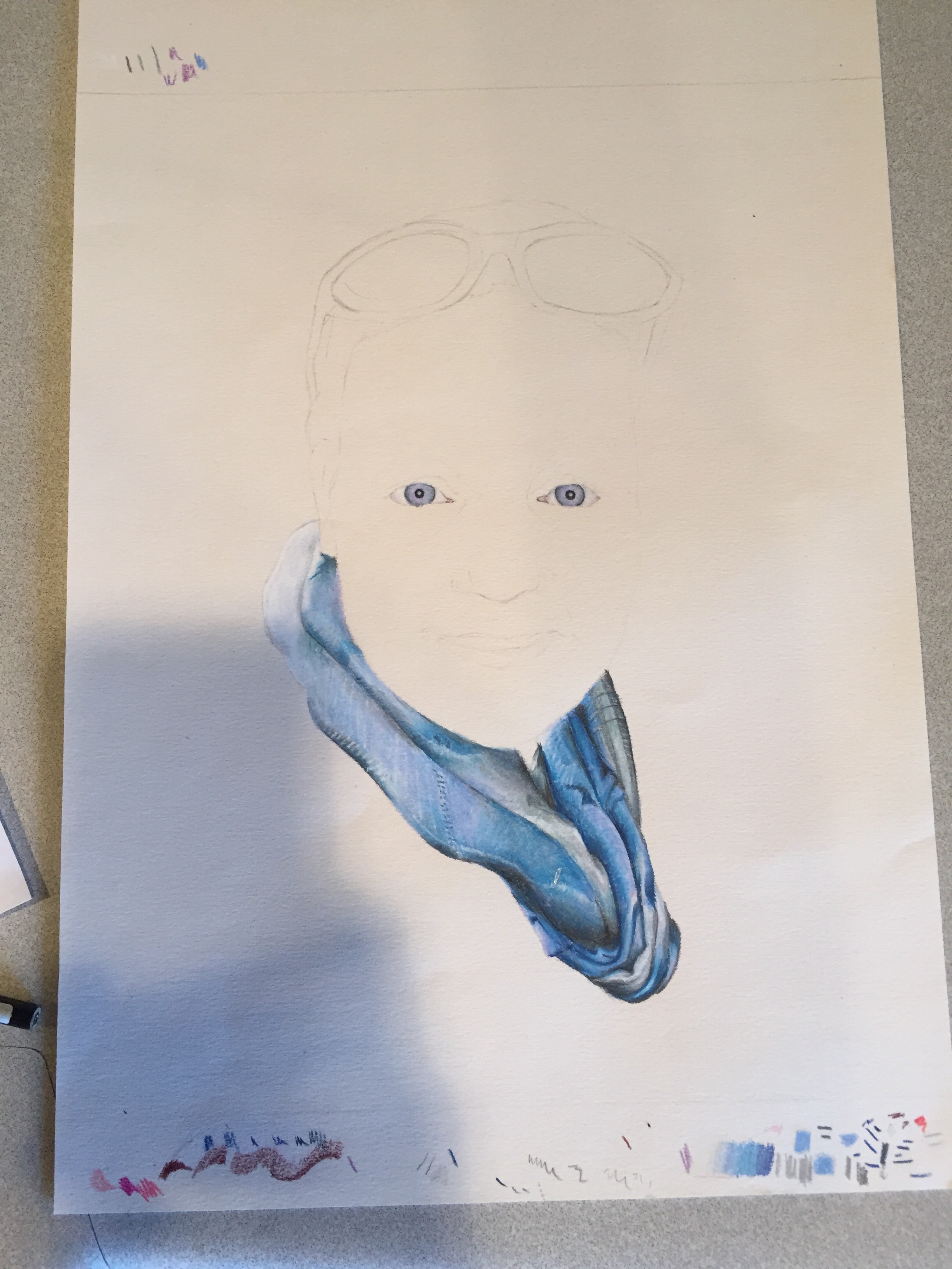
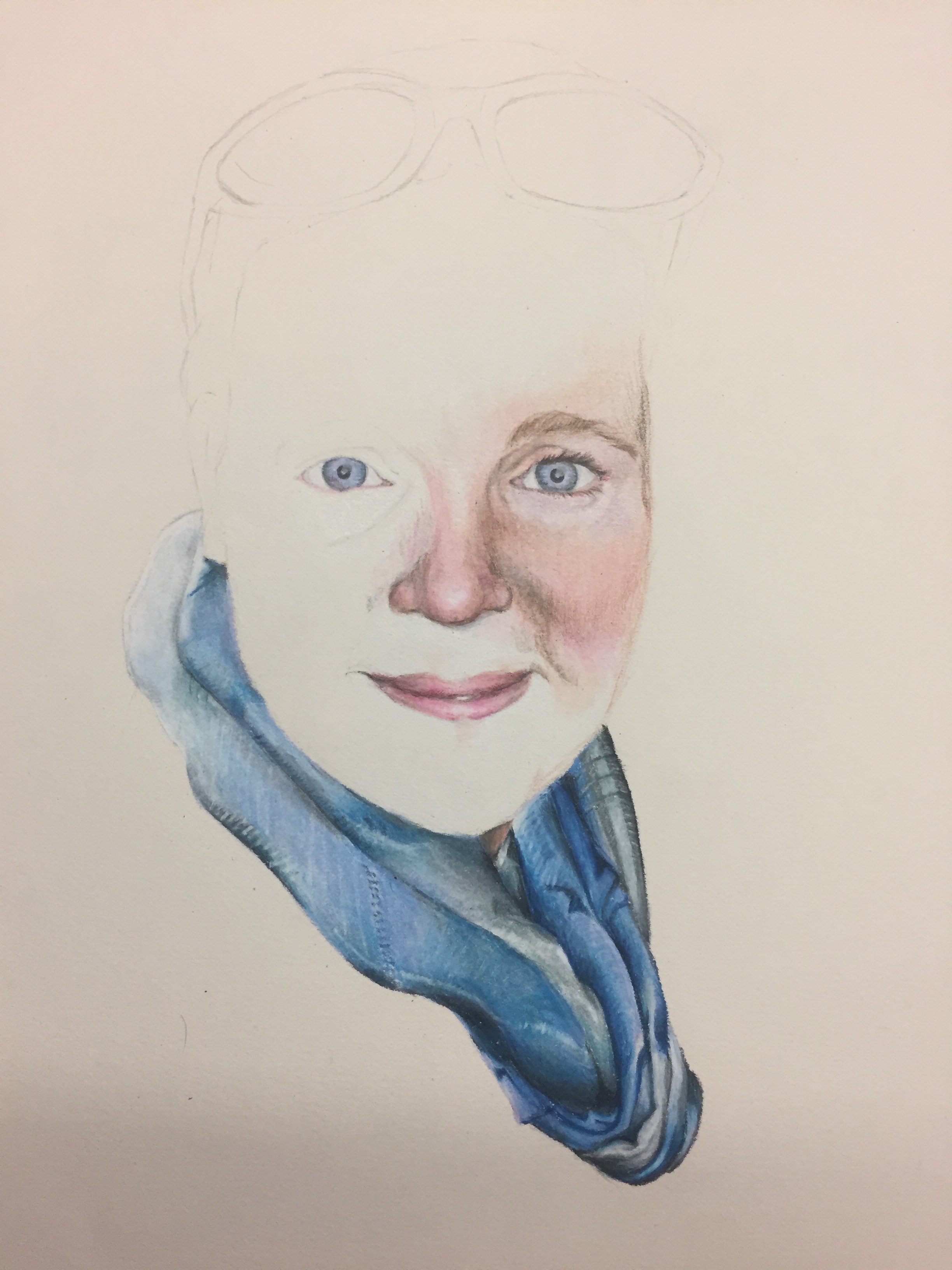
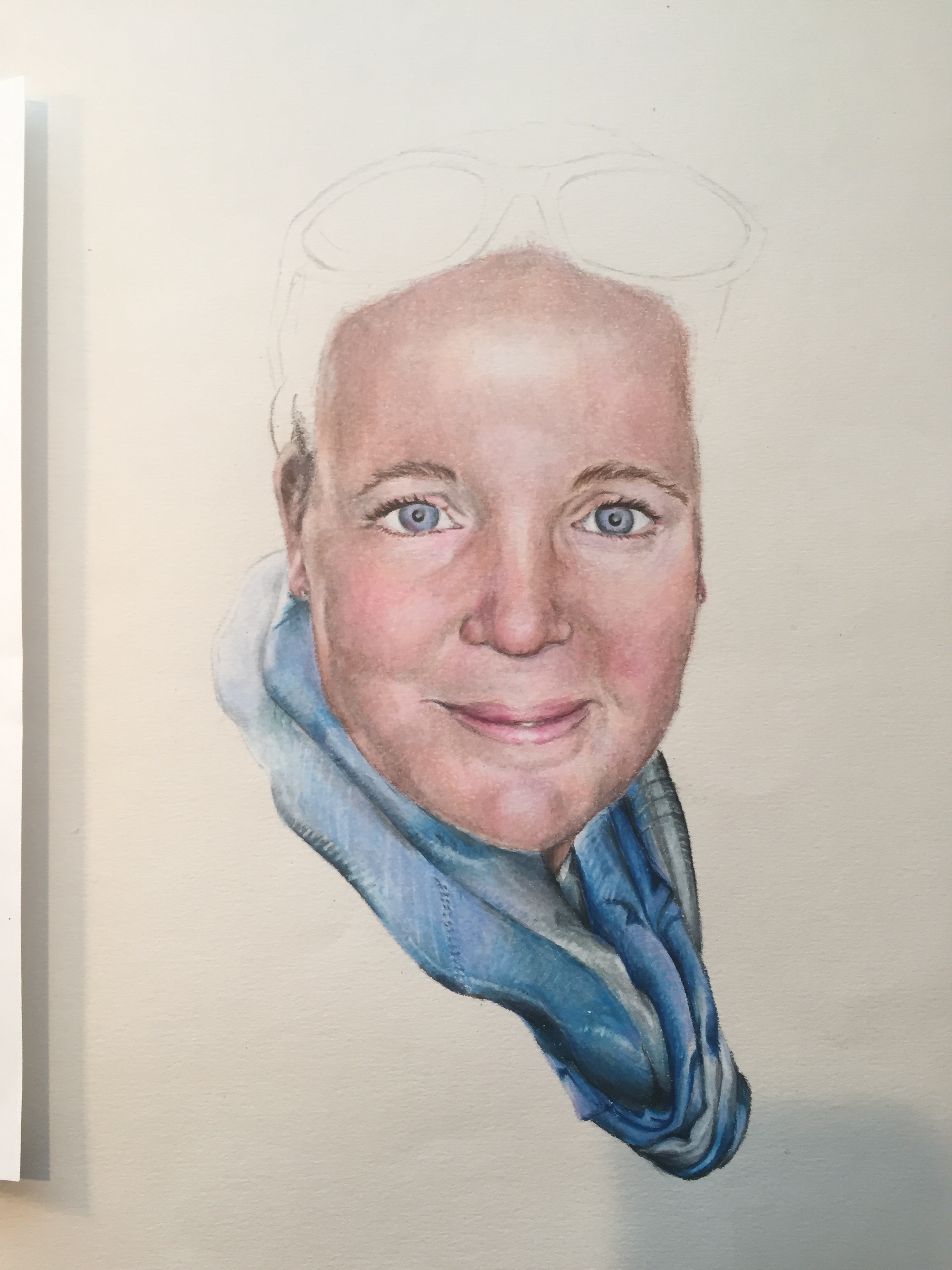
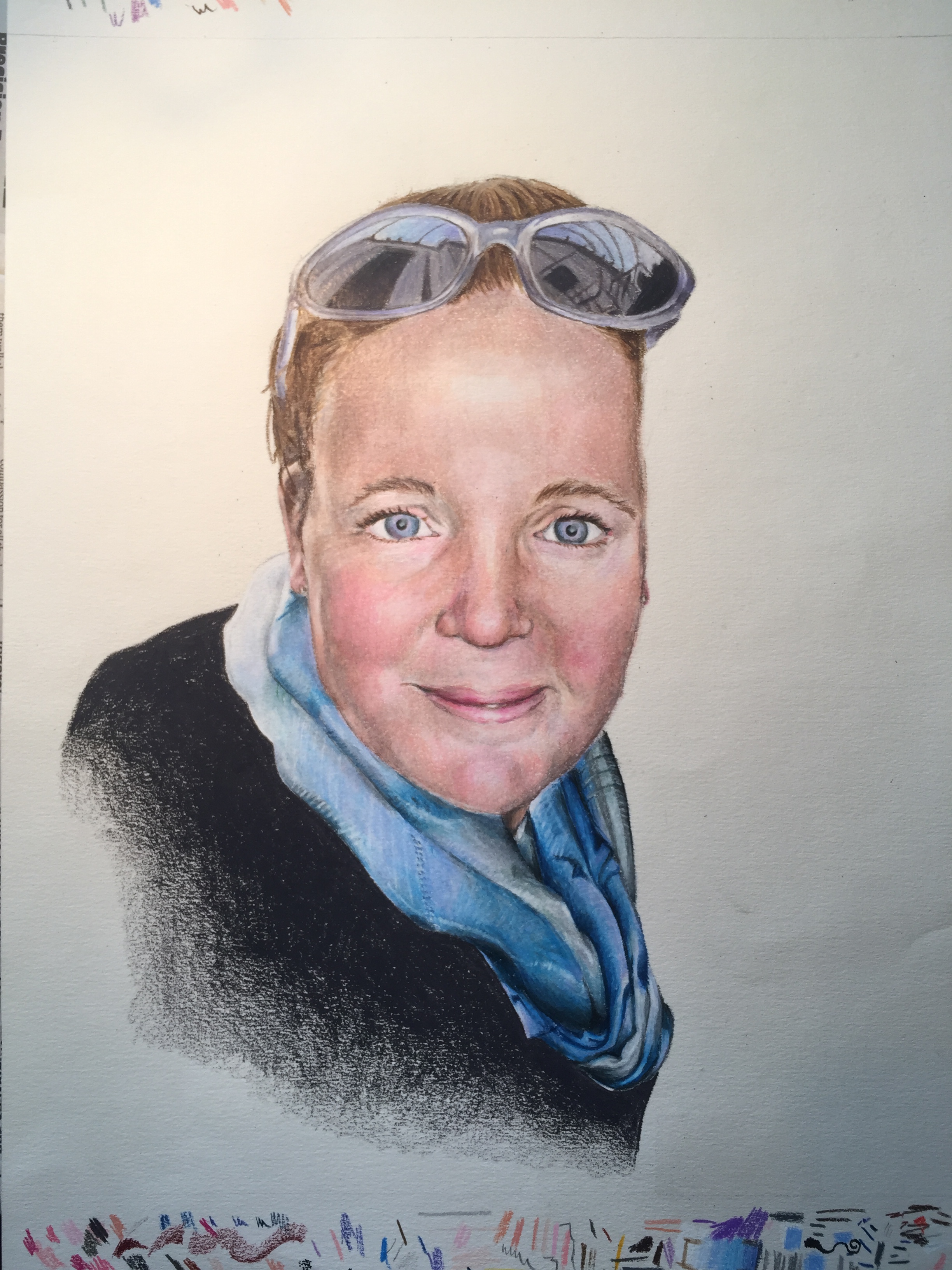
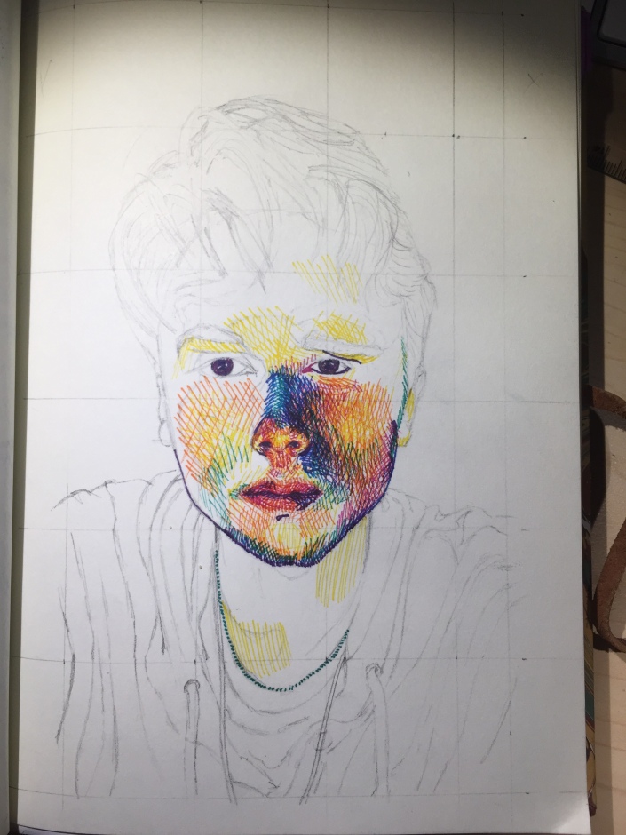
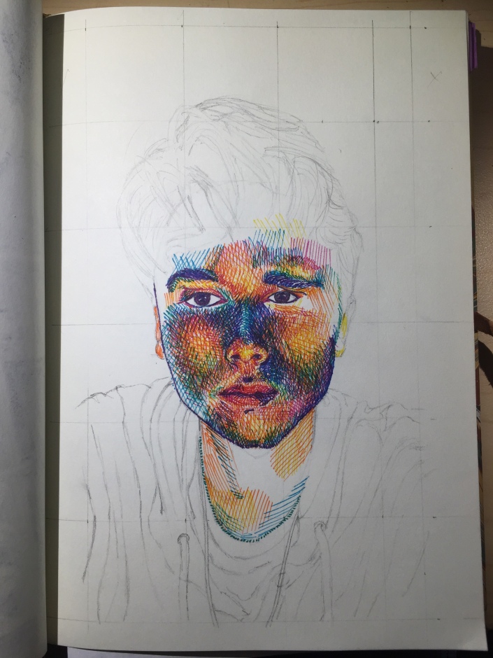
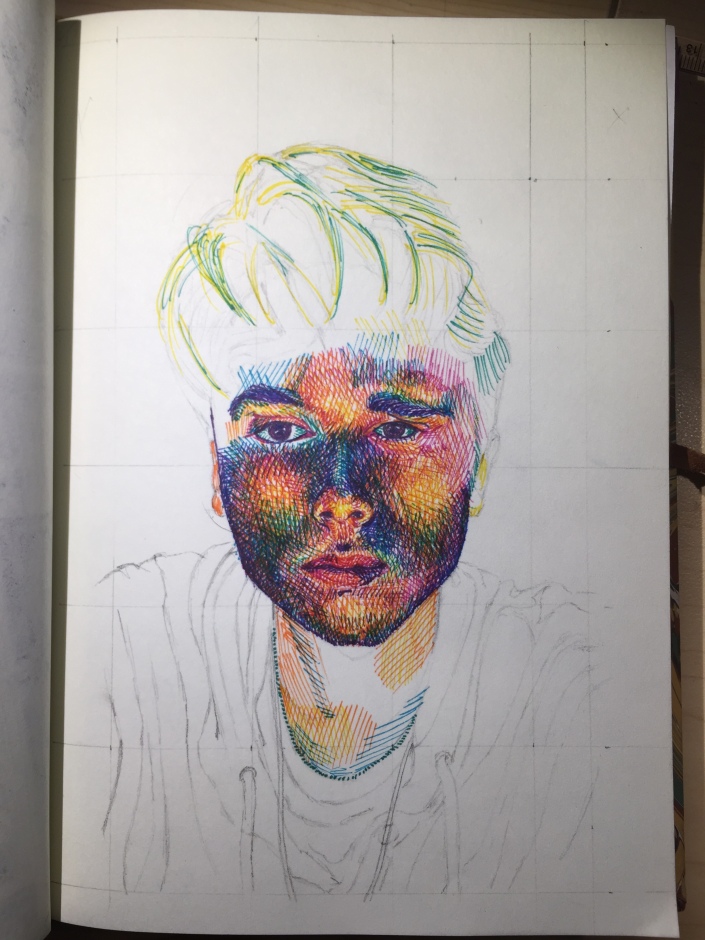
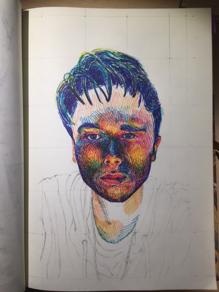
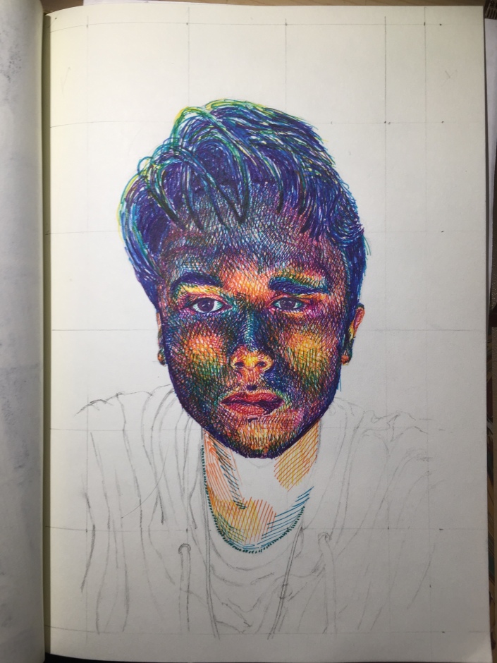
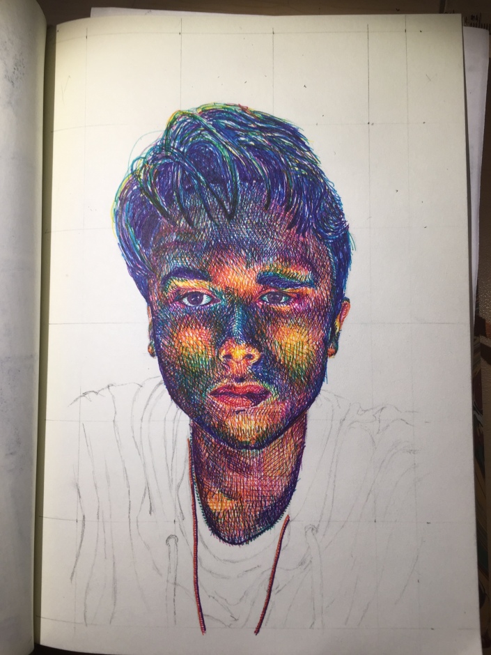
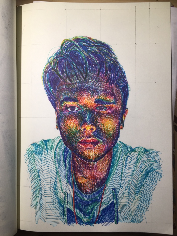
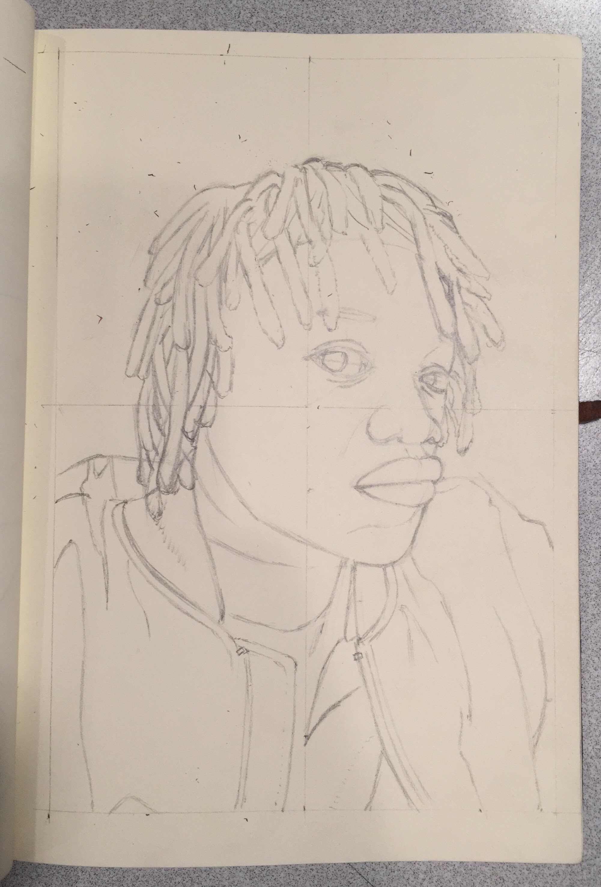
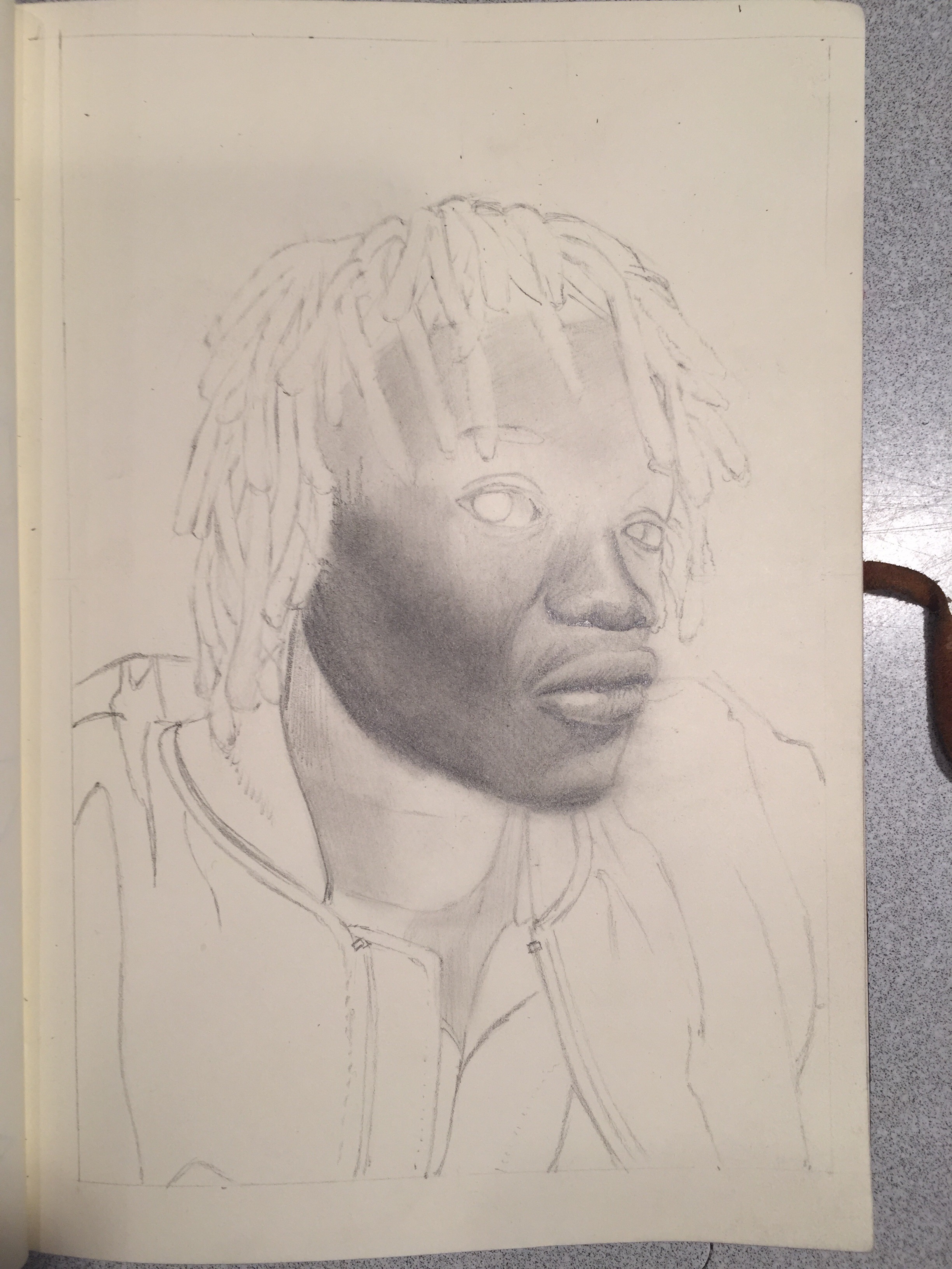
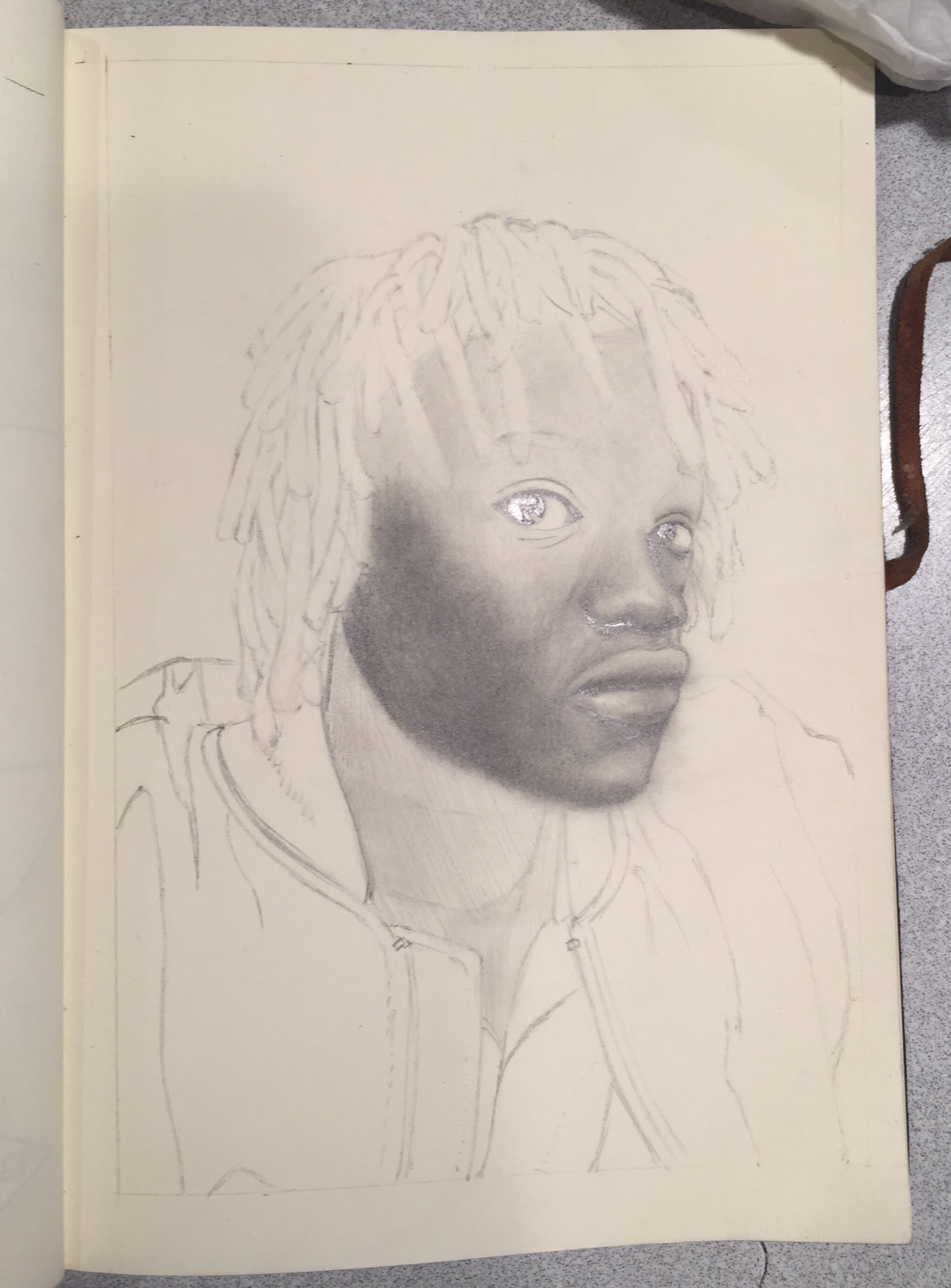
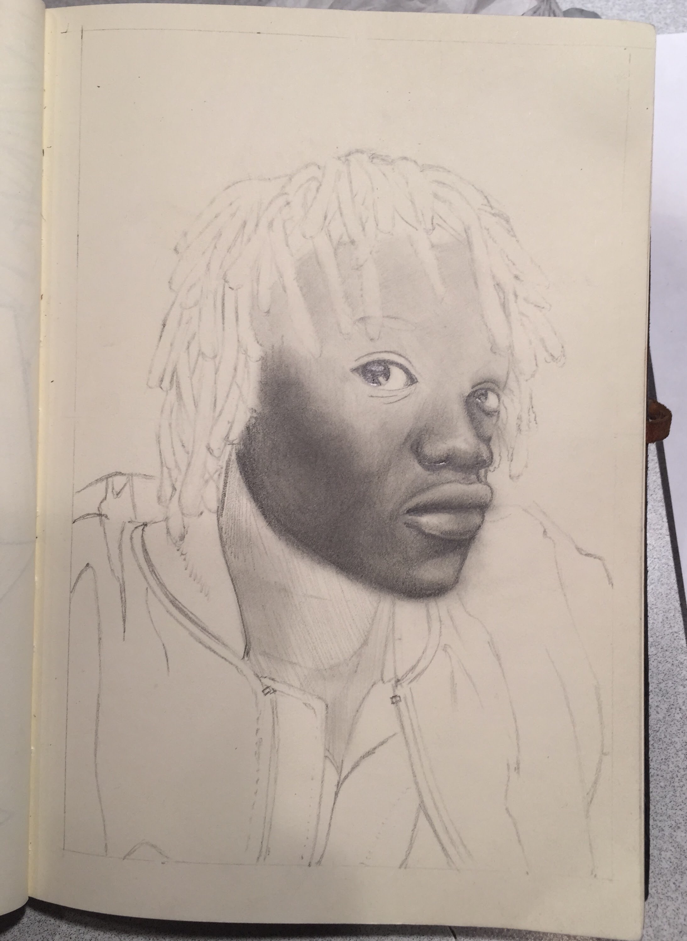
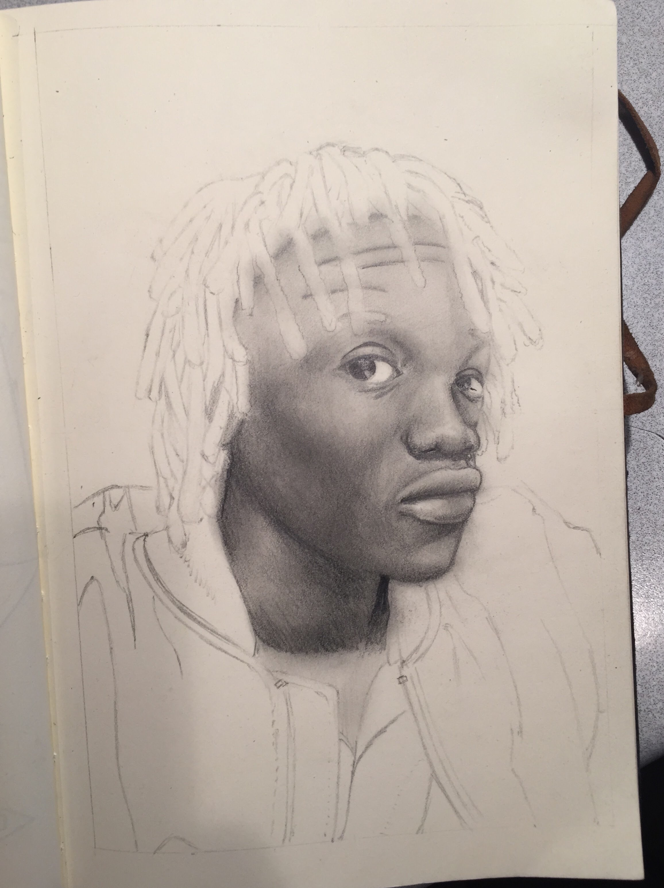
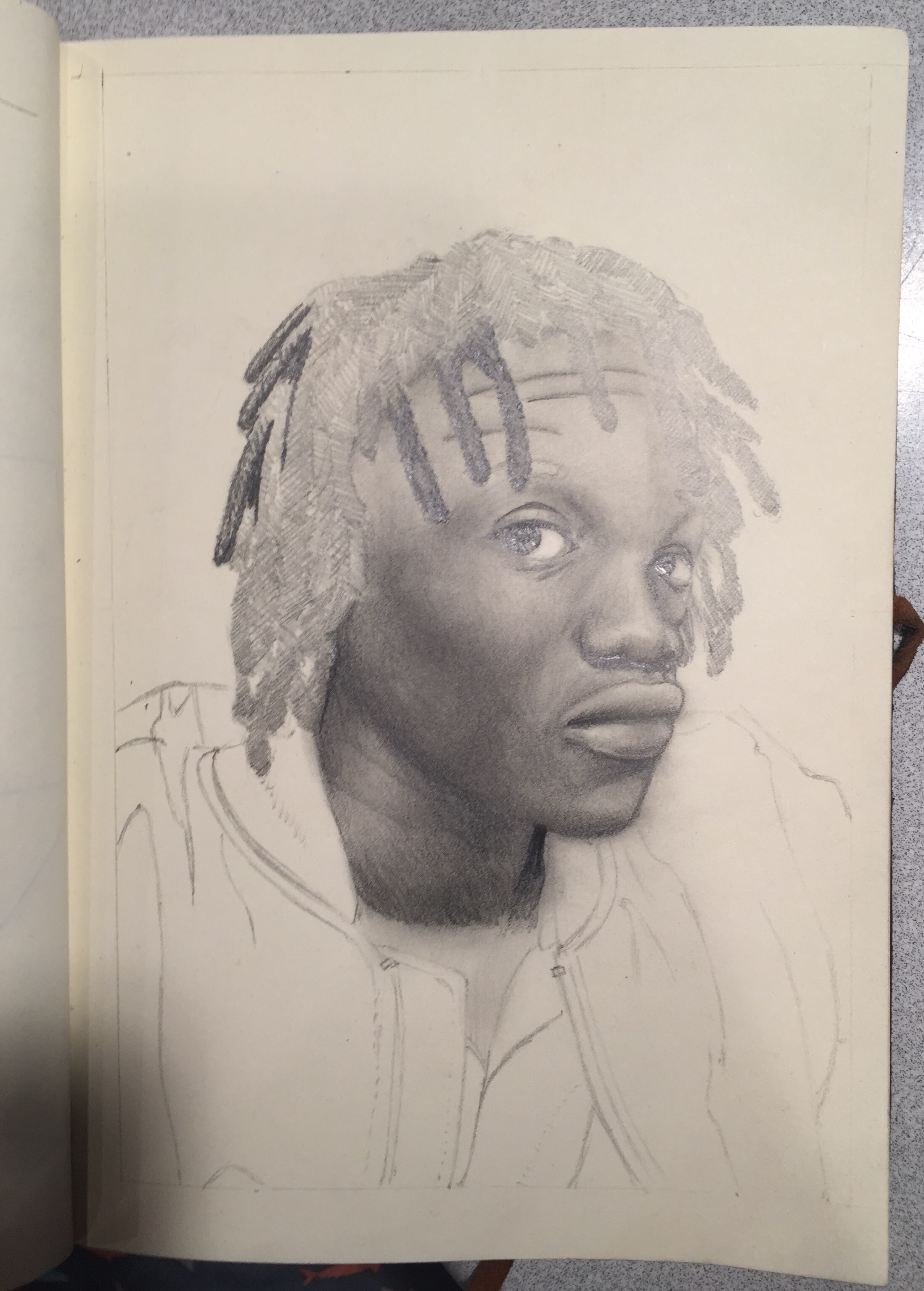
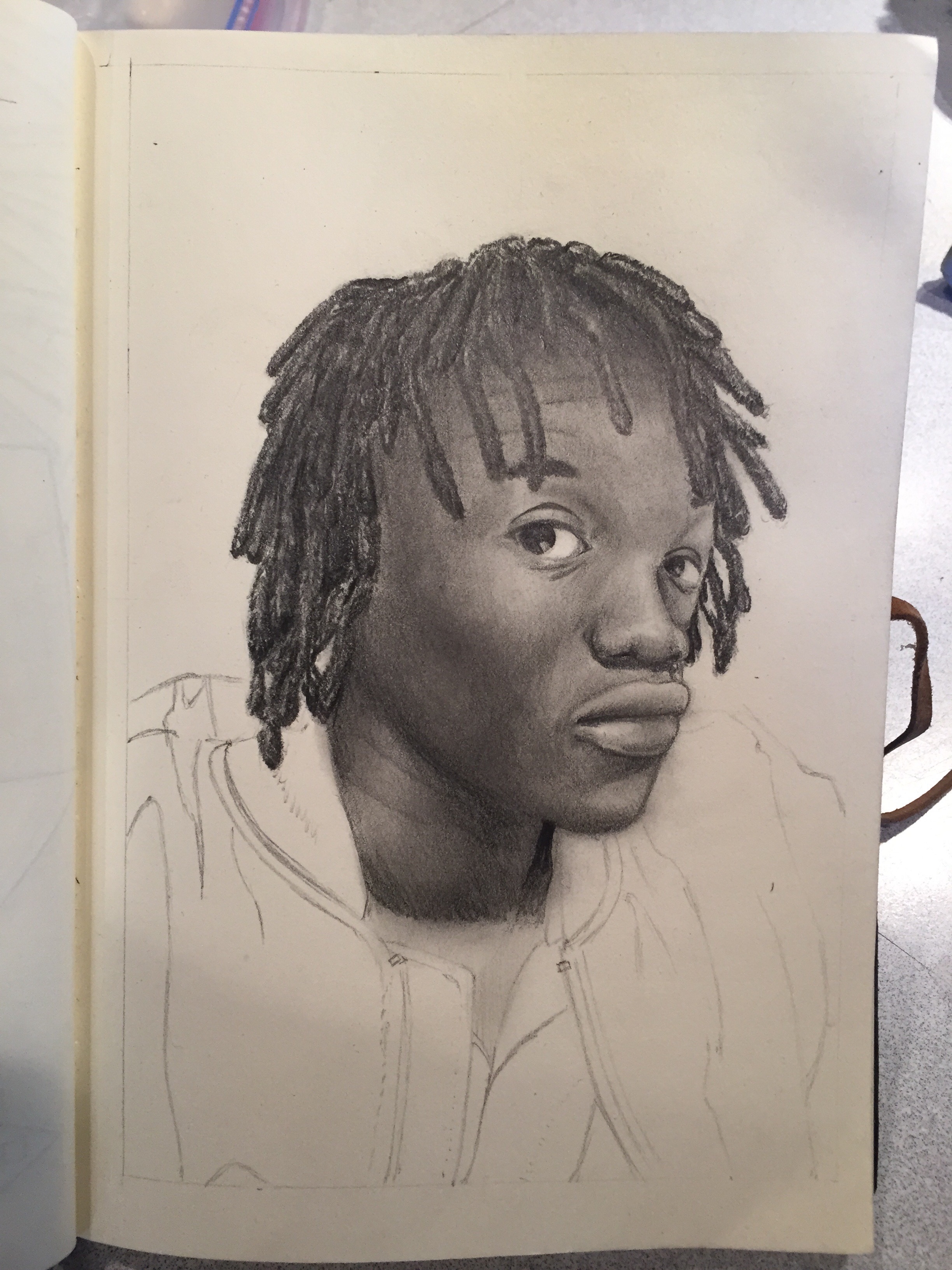
This portrait is of his wife, Cory’s, sister Julie, who unfortunately passed away. I believe it’s to be a gift for her mother. I was touched that he asked me to do it, as a way to commemorate her. A portrait is always a high pressure piece, because there is really not a ton of room to leave it up to your interpretation. When you draw someone, it either looks like that person or it doesn’t, for the most part. Whereas if you draw a landscape, for example, the scene changes, the weather changes and the specific place you draw it from is so specific that it would be hard for someone to find that exact spot to compare. So the little mistakes you make are more forgivable, because someone can’t be for sure that a building or landscape doesn’t look the way you drew it (Unless they are intimately familiar with how it looks, they way we are with faces). So, the fact that this portrait was to commemorate someone who has passed, made it even more high pressure. You’ve got to get it just right or else feel like you aren’t doing justice to their memory. This is the main reason why it took me over a year to finish. Immediately after he commissioned me I got to work right away and I particularly enjoyed drawing her scarf, but soon when I started on her face, I just felt that it wasn’t going well, that I was making it worse with every pencil stroke. I wouldn’t say I gave up or abandoned it, but I just kept putting it further and further back on my current projects list. He never gave me a deadline either, told me to work on it whenever I felt like, which enabled me to put it off for sometimes months at time. The first four in-process images below are from when I woke on it consistently at the beginning. The last three, which obviously show a huge jump in progress, are from the past two weeks. I took it home with me to Salt Lake in my portfolio, over winter break and decided it was high time I just finished it, even though I wasn’t happy with it. My goal was to not bring it back to Seattle with me. Mission accomplished. Scooter and Cory really liked it, Cory even cried a little bit.
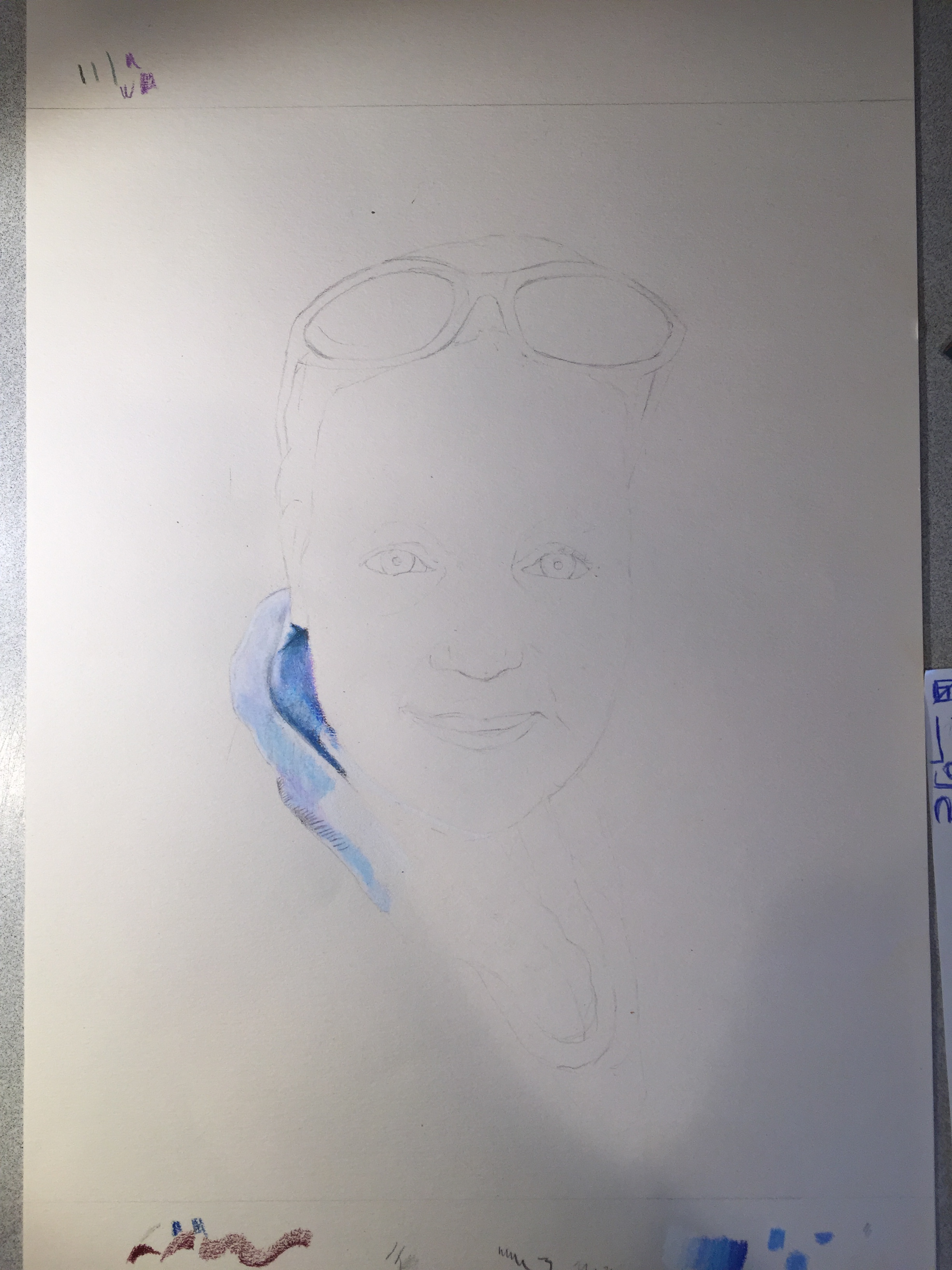
(1 of 7) – Just starting, late December 2015
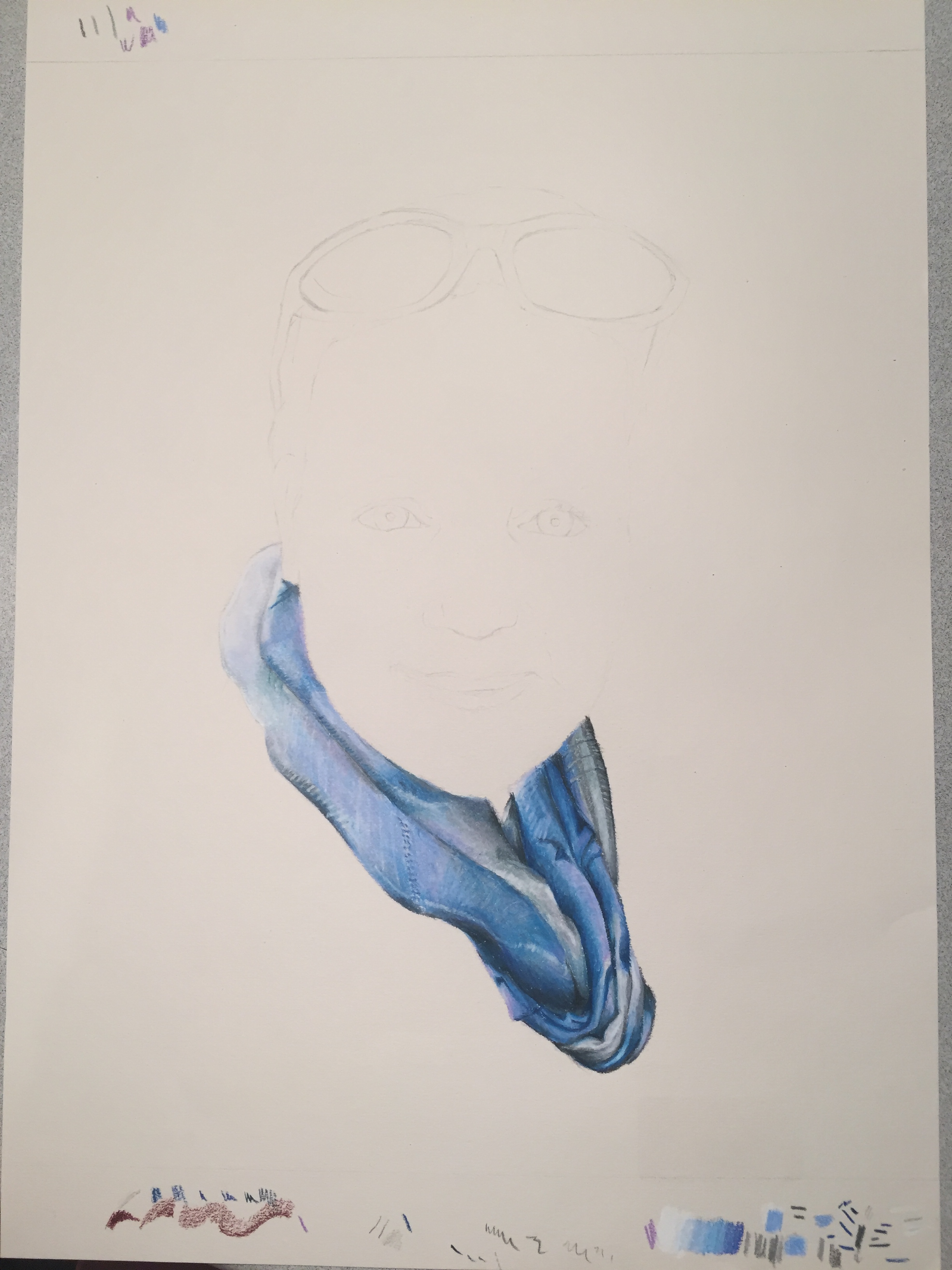
(2 of 7) – I remember sending photos back and forth with my aunt at this stage of the piece. I remember commenting that it rather looked like I was drawing a large blue vagina. Maybe that’s the reason why I liked drawing the scarf so much.
(3 of 7) – I usually start faces with the eyes. They always seem too far apart without all the stuff in-between, when actually they are the correct distance. It’s easy to accidentally draw them too small or too close together for this reason. Your mind over compensates for the lack of other facial features.
(4 of 7) – Pretty much at this point I stopped working on it for the better part of 2016. The straw that broke the camel’s back, as far as mistakes that caused me to give up for the time being, is the heavy brown shadow under her cheek. I added too much brown and couldn’t blend it out. The color pencils I work with are very blendable, but after a certain point, the reach the most amount of pigment that can be on the paper, and it will start to scrape off if you try to add more or blend more, so I felt it was ruined.
(5 of 7) – It wasn’t till I discovered that you can use a kneaded eraser to take of some top layers of ‘over saturated’ color pencil that I realized I could fix some of my mistakes and started to work on it consistently again.
(6 of 7) – Luckily that discovery happened just a few weeks before I had two weeks off from classes for winter break. Plenty of time to finish it. Here it is just as I finished the portrait and added her shoulder and side in dark grey.
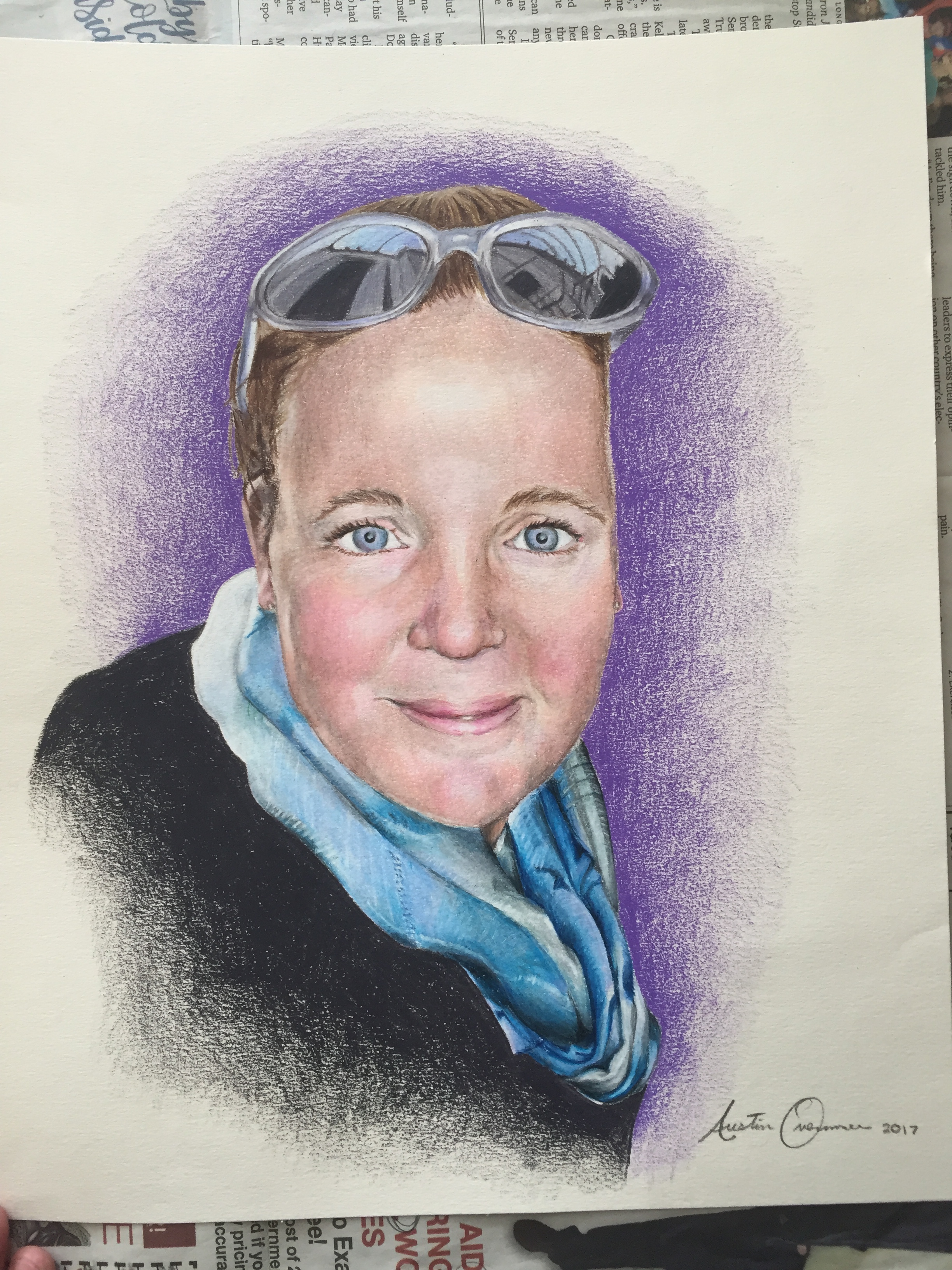
(7 of 7) – finished. This was the first piece I signed 2017. I tried to finish it in 2016 and make it my last major piece for the year, but it didn’t happen. I still am not entirely happy with it. I certainly don’t love it as much as Scott and Cory seemed to, but seeing their reaction definitely made me feel better about it. It definitely turned out better than I thought it would from the standpoint of where I was on it at the time I set it aside.
There are a lot of pieces or drawings that have a special meaning to me beyond what the final piece is. Drawings that I think of as key learning points in my art. Usually these pieces are where I figured out some specific aspect of technique, like “I remember this, this is the drawing where I figured out how perspective works” or “This little piece is when I realized how to draw circles skewing toward a vanishing point” This piece taught me an incredible valuable lesson, but not about artistic technique. I know now to always ask for a deadline. From now on I’m going to insist on a deadline on my commissions, so that I don’t end up leaving something un-done for more than a year.
Thanks for looking.
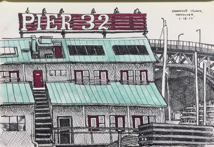
Inktober Part…Four ?
I wouldn’t say I gave up on Inktober, I just got off track and after that it wasn’t my main focus any more. So it’s taken me until now to accumulate enough drawings, that I just happened to do in pen and ink, to finish the 31 drawings for Inktober. Hope you enjoy:
Drawing #31
I drew this on my last day on my trip to Vancouver over MLK weekend. It feels a bit flat, but I still love the way it turned out. Faber-Castel Black SX Pen & Gouache Embellishments.
Drawing #30
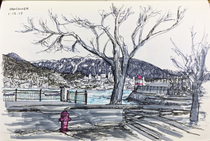
I took advantage of the long weekend and rode the train up to Vancouver for three days to do some drawing and photography. This was my first drawing I did…It was so cold that it was hard to stay outside to finish it.
Also, look for my photographs from Vancouver on the Photography Collections page, coming soon.
Drawing #29
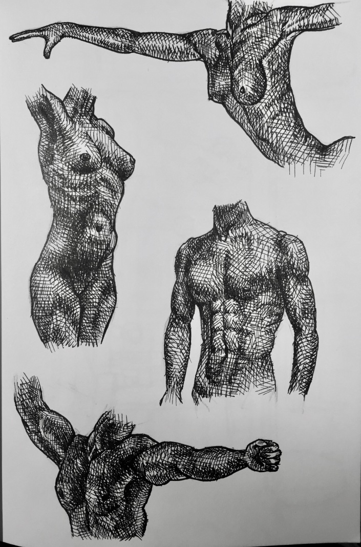
Male and female torso and arm studies. I love the way the whole page of them looks together, but here are closer pictures of each one, below:
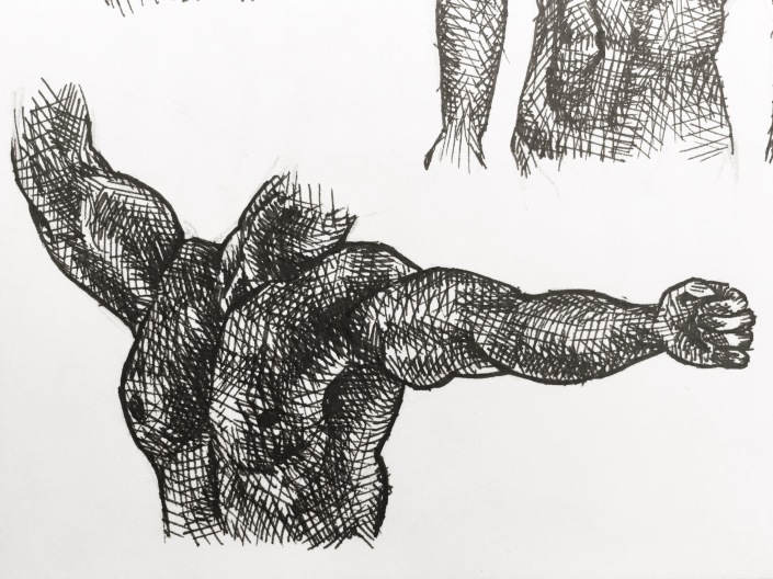
(1/4 – Male torso with arms extended)
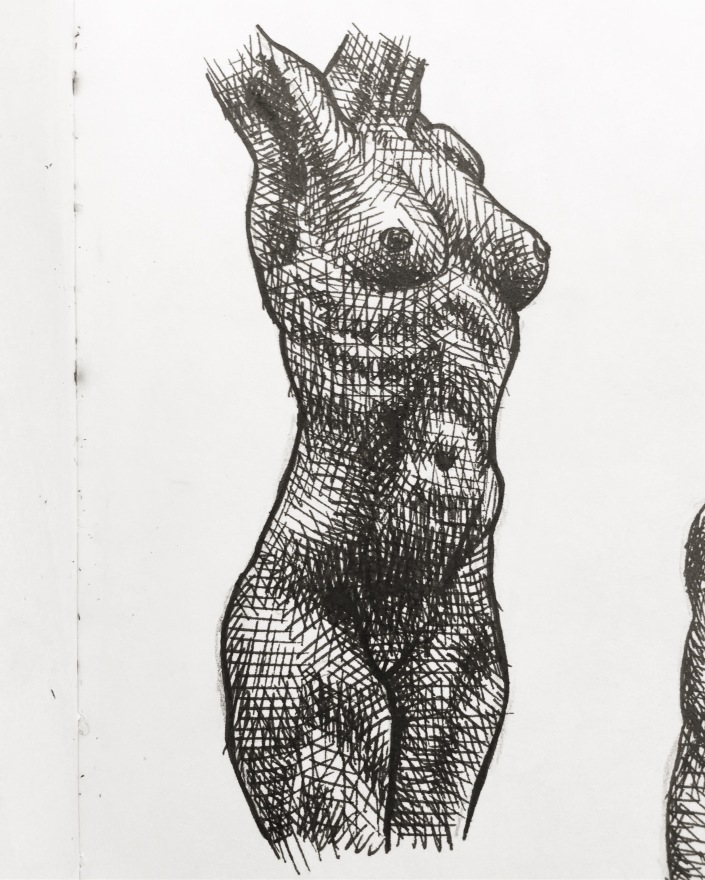 (2/4 – Female Torso)
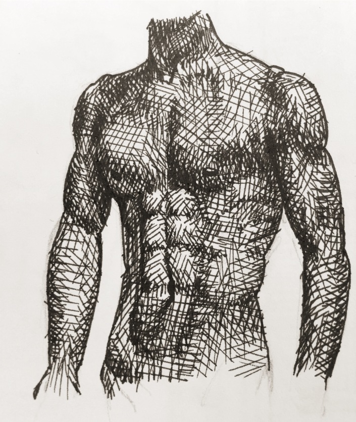
(3/4 – Male Torso)
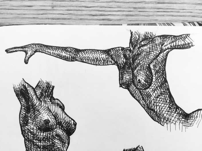
(4/4 – Female torso with arms extended)
Drawing #28
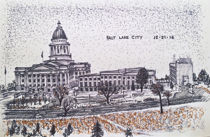
A drawing I did of the Utah State Capitol Building, when I went home for winter break. My buddy Esteban and I drove around for a while, ended up at the capitol, drew it in the freezing cold, and then went to Siegfried’s german deli to eat when it started snowing and we had to stop drawing.
Drawing #27
Nothing more than some doodles really.
Drawing #26
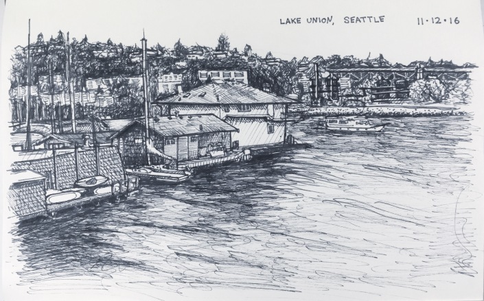
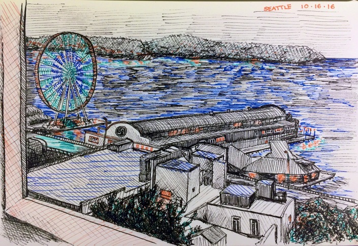
Lake Union, Seattle. I love this one.
Drawing #25
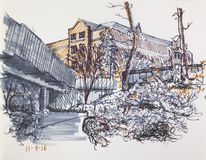
The seam in the cement, the shrub at the base of the walkway pillar, and the black and grey scribbles in the foreground on the left…look like a man sitting with a fishing pole…or so my aunt tells me. (That’s called apophenia)
Drawing #24
Drawing #23
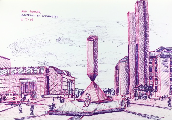
Red Square on UW campus. Perspective is really off…just keep moving. Nothing to see here.
Drawing #22
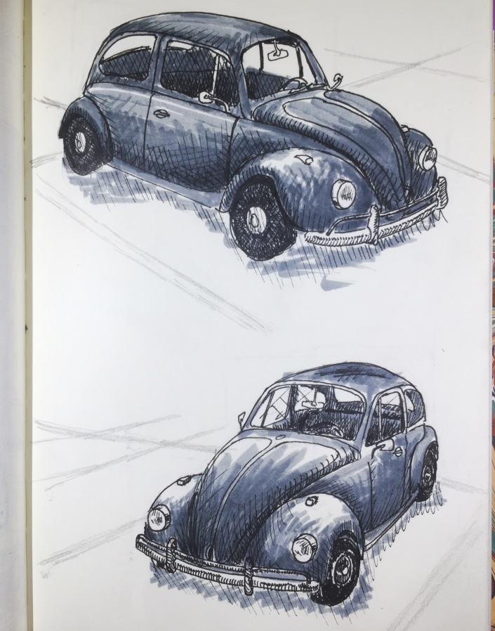
These were really fun to draw. A VW bug in the parking lot next to my building, from two different angles.
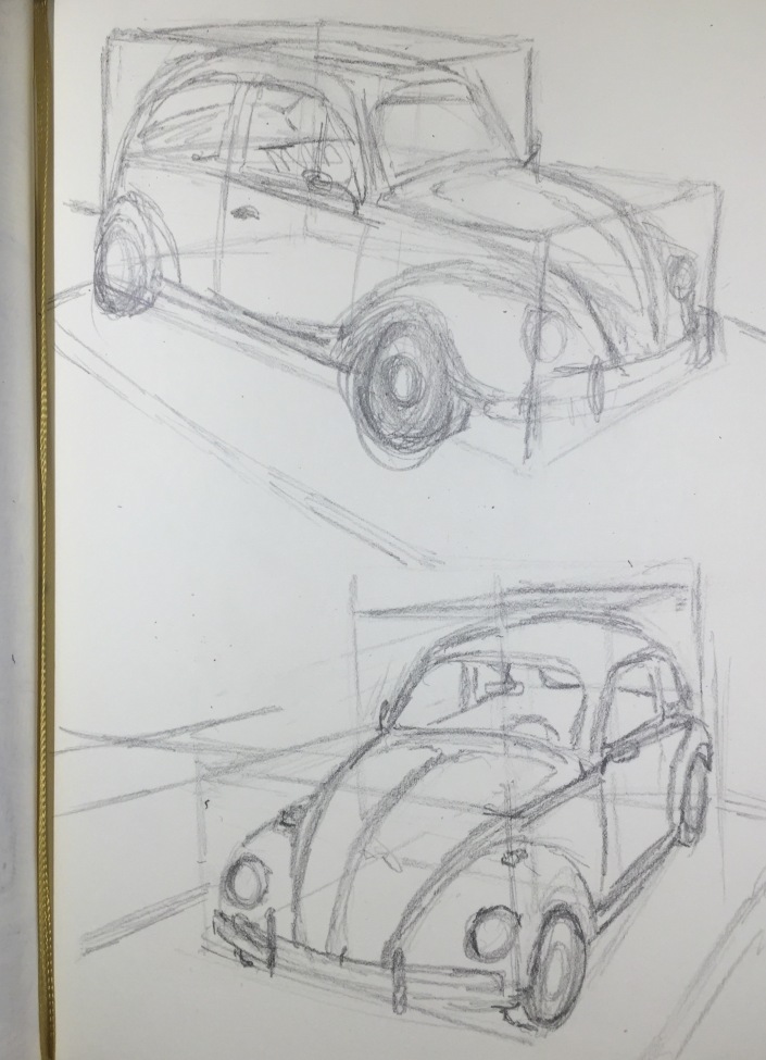
I actually liked these more before I inked them, when they were just pencil. Here I tried something new. I used these box grids to help me visualize how the cars would fit in there. It helped with getting the perspective (almost) right.
Thanks for all your support! Its been a fun project. I’ll try again in October.
Inktober Part Three
I’ve fallen behind…got too wrapped up in college papers to take ink to page recently. So even though they don’t match up with the days completely, here is the next seven drawings
Drawing #21
Lights. The five smaller bulbs in the background are actually supposed to be the reflection in the dark window. I’m not sure if you can tell that or not.
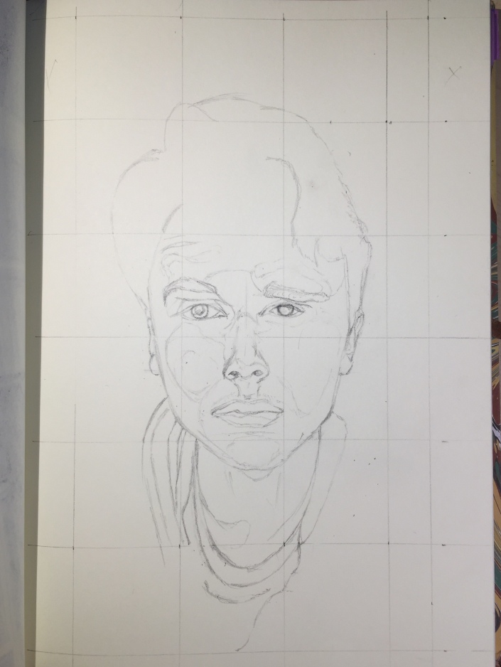
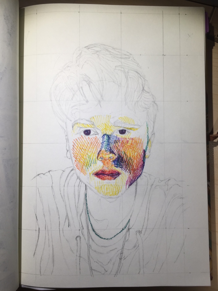
Drawing #20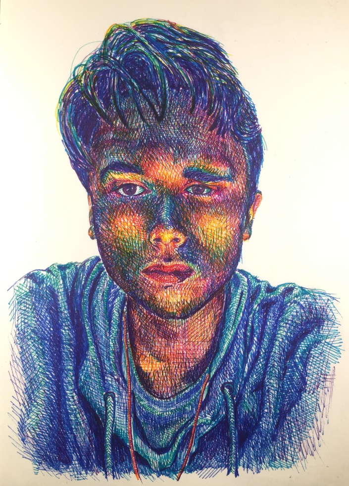
As far as I can remember, this is the third self portrait I’ve ever done. The one before this was from my sophomore year in high school. It was the first image posted on this blog. You can look back to the very first post to see it here, if you like: Test Post
The first was one I drew in second grade art class. I imagine my mom might still have it somewhere.
I made sure to take process photos. I love to see the process. See them below.

Drawing #19
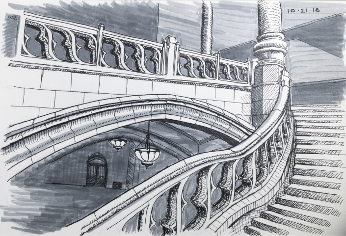
This is the third drawing of Inktober so far with at the Suzallo Library. This is my first drawing using a shading marker. This month, with all the time I’ve spent drawing, I really think I’ve broken through to a new level of understanding the things I see and how to draw them. The perspective on the stair rail and the lights was tough, but I could not have drawn this a few months ago. Its one of the best in the series, I feel.
Drawing #18
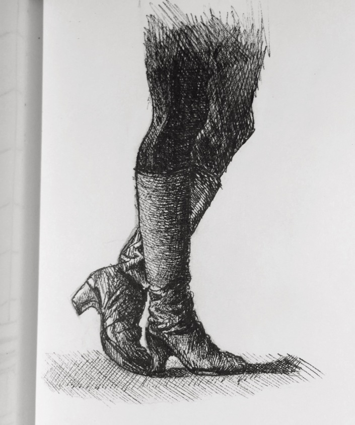
What does it say about you if a pretty girl stands next to you in the library, and you’re more interested in the way her leather boots fold, than her?…Anyway, I felt a bit creepy surreptitiosly taking a picture of her boots, but I had fun drawing them. I left room on this page in my sketchbook to do several more. I plan to draw the same boots but in several different mediums. Look for it in a future post.
Drawing #17
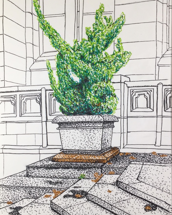
A plant outside Suzallo Library in Red Square on my campus. I love the way it turned out. If you remember my October 6th drawing, this plant is right behind the penciled in lamp in the distance, on the other side of the stairs.
Drawing #16
This was a fun one; I met up with my friend Darren whom I met a year ago on my first trip to Seattle. We met up for coffee and went down town to do some sketching. We might even collaborate on some projects in the future.
Drawing #15
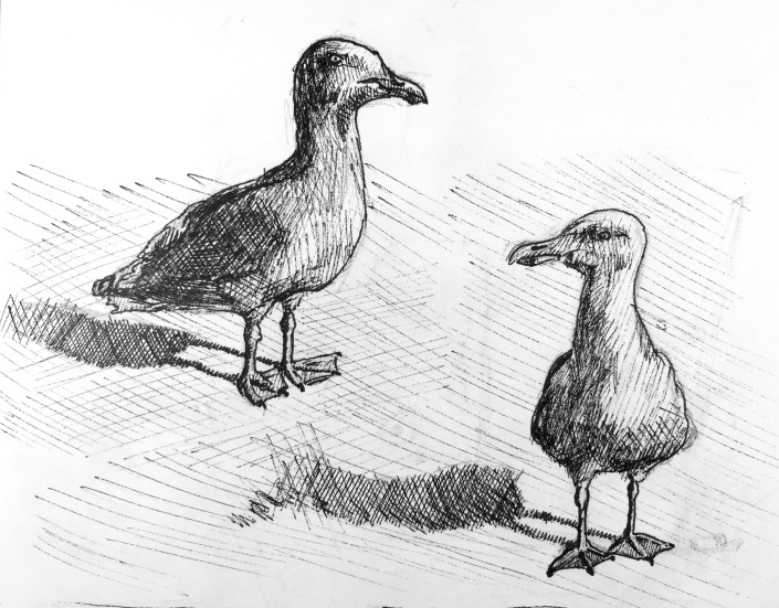
There was a seagull who sat next to me while I was eating my lunch in Red Square. Here he is twice.
Like I said, I’ve fallen behind, but I’ll post the last series when I’ve finished them. There will be 31 drawings for 31 days of Inktober.
Thanks for looking!
Inktober Week Two
This week I definitely had less time to devote to drawing. I still did some good ones, it was just harder to fit it in. Hope you enjoy them!
October 14th
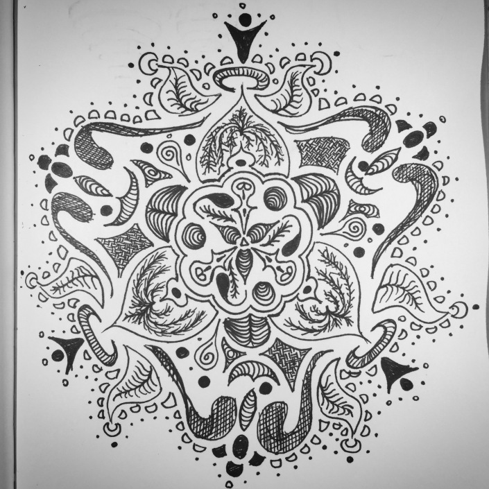
This is definitely my least favorite drawing from my Inktober project so far. I was tired and it was late so I opted to draw another mandala. Im just not super happy with the way it turned out, but that’s all right. Not every drawing is a masterpiece, as they say.
October 13th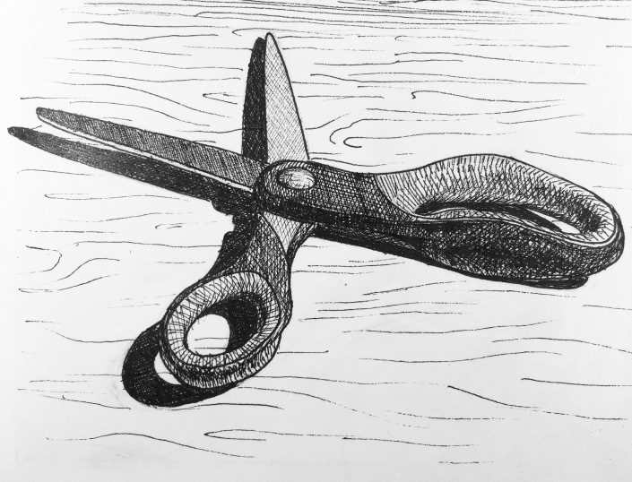
Scissors. ‘nough said.
October 12th
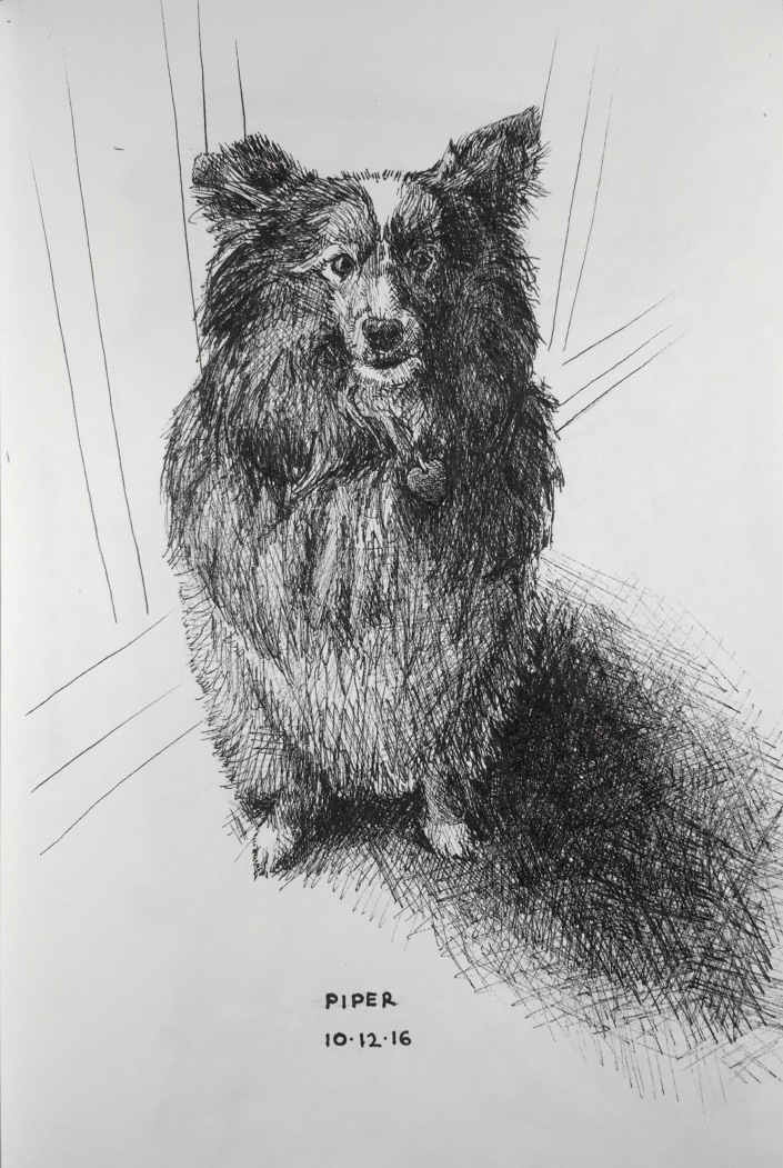
“Piper”
Ive only been living away from home for about a month at this point, and one of the many things I miss most is my dog, Piper. So I channeled that into a drawing of her.
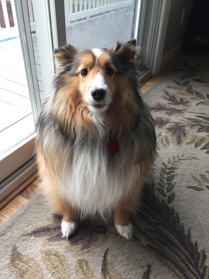
Drawing based on this photograph by my mom.
October 11th
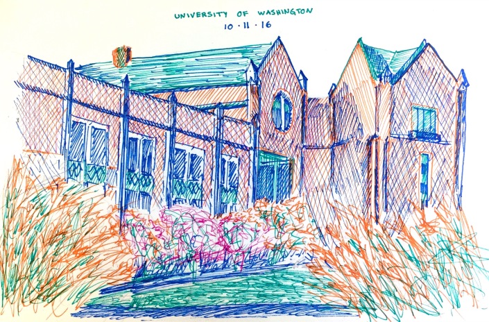
I only had about 45 minutes this day to draw. But it was a beautiful day, one of the last this year here in Seattle, so I decided to spend it on a campus bench drawing this building. It turned out well.
October 10th
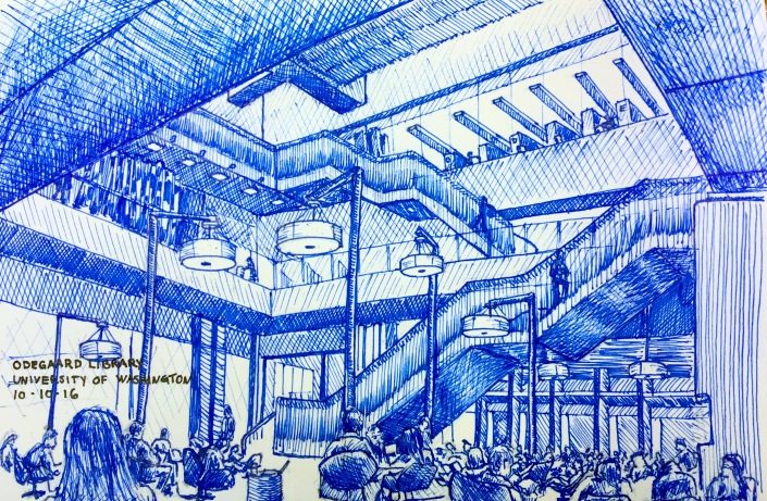
Drawing on campus this day at the Odegaard Undergraduate Library.
This drawing is very important to me because I think it is the first example when I’ve even tried to include the people in the scene in the drawing. Usually they move around to fast and my pen, which moves much slower only captures the non moving objects…I like to think of it like an old photograph from the 1800s, when it would take several hours to expose and the streets would appear empty. But this time I was able to capture most of them, and even some of the faster moving ones who were walking around or on the staircases.
October 9th
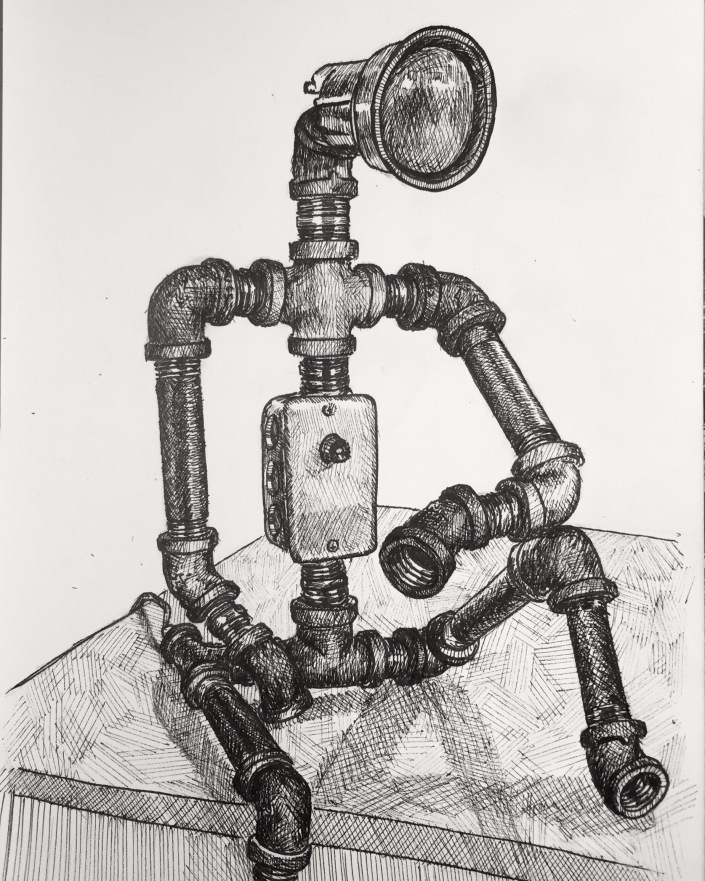
“Ferrous”
Based on this photograph of this lamp that my Uncle Alan made and gave me. He calls it Ferrous.
October 8th
Just a mandala…always fun and relaxing to draw.
Thanks for reading! Week three coming soon.
Inktober Week One
I’m doing a drawing challenge this month: “Inktober” the challenge is to do a new drawing in ink every day of October. At the end of each week I’ll post the new drawings from that week. Here’s week one
October 7th
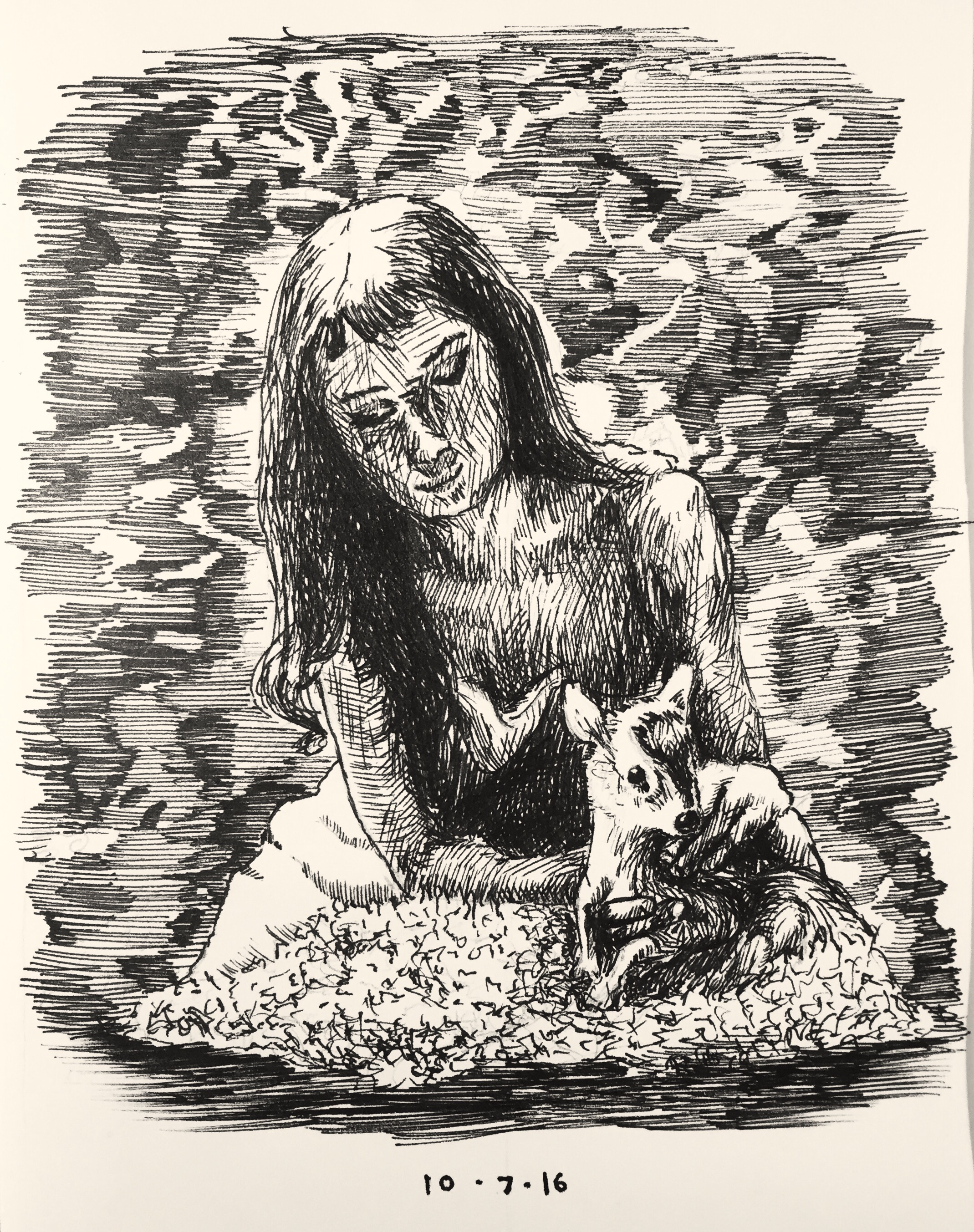
A drawing of Audrey Hepburn and her pet deer Pippin
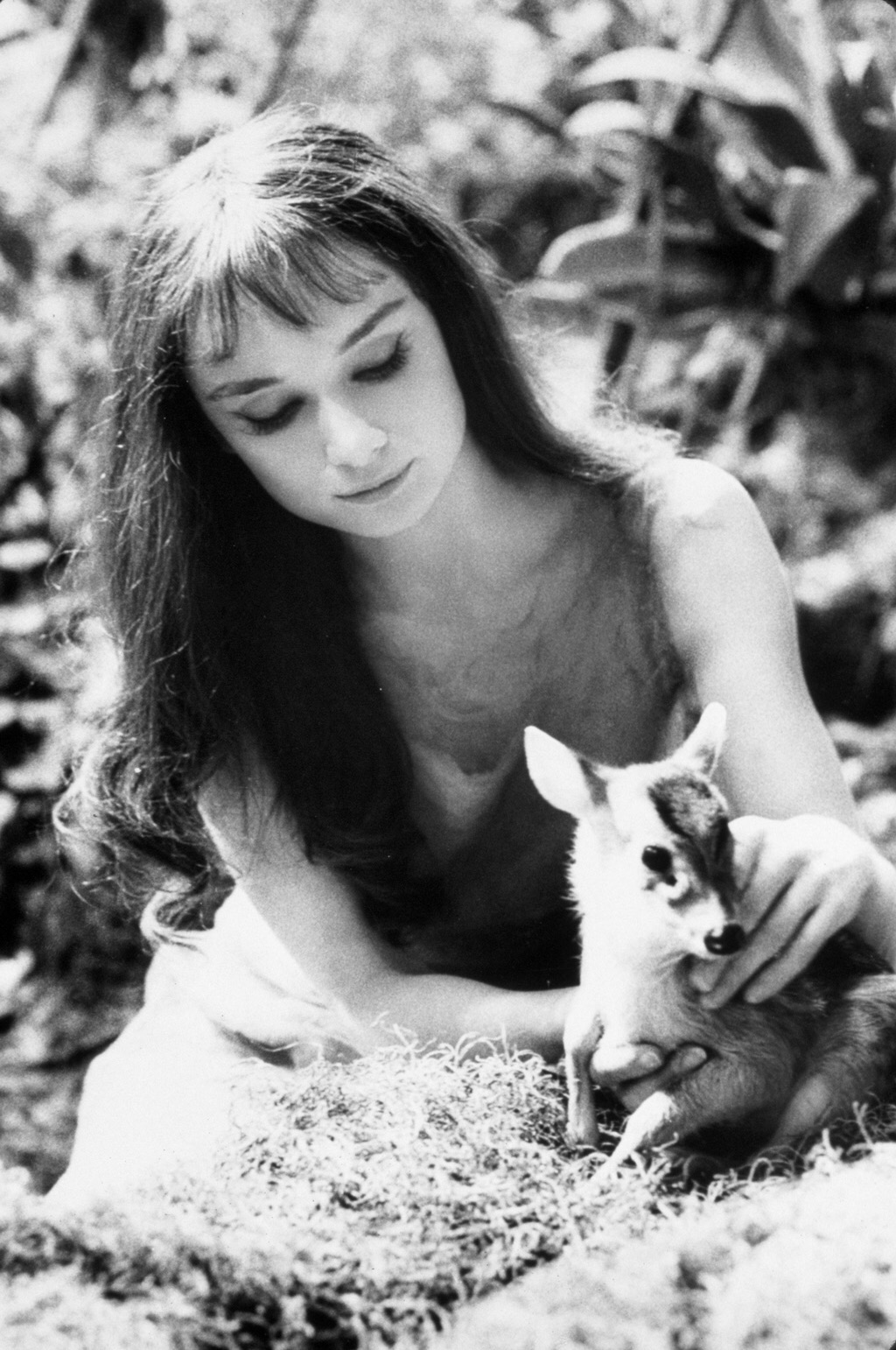
Based on this photograph.
A lot of people don’t know that I’m a big fan of Audrey Hepburn. This drawing didn’t turn out the way I wanted, so I’m going to try it again next week, but I wanted to mix it up and draw something other than buildings for a change. I rarely draw people because I’m not very good at it.
October 6th
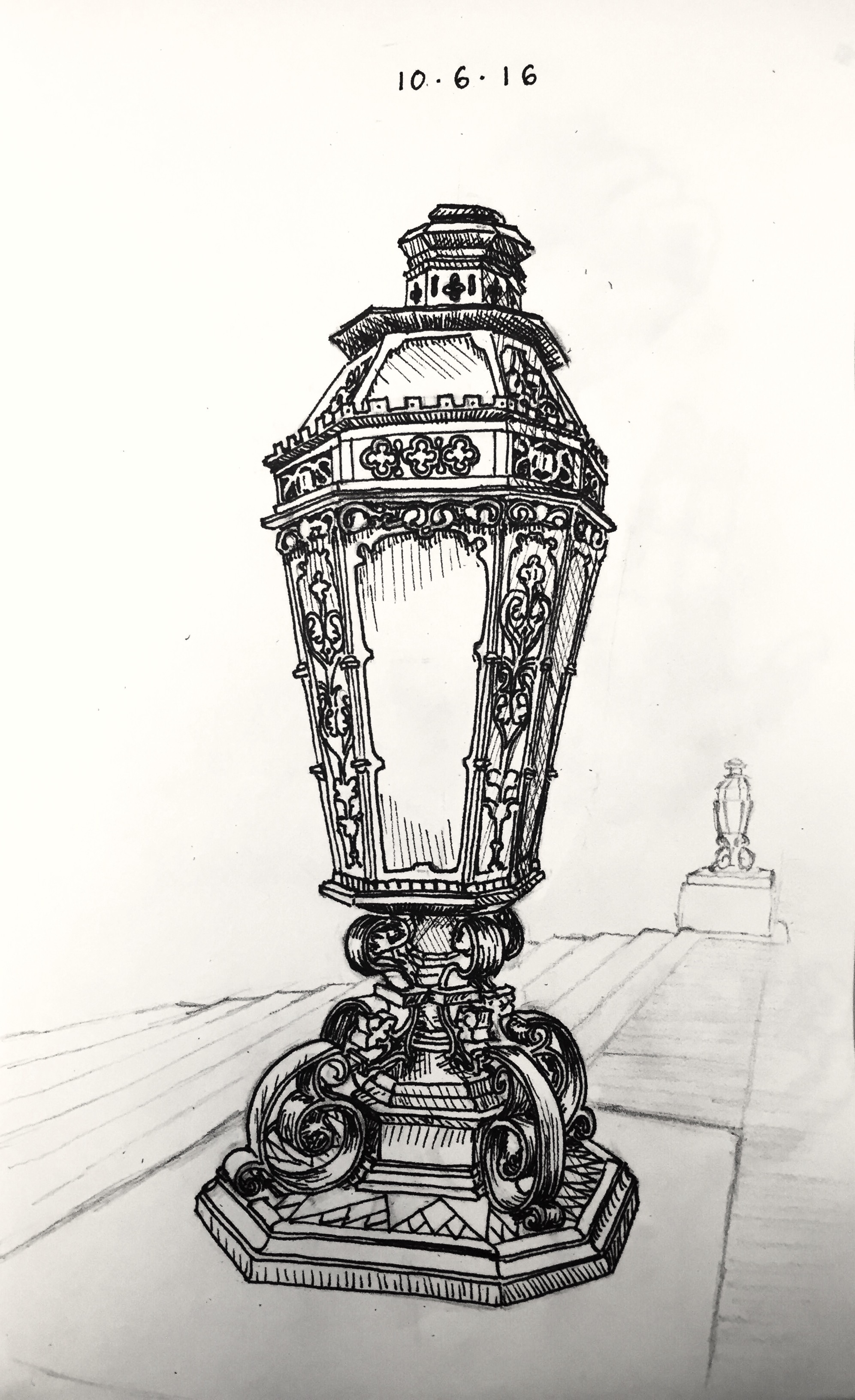
A lamp at Suzallo Library.
October 5th
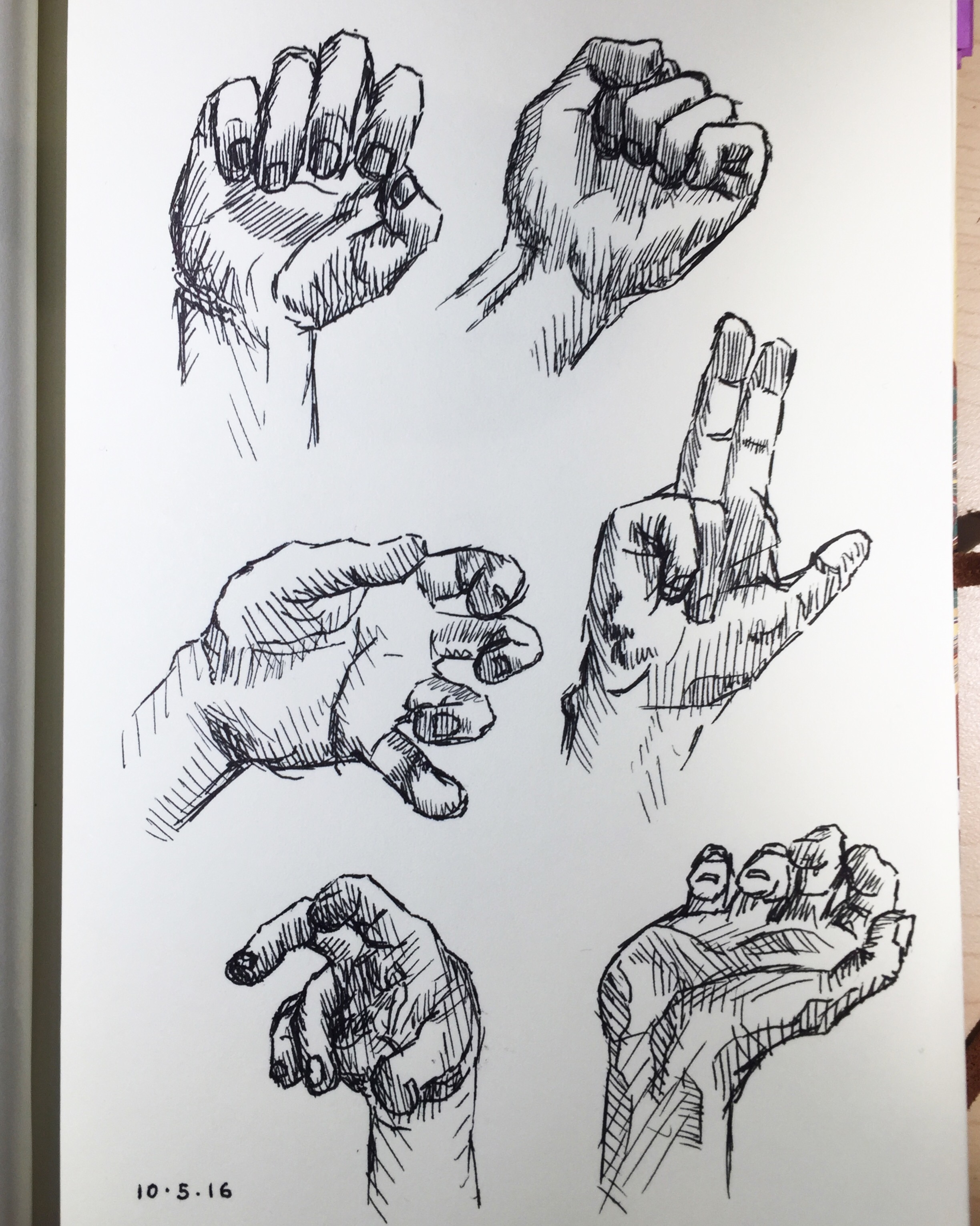
Some hand studdies. Used reference photographs from the internet.
October 4th
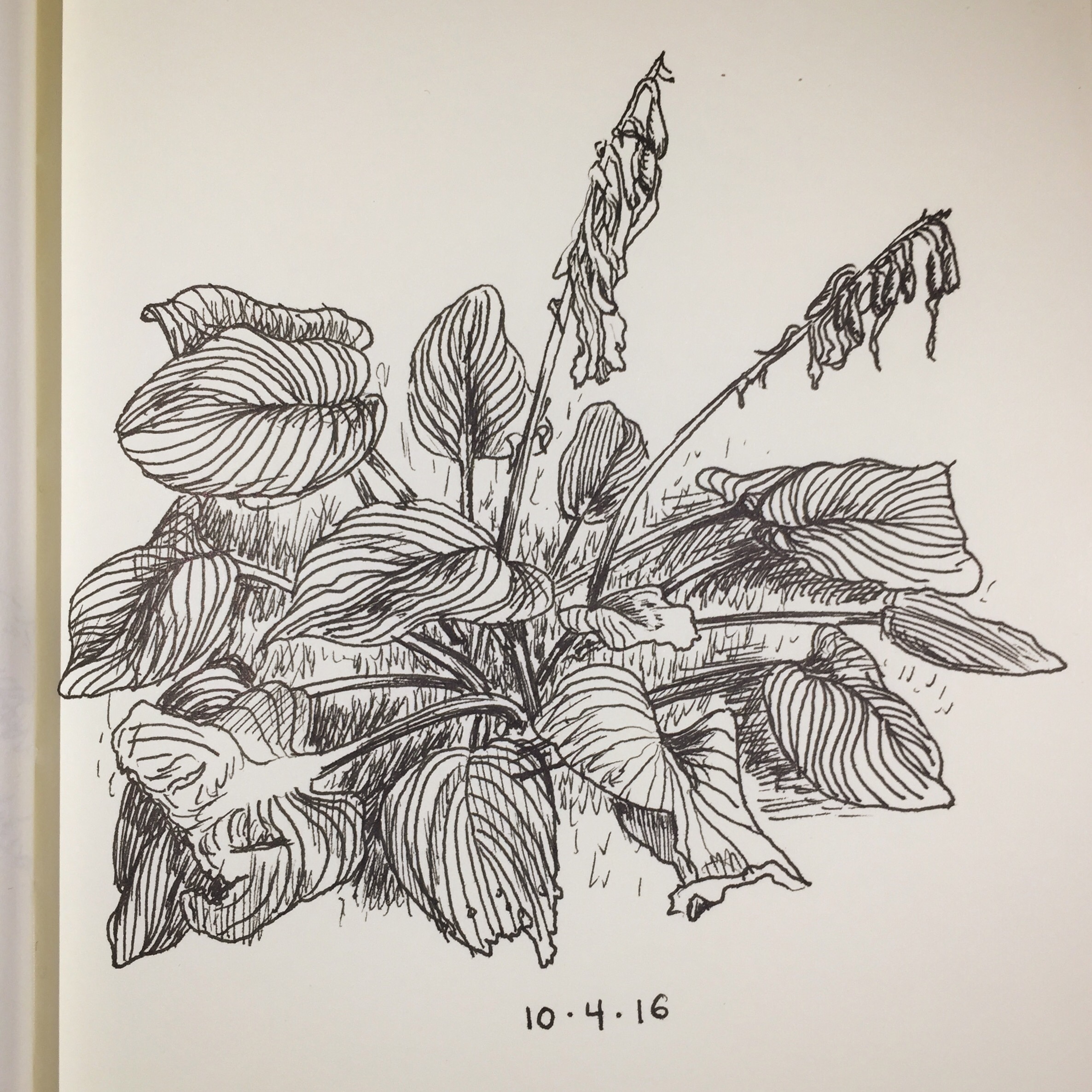
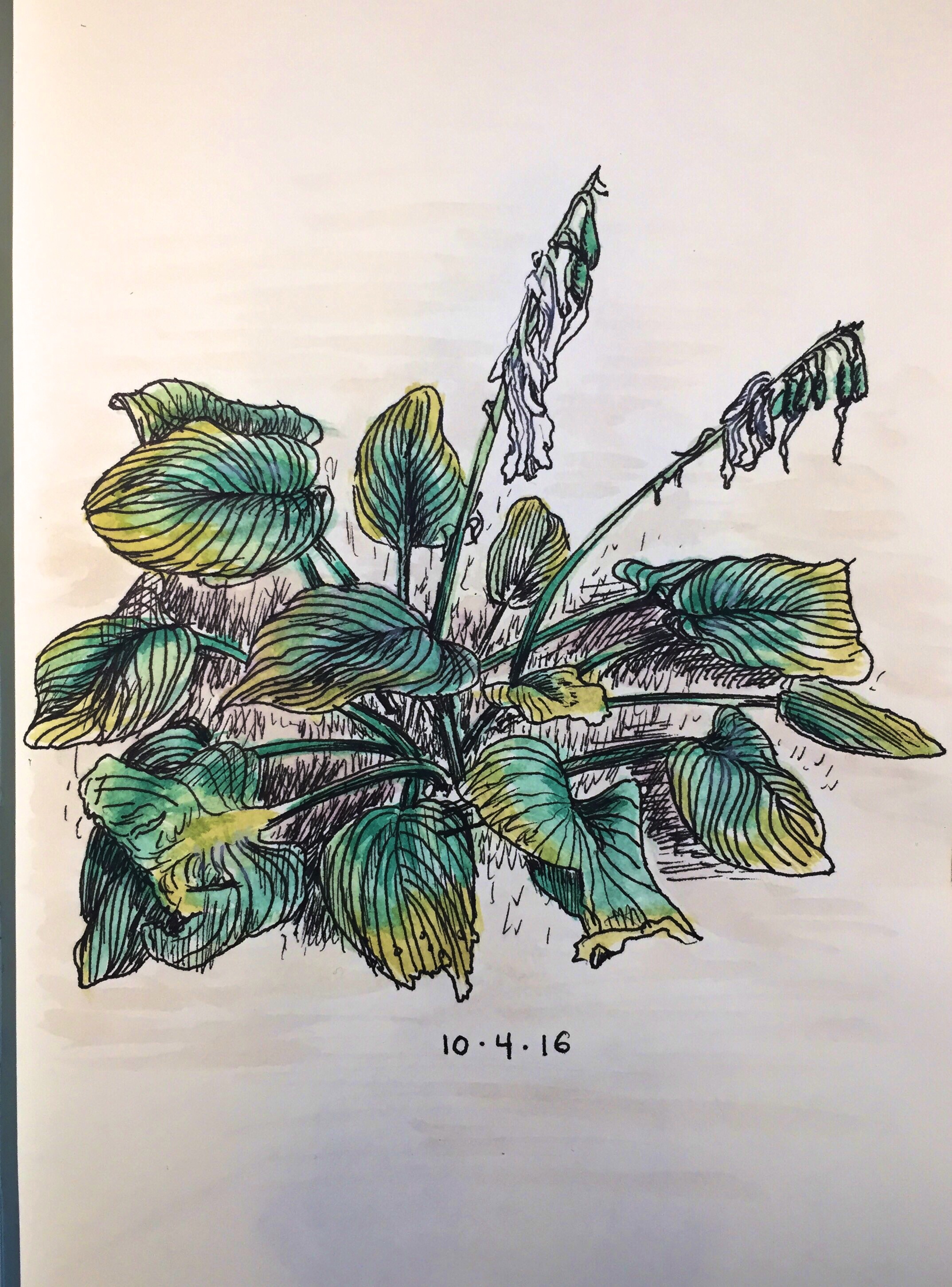
I also added watercolor embelishments to this drawing afterwards.
October 3rd
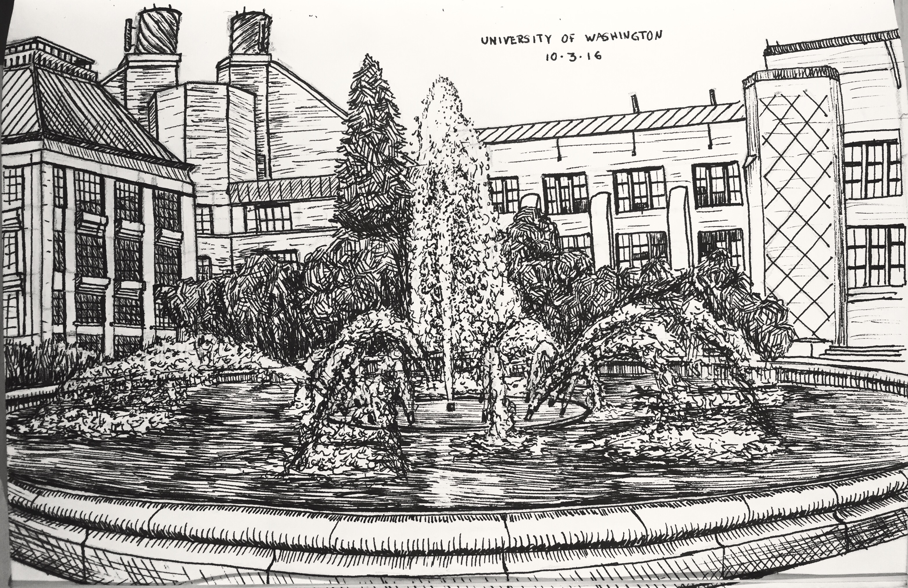
The University of Washington Fountain (it has another name, but I can’t remember it).
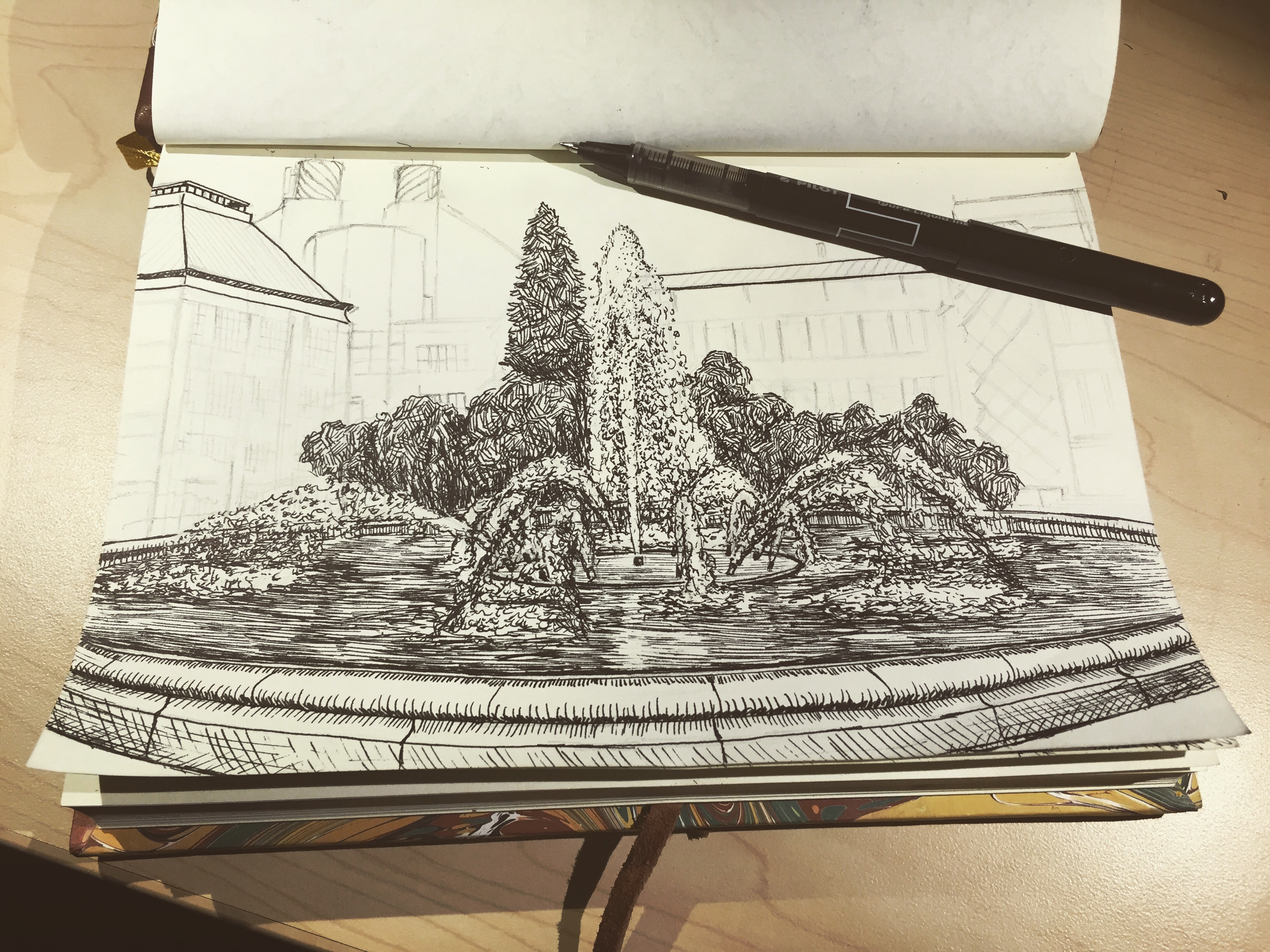
In-progress shot.
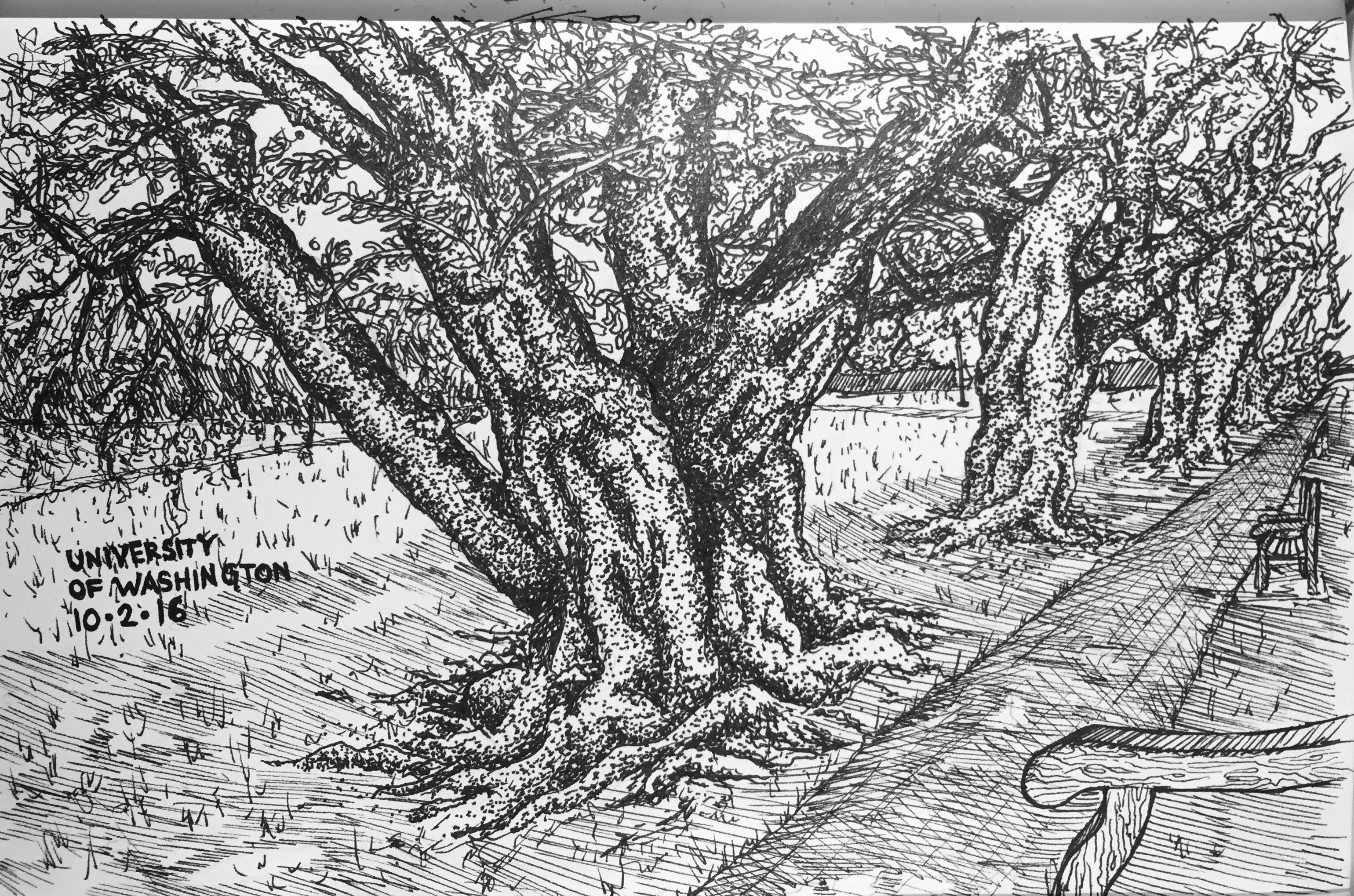
October 2nd.
October 1st
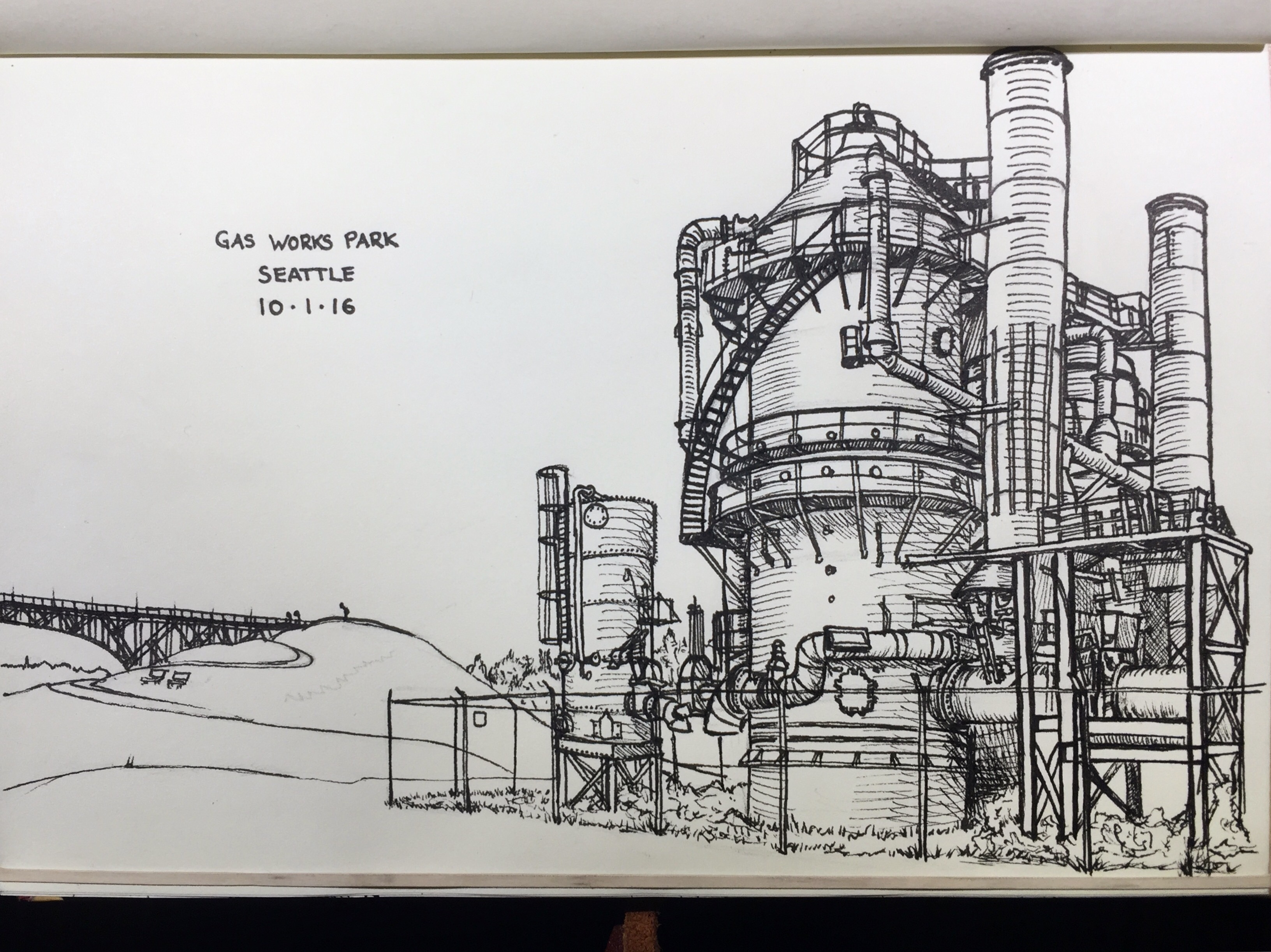
Gas works park in Seattle.
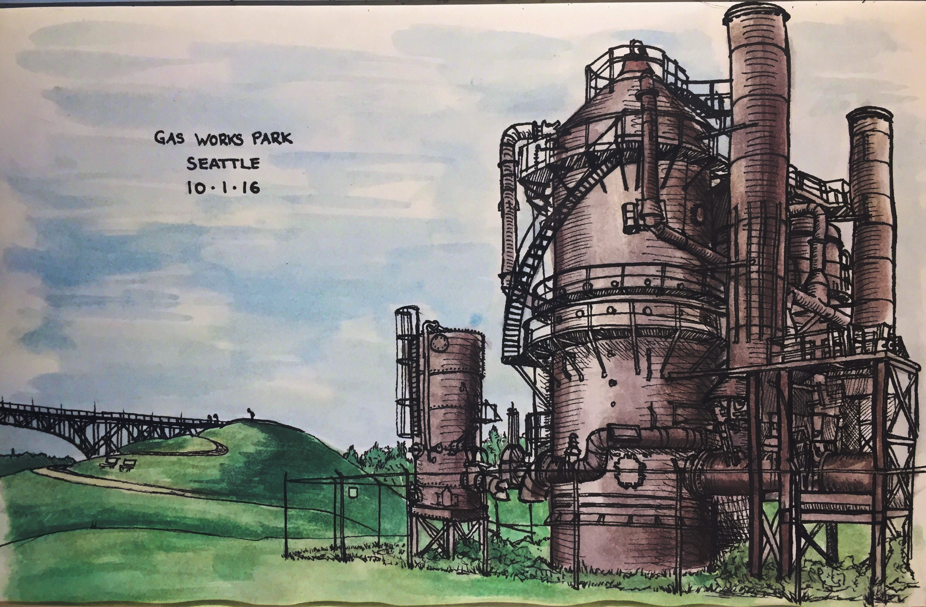
I later added some watercolor Embelishments.
Thanks for reading, check back next week for Week Two.
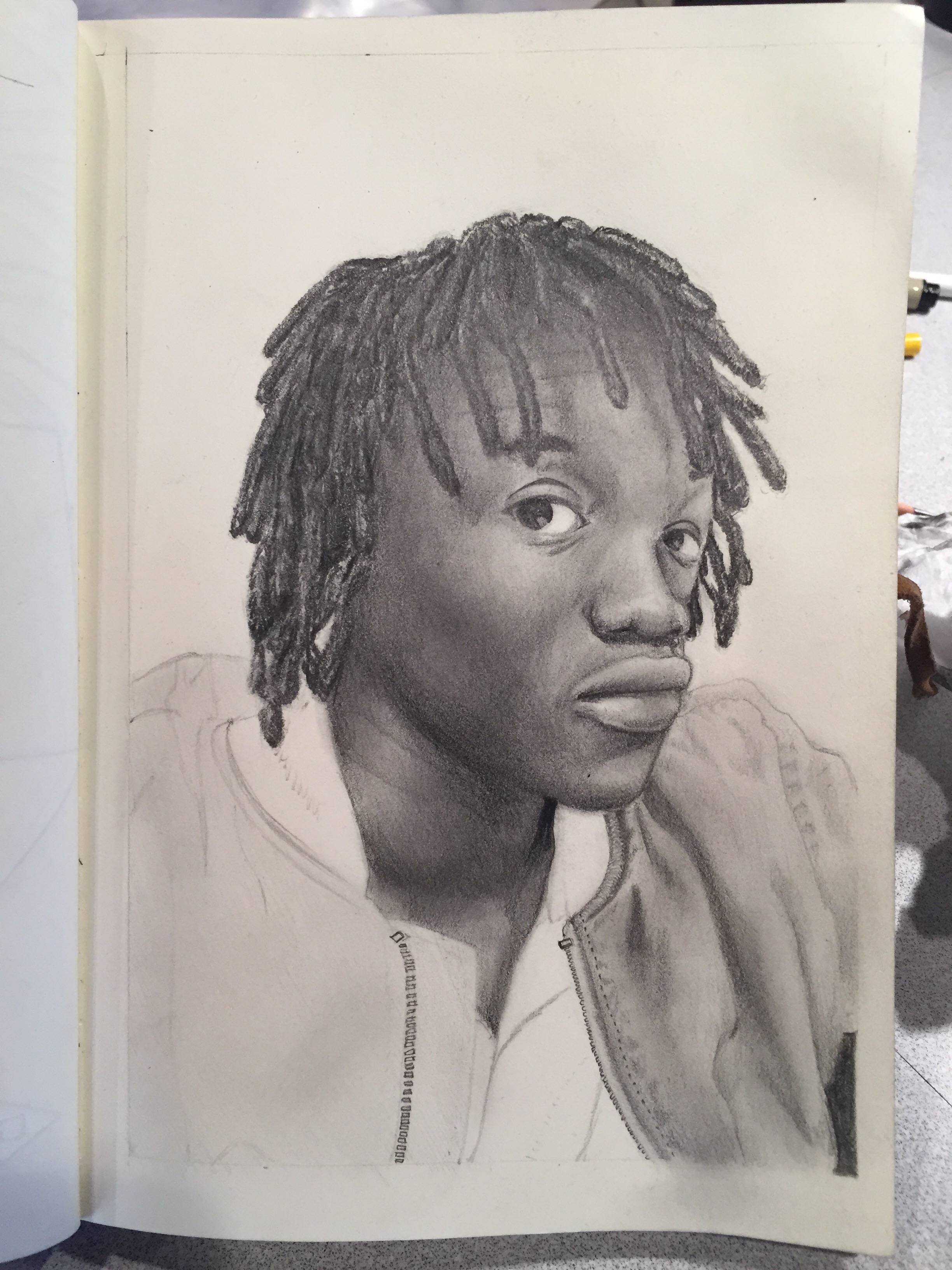
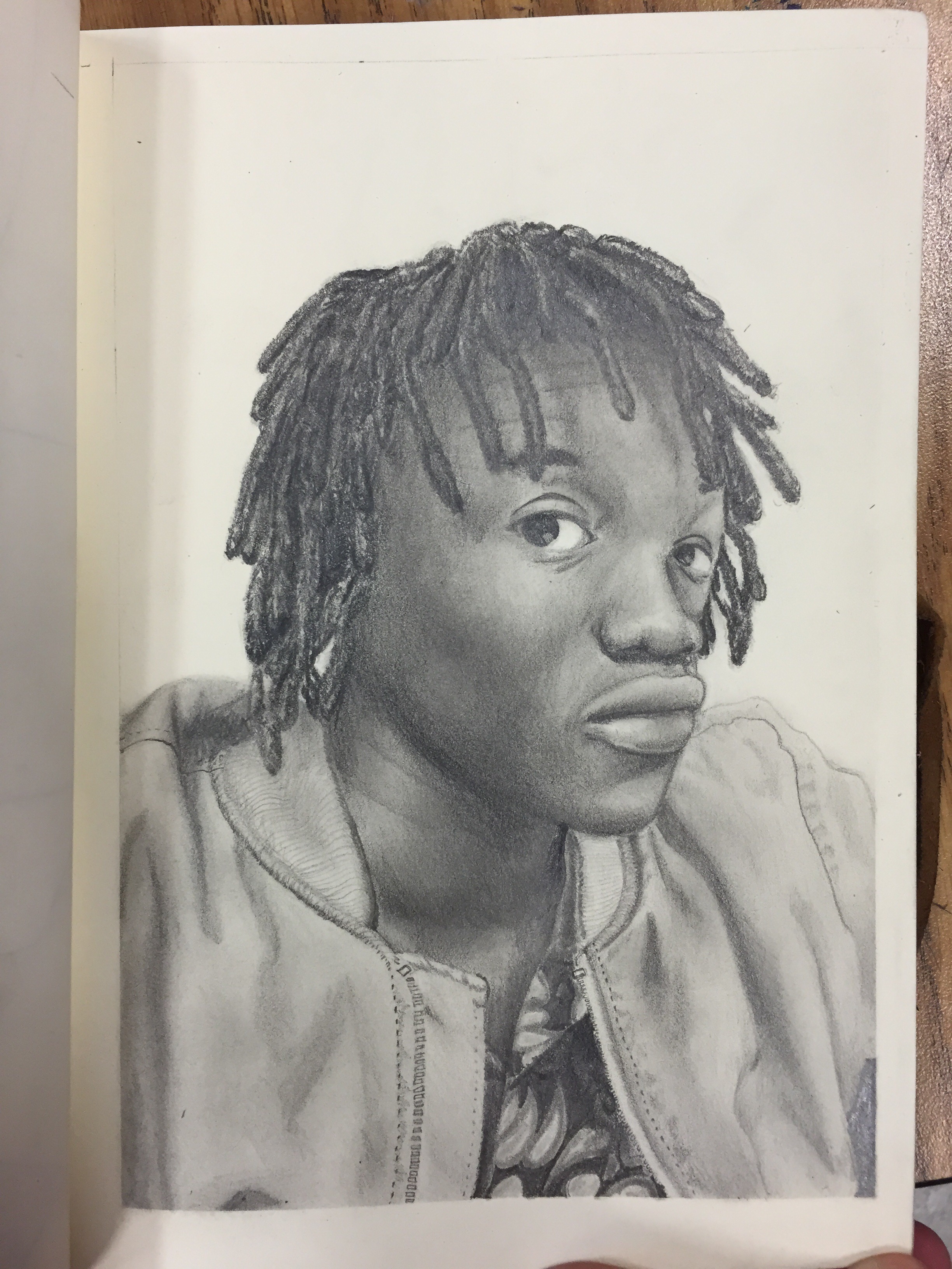
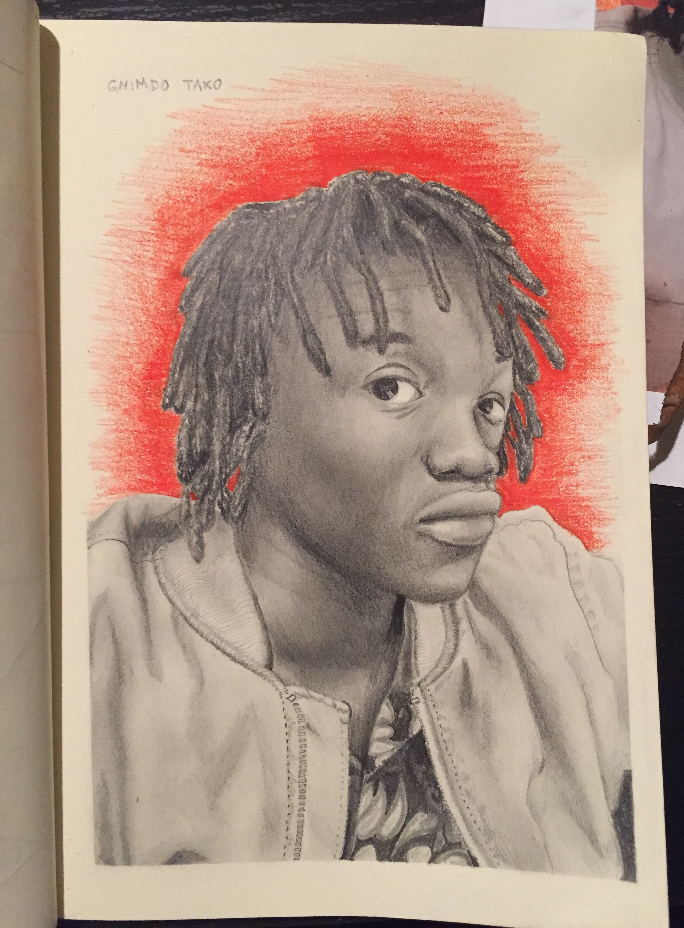
Portrait of Gnimdo T.
This is one of my best portraits, a drawing in my sketchbook of my buddy Gnimdo from a few years ago.
Watch the video to see an animation of the process photos from reference photo to final.
In case you didn’t/couldn’t see the video, here are pictures from the process.
Thanks for looking!
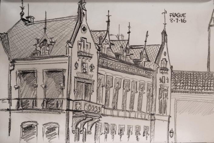
New Drawings from Europe
This summer was great, I traveled to Europe with my family as a graduation present, and I (mostly) got to pick the destinations. Given my fascination with german culture and language, I wanted to go to Germany and Austria, so that’s where we went. We also stayed a few days in Prague, which was incredible as well. We went to Berlin, Prague and Vienna. Here are my drawings I did while there.


For some reason, I wasn’t loving my drawings at the beginning of the trip. But they got better. They actually go from my least favorite to most:
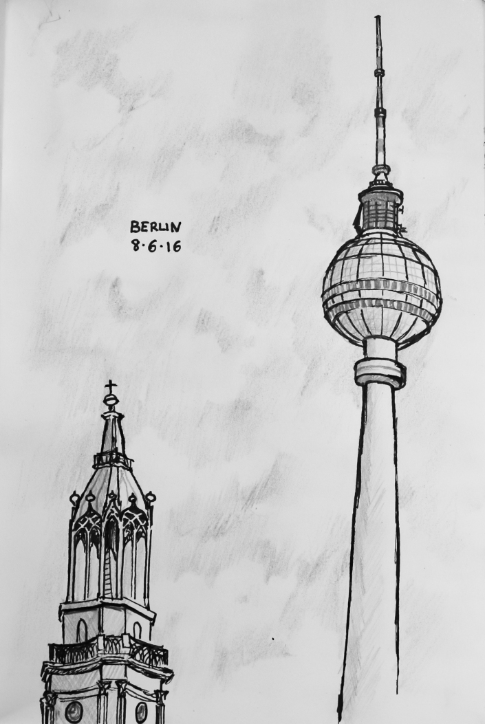
It was our last day in Berlin so I had to at least do at least one drawing. I drew the Berlin Communications tower at Alexanderplatz and the top of a church that’s in that same square. Ehhhh…it’s alright, I’ve done better.
This sketch isn’t the greatest either, but I like it much more than the one from Berlin because this was what I sometimes call a “power sketch” something I do when I have very little time to draw: I forgo taking time to get the perspective perfectly right and cheat a little bit on the details. Also edit out a lot of the details so that instead of a detailed sketch it really captures more the feel of the scene. I did this sketch in 25 minutes.
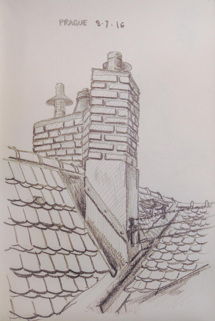 This is the chimney and part of the roof on our terrace at the place where we stayed in Prague. I like this one a lot.
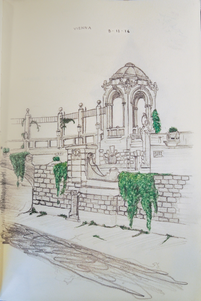
This drawing I did in the Stadtpark of Vienna, The largest central park/greenspace in the city. This park was seriously one of the most beautiful I’ve ever seen. If you ever are in Vienna, make sure you go there. While drawing this two girls who walked by and saw me drawing stopped and asked to see my drawing. That happens from time to time when I’m out drawing, but this time we talked for a while and they ended up looking through my whole sketchbook! They seemed to like my work but I bet I was having a much better time just having them look. It was so great to have someone be interested in my drawings.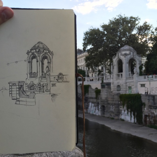
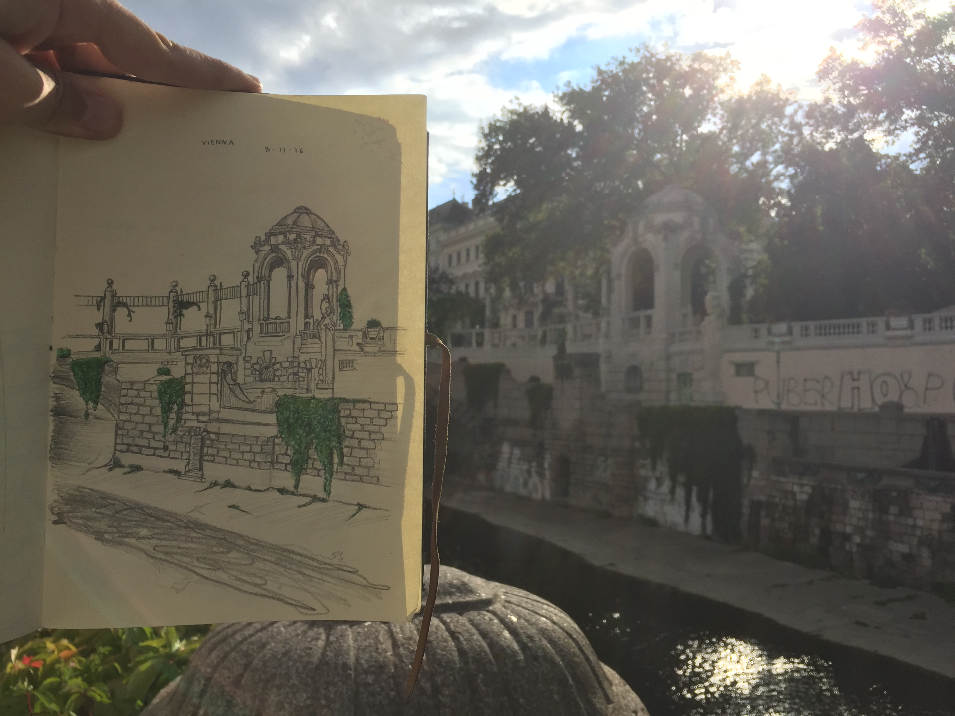
I took these while I was sitting on a ledge similar to the one you can see in the photo on the opposite side of the river. The first one is from the first day. But I loved the park so much that I decided to come back the next day to add more to the drawing: what you see in the second one.
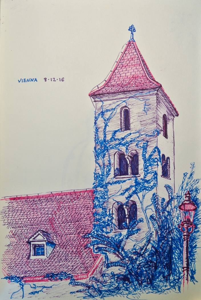
This is my favorite one from the trip. Also in Vienna, this is the oldest church in the city. A similar experience happened while I was working on this one: A man who only spoke German walked up and admired my drawing. I did my best to understand what he was asking me but, Meine Deutsch ist nicht sehr gut! He didn’t look through my sketchbook like the other two, but he seemed to like this one.
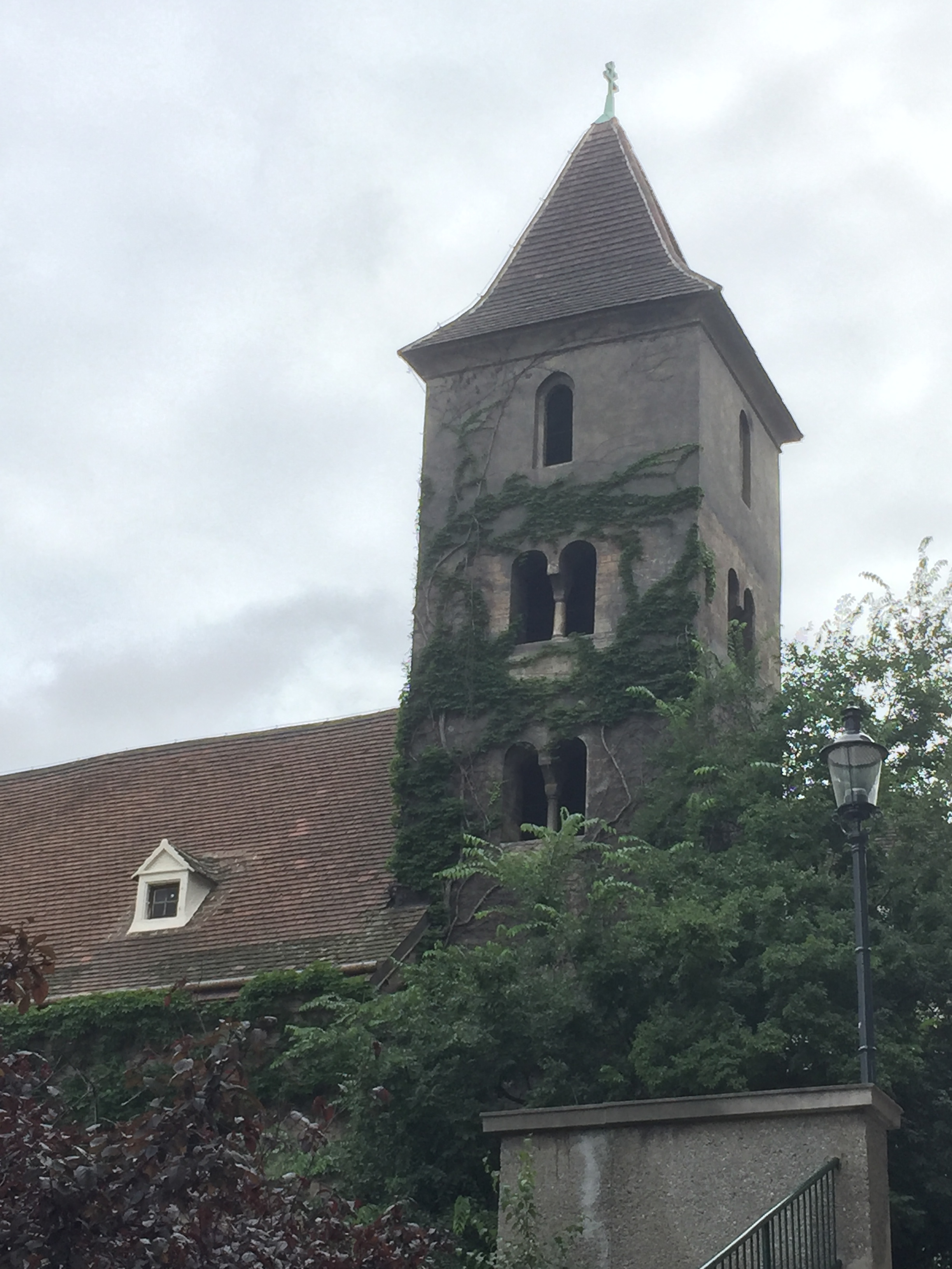
And here’s a photo of the church. I like to take photos of the places I draw from the same vantage point I drew them so that I can compare. This one I think is one of my best in the whole book.
That’s all. Thank you so much for checking out this page! Please check back for new pieces and drawings. Im really trying to be better about posting regularly.
Claire’s Book

This is, in my opinion, the best and most complex book I’ve ever bound. It was a gift for my girlfriend Claire.
***
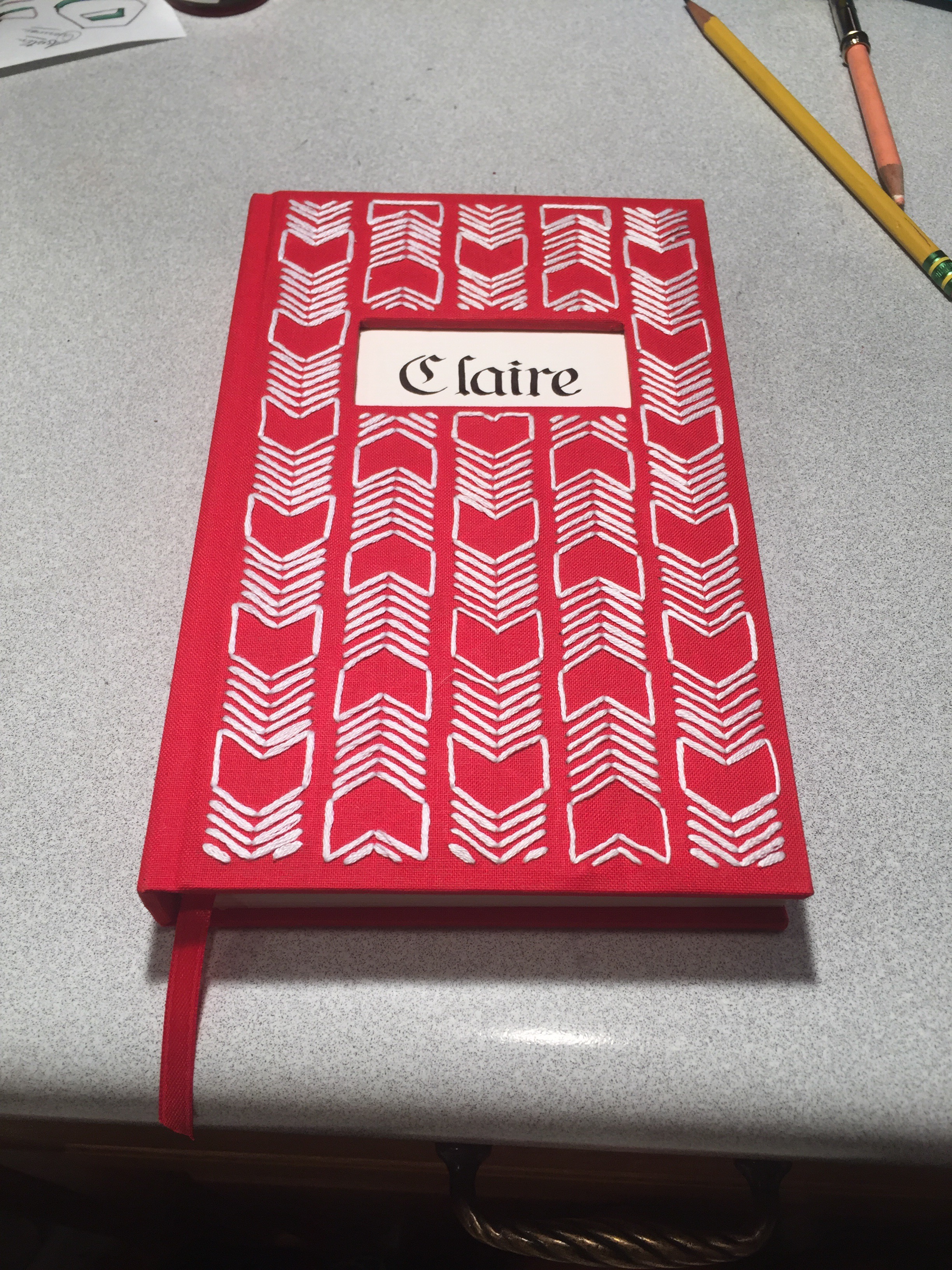
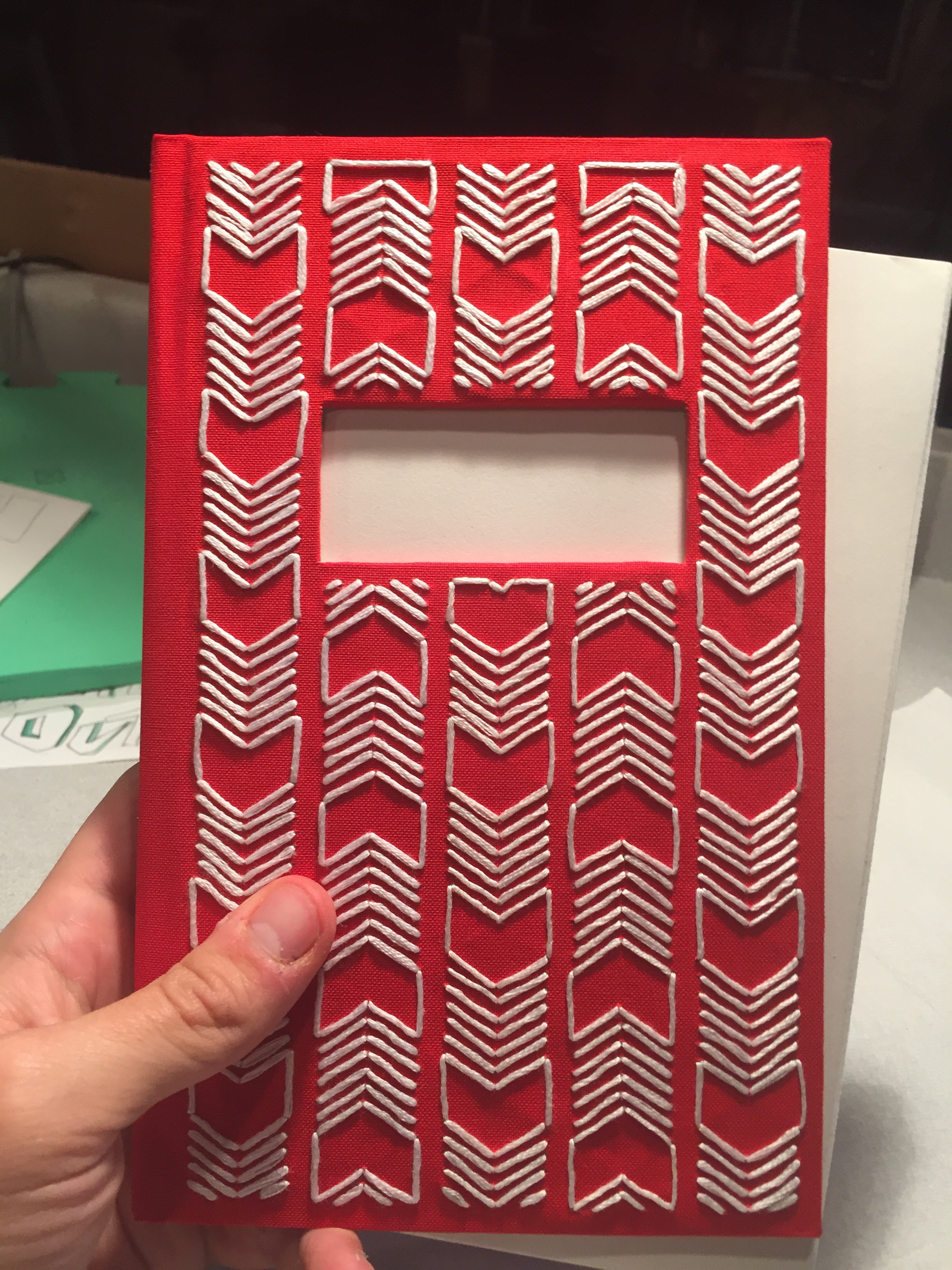
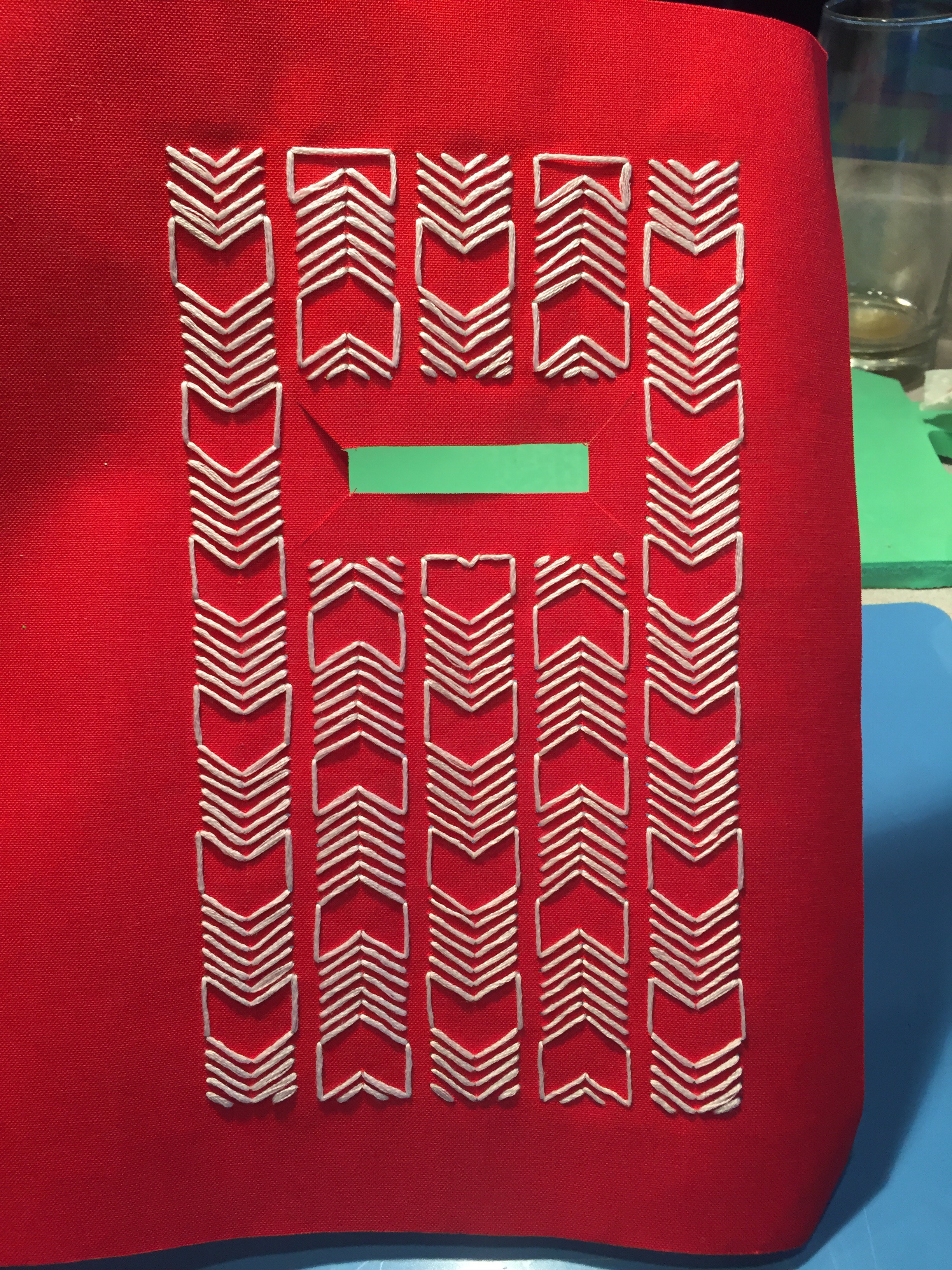
Here is it finished. It’s different from my other books in that I added some new features I’ve never done before. It’s got the window through the front cover with the calligraphy showing through from the end page, and I embroidered the book cloth to make the pattern you see on the front cover.
***
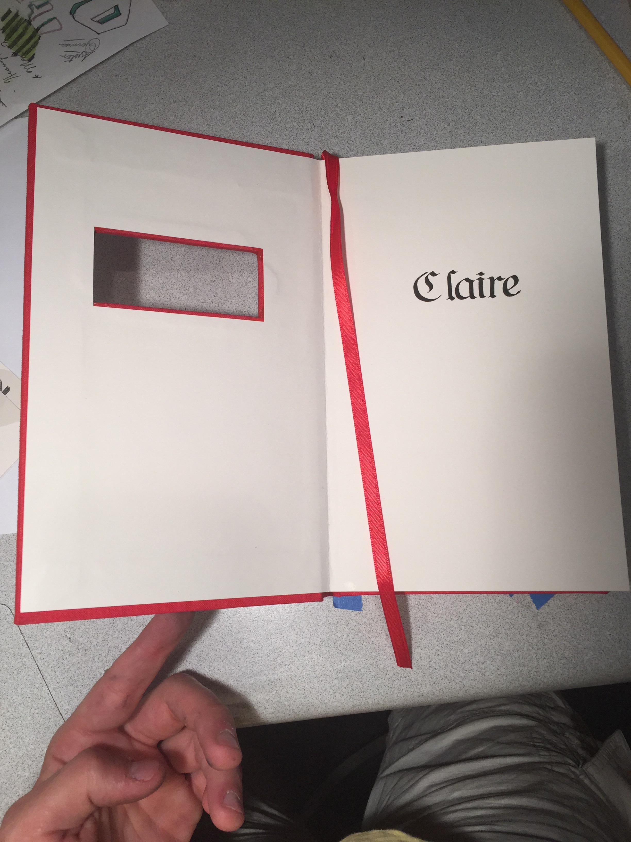
The Window and caligraphy. Writing the caligraphy was nerve wracking because, not only did it have to be perfectly centered and well formed letters, but I only got one chance to get it right.
***
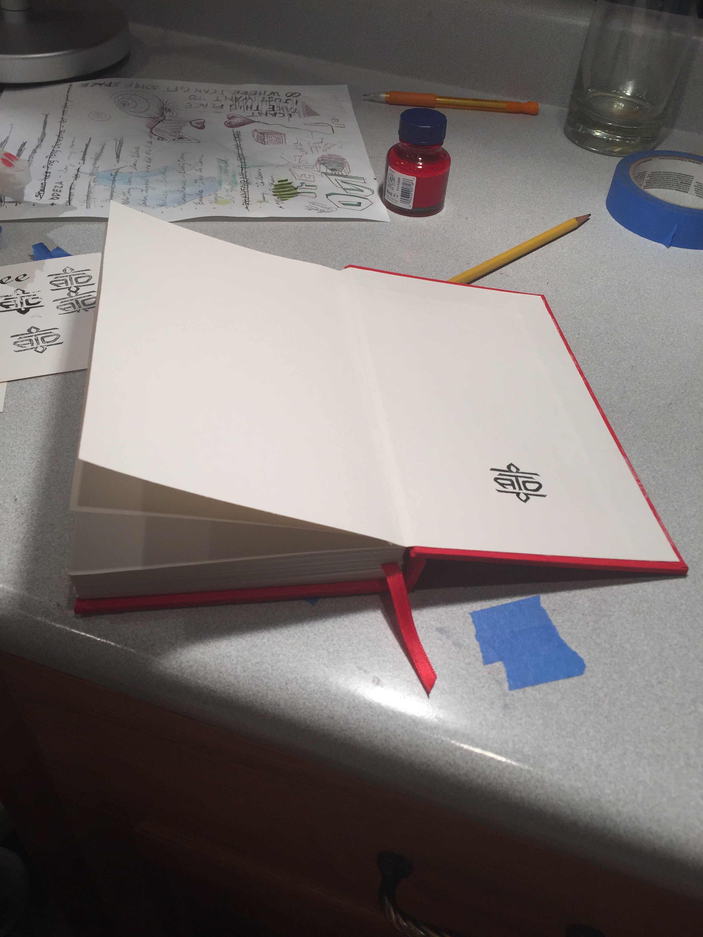
Just like all my books, it bares my bookbinding ensignia. My way of signing all the books I create
***
Here is the finished cover with the finished text block sticking out of it, about to be glued together: One of the final steps.
***
After I finished the pattern, here is the book cloth glued to the front cover board.
***
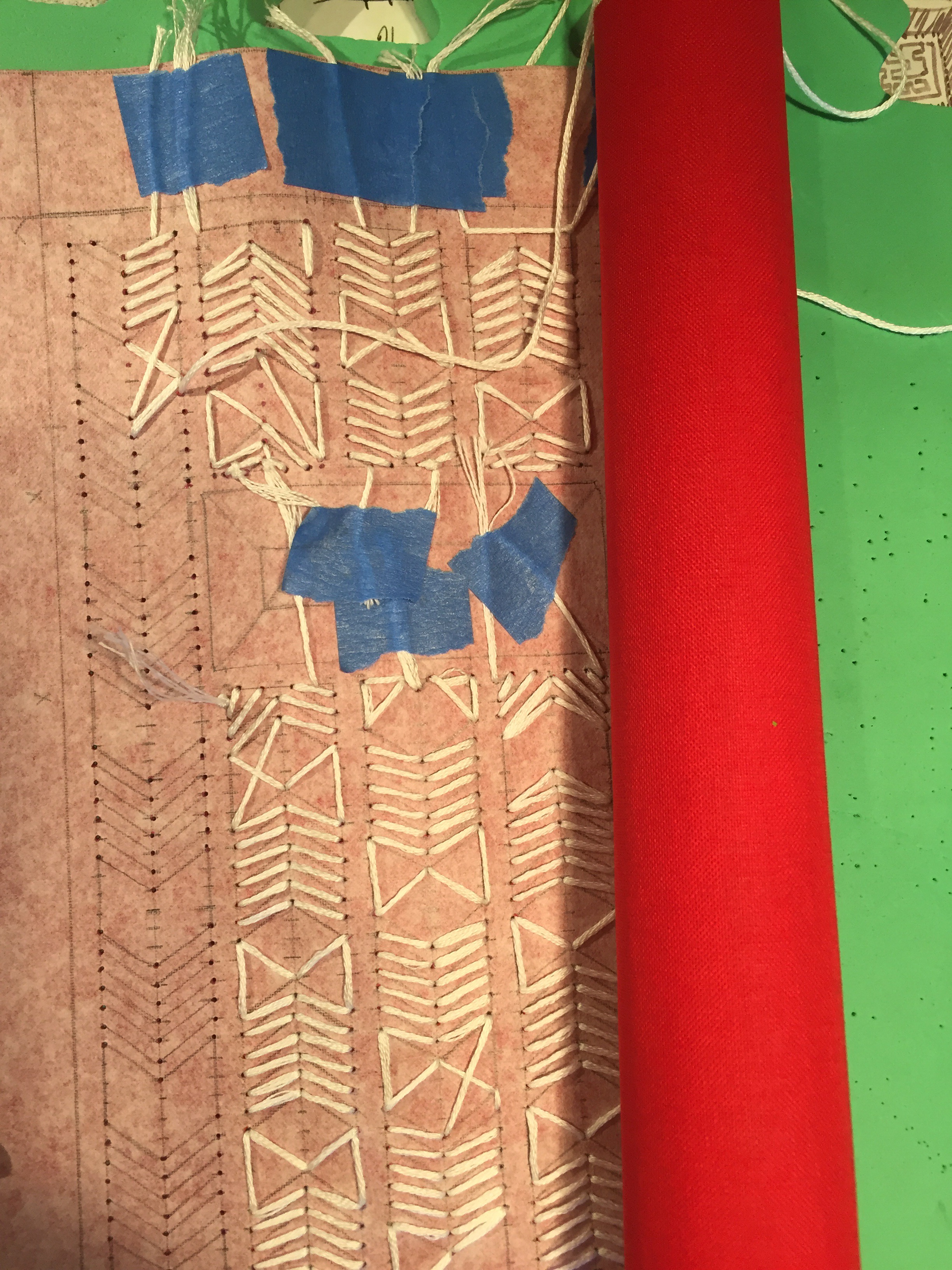
The cover before being clued to the boards. Notice the flaps of the window that will be folded and glued into the board.
***
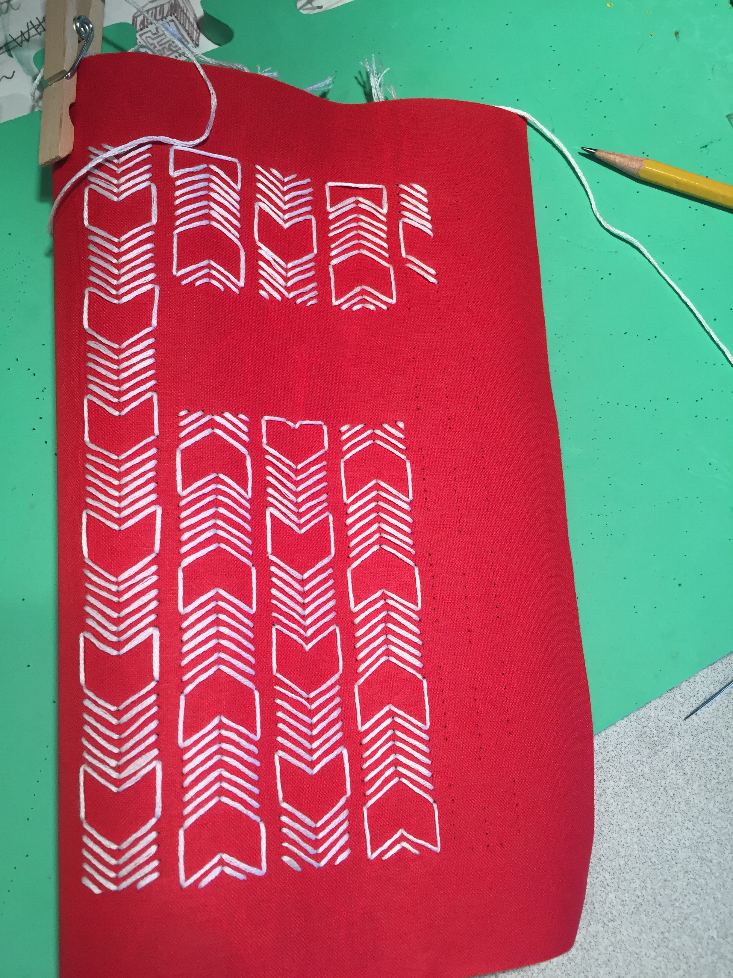
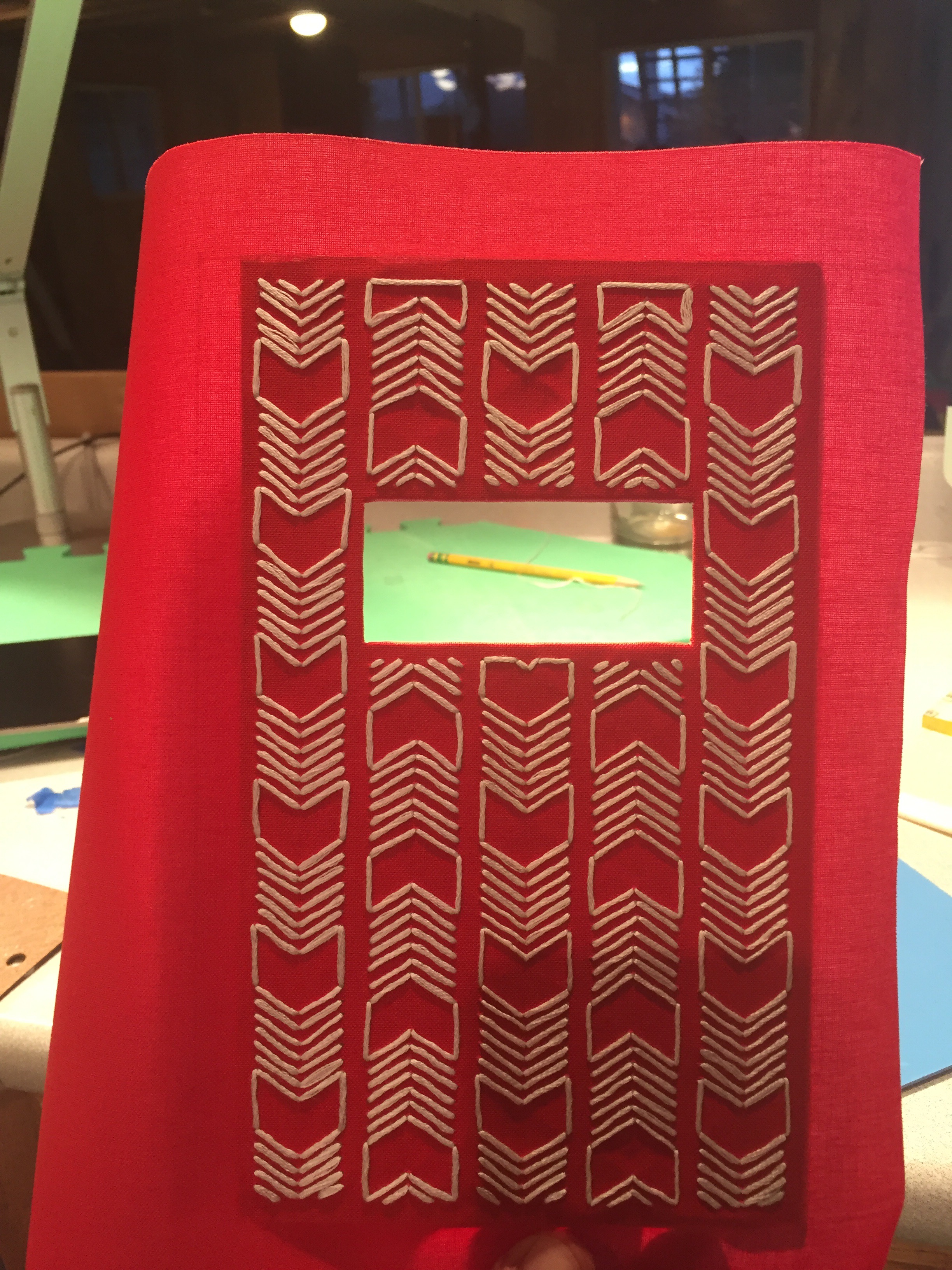
Embroidering the cover.
***
The back of the cover during embroidering. Not very neat I know, I’ve never done this before though.
***
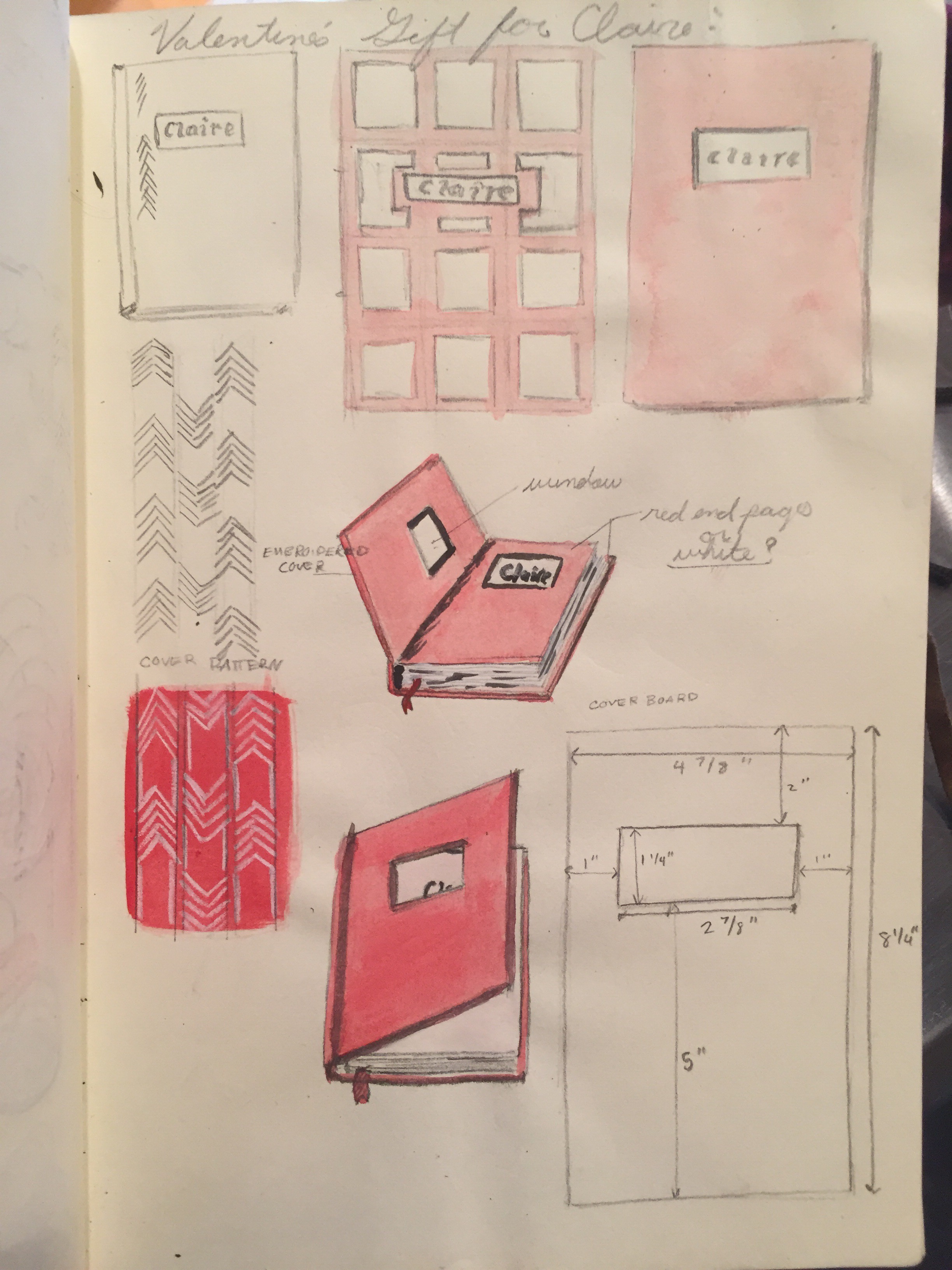
A page from my sketchbook, showing sketches, ideas, and plans for making the book.
***
I hope you enjoyed this post. Thanks for reading!
Newport Beach: Painting on Stone #2
After seeing my post about my Newport Beach Stone Painting, my good friend Anthony, asked me to create a similar rock for him, as a gift for his dad. (His dad lived in Newport Beach area) so here it is:
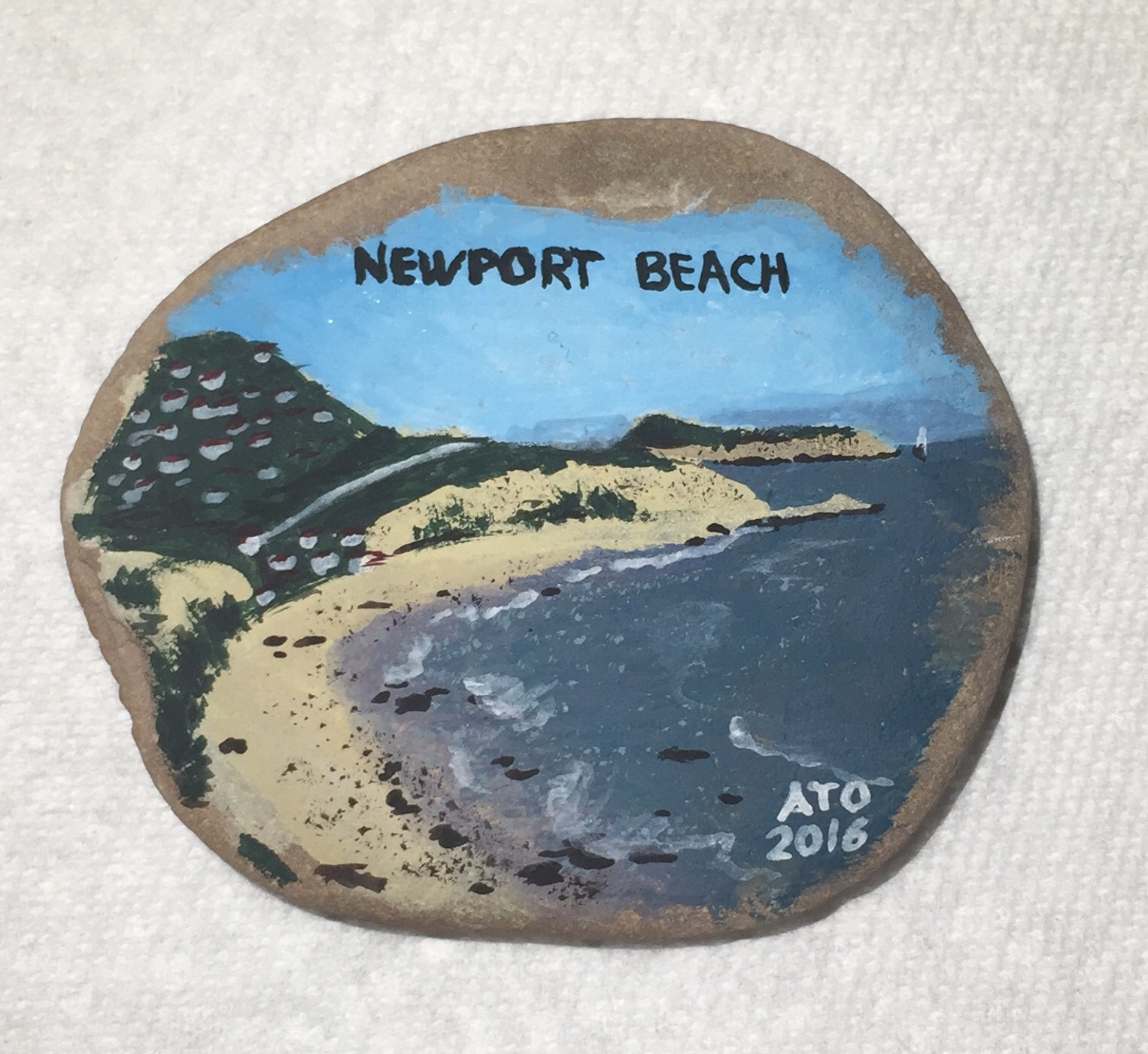 The stone is another of the ones I brought back from my trip. So it is again a painting of the beach on a stone from the beach, however this time I didn’t/couldn’t use water from the ocean.
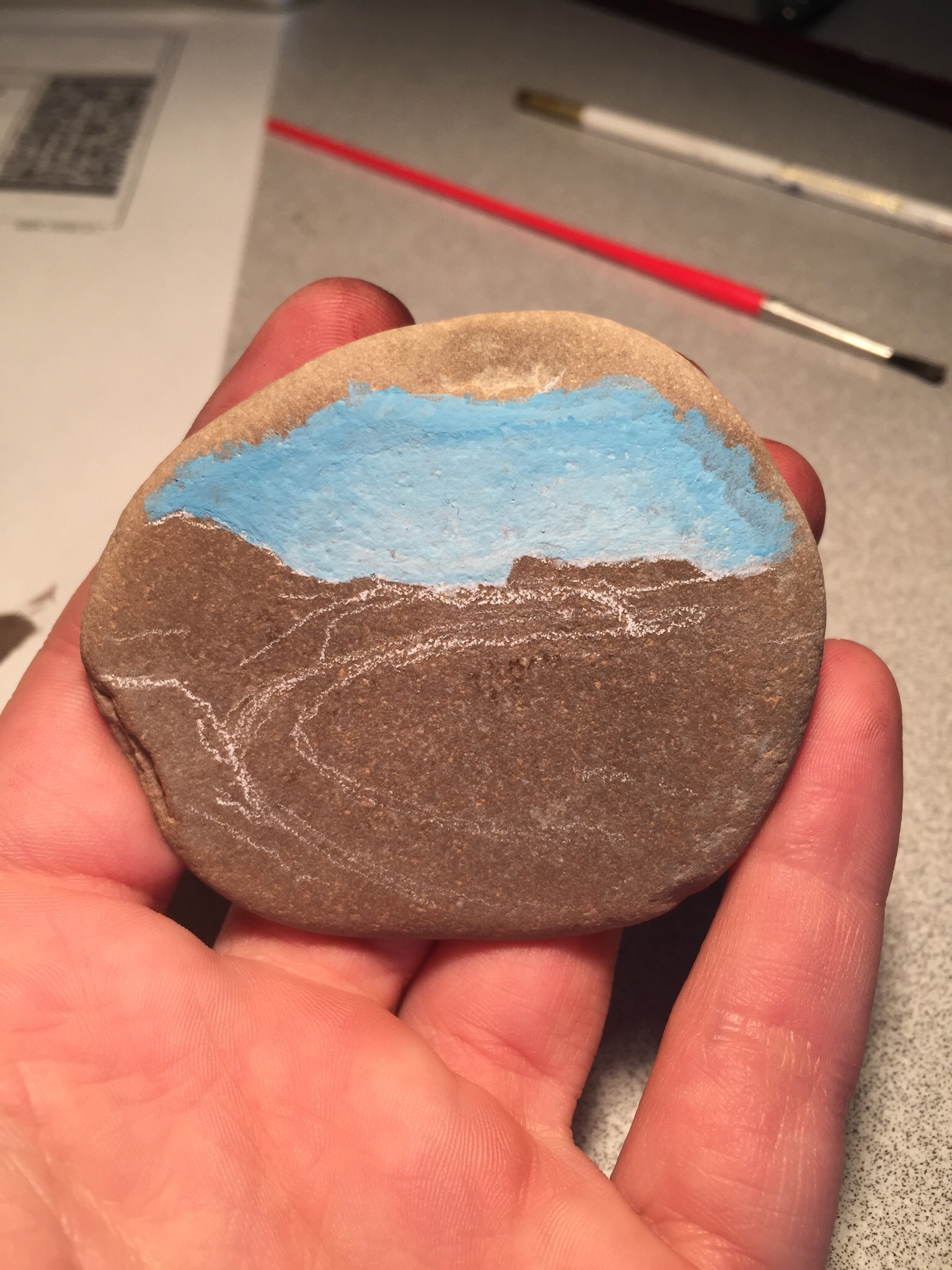 In progress.
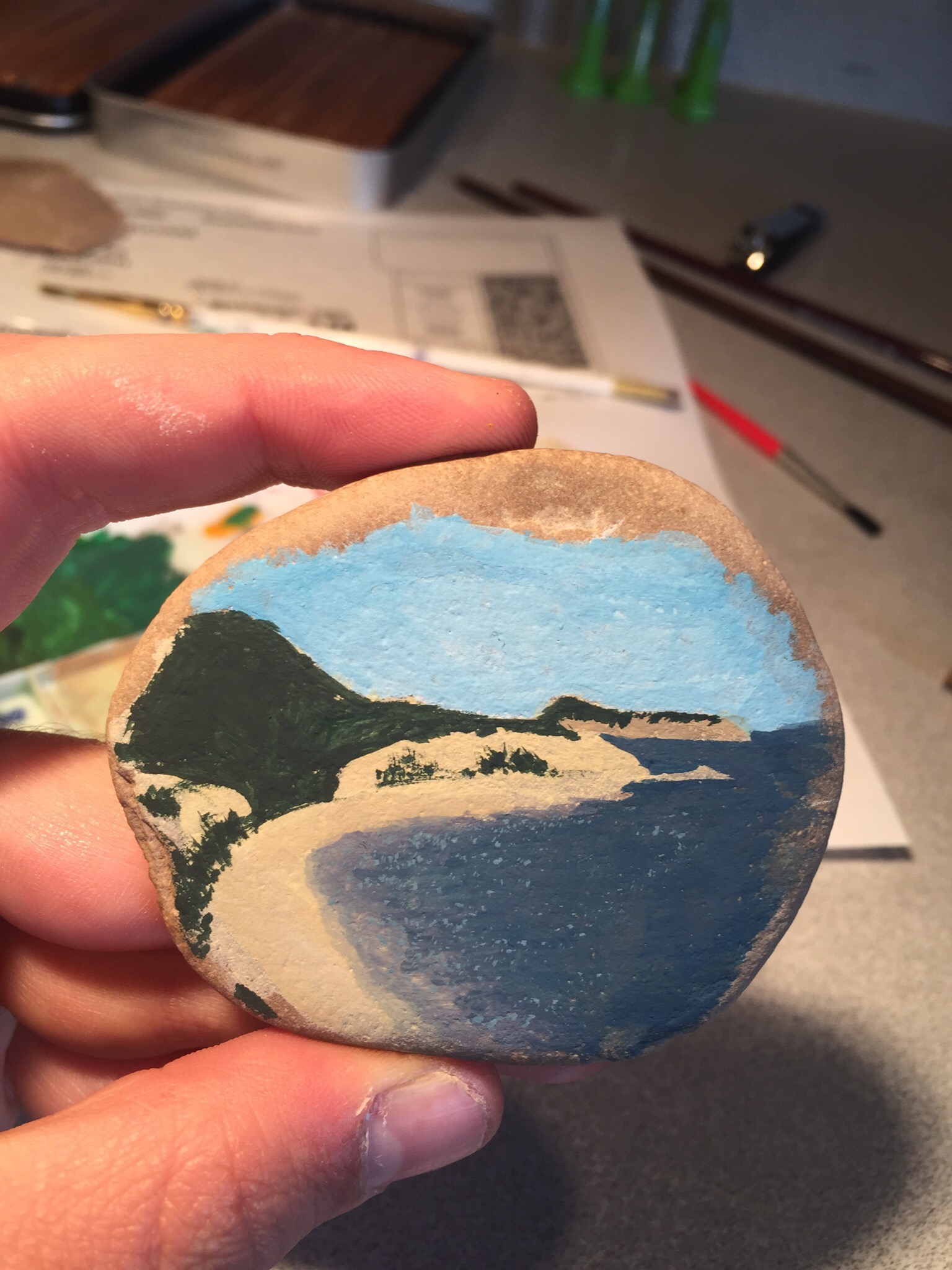 Nearly finished.
