drawings
Showcase at RAW ARTIST: Impact
Exciting development for me!: I was scouted to be a featured artist at IMPACT: the first showcase held by RAW Artists in Salt Lake City. They are an international organization which organizes local art shows in Australia, The US, Canada and Mexico. I’m very excited. The show is at the Depot on Tuesday April 30 from 19:00-23:00. There will be other local artists, musicians, dancers, fashion designers and filmmakers showcasing their work as well. It’s an honor to be sought out to be part of Salt Lake’s local art scene. Here are just a few of the pieces I’ll be showing and selling prints of at the show.
About these Pieces:
***
This piece I made specifically as a test to sell something on my recently opened Etsy online store. I sold it and mailed it to my parents. Thanks for the support guys! – The image is form a photograph I took while on vacation in Riga, Latvia. I quite liked the cat shaped weathervane on top of the wood shingled, conical roof. The reflectiveness came through well using the chalk pencil.
-
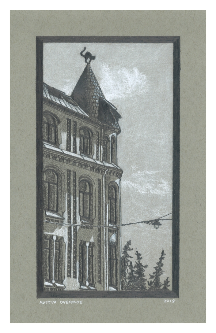
Riga, 2018, Chalk and Graphite on toned Paper
***
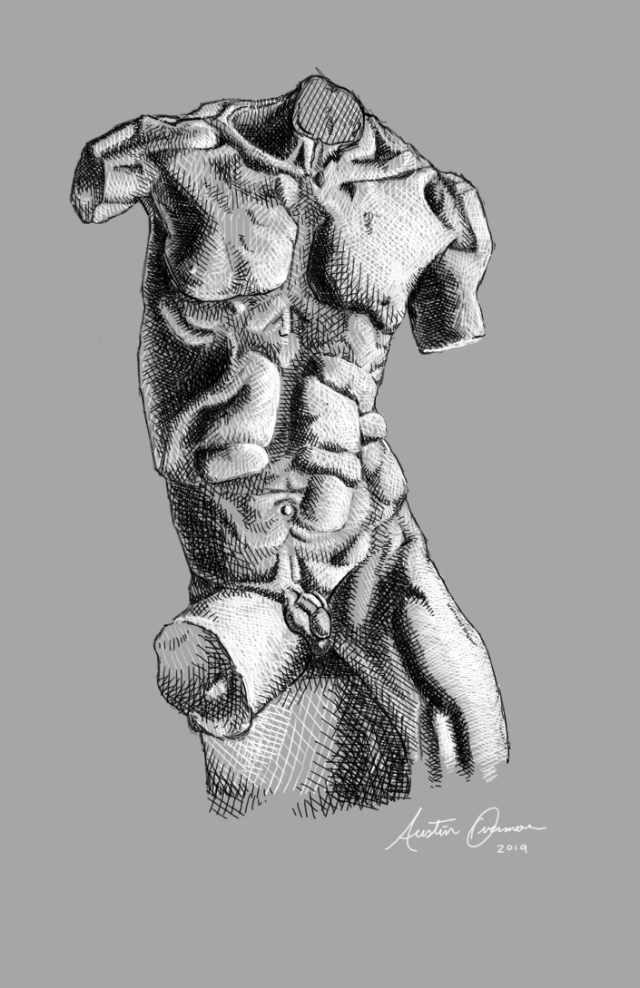
This torso study is based on a sculpture by Marusia Nita, an Italian Sculptor in Florence. Find their work on instagram at @marusianita. This is one of my very first digital works, and certainly the one I’m most proud of so far. I’ve been teaching my self to use Krita, a digital art software and drawing on my surface pro, which I highly recommend for doing this type of work.
***
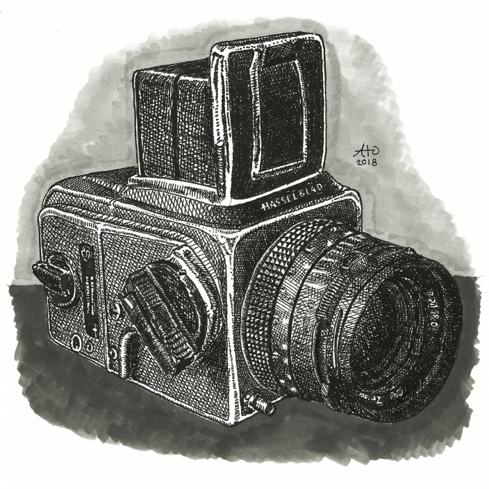
My dear friend and ex teacher, Paul Ramsey asked me to draw some of his cameras; well, as he put it, he had “a number of cameras who would love to pose for me”. This is the first, I plan to draw more of his cameras when I get the time.
- ***
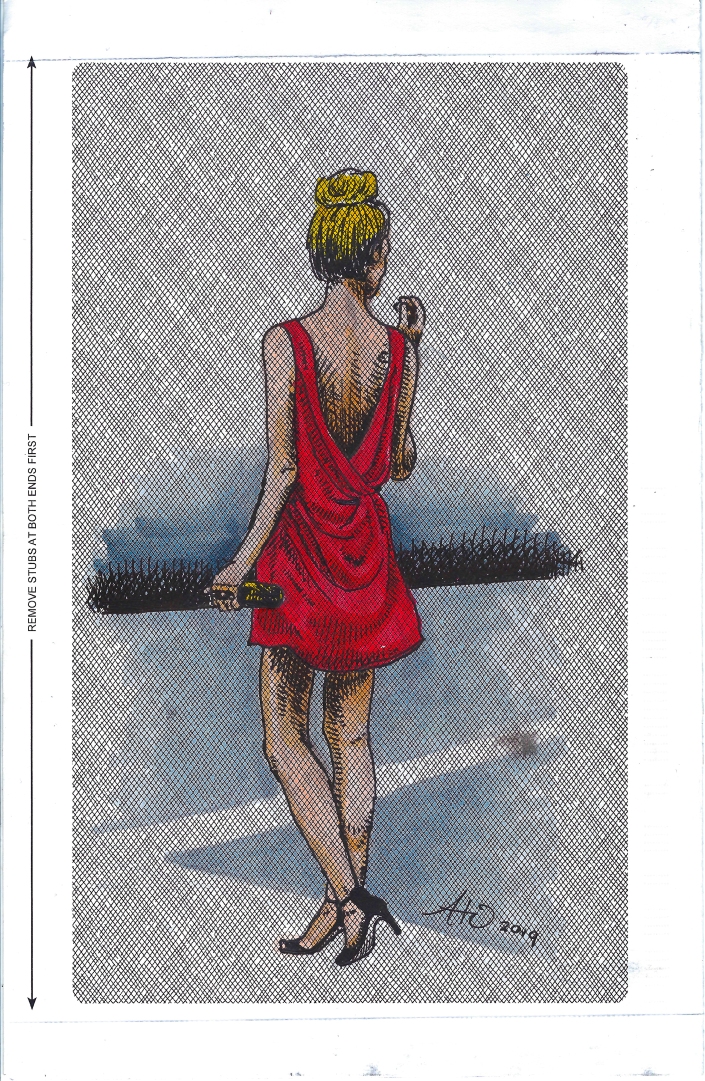
Perhaps one of my favorite drawings in recent months, I found a piece of a security envelope in my apartment building’s recycle bin (I am consistently stealing and hoarding ‘trash’ for art purposes) and the printed pattern on it begged me to draw on it. Hopefully the first in a series of many pieces created with up cycled and found materials.
***
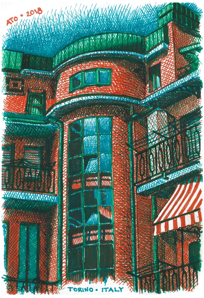
I drew this ink drawing of my hotel I stayed at, in Torino, Italy, (Otherwise known as Turin) while I was waiting for my flight home at the airport. I think this piece was so successful because I used a limited color palette, and the colors all work very well together. The deep tones are made by layering the orange, blue, and green ink. This has the effect of making the shadows read as genuine darker tones of the same colors. If i were to have used brown, purple, or black ink for the shadows, the effect would not be the same. Even though shadows appear as those colors to our naked eye, there are still complex tones that we don’t pick up on. A shadow may be brown, but any brown pen is not likely to be the exact mix of colors, or the exact brown, that you see when a lighter colored surface is in shadow.
P.S. for those of you who don’t know, the series of three asterisks (***) is called an asterism. It’s a typographical symbol used to divide sections or segments of text. I’ve always found it to be an attractive typographic ornament.
***
Thanks for reading!
The Norway Drawings
While I was in Norway this summer with my family, we were constantly on the move. I didn’t have time to sit and draw as much as I would have liked to, which makes these few drawing that I did, all the more valuable I think.
In the order I drew them, and the order they appear in my sketchbook:
 Bergen, 7•30•15
 Bergen, 8•2•15
 Lillehammer, 8•6•15
 Oslo Opera House, Oslo, 8•8•15
