From the Studio
Showcase at RAW ARTIST: Impact
Exciting development for me!: I was scouted to be a featured artist at IMPACT: the first showcase held by RAW Artists in Salt Lake City. They are an international organization which organizes local art shows in Australia, The US, Canada and Mexico. I’m very excited. The show is at the Depot on Tuesday April 30 from 19:00-23:00. There will be other local artists, musicians, dancers, fashion designers and filmmakers showcasing their work as well. It’s an honor to be sought out to be part of Salt Lake’s local art scene. Here are just a few of the pieces I’ll be showing and selling prints of at the show.
About these Pieces:
***
This piece I made specifically as a test to sell something on my recently opened Etsy online store. I sold it and mailed it to my parents. Thanks for the support guys! – The image is form a photograph I took while on vacation in Riga, Latvia. I quite liked the cat shaped weathervane on top of the wood shingled, conical roof. The reflectiveness came through well using the chalk pencil.
-
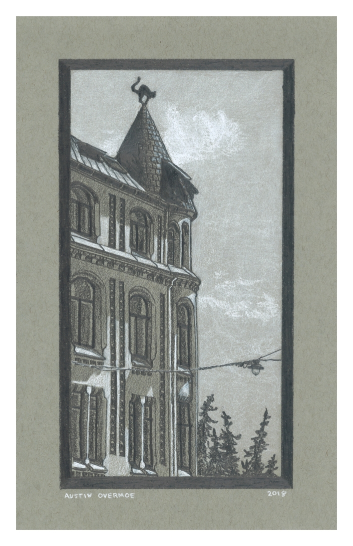
Riga, 2018, Chalk and Graphite on toned Paper
***
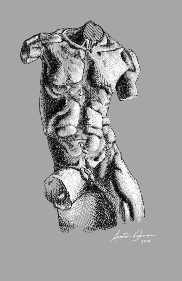
This torso study is based on a sculpture by Marusia Nita, an Italian Sculptor in Florence. Find their work on instagram at @marusianita. This is one of my very first digital works, and certainly the one I’m most proud of so far. I’ve been teaching my self to use Krita, a digital art software and drawing on my surface pro, which I highly recommend for doing this type of work.
***
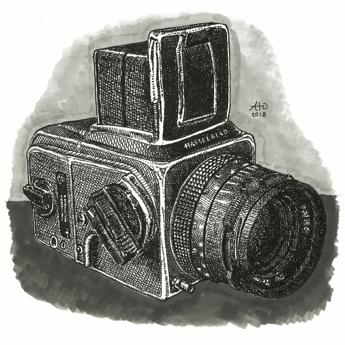
My dear friend and ex teacher, Paul Ramsey asked me to draw some of his cameras; well, as he put it, he had “a number of cameras who would love to pose for me”. This is the first, I plan to draw more of his cameras when I get the time.
- ***
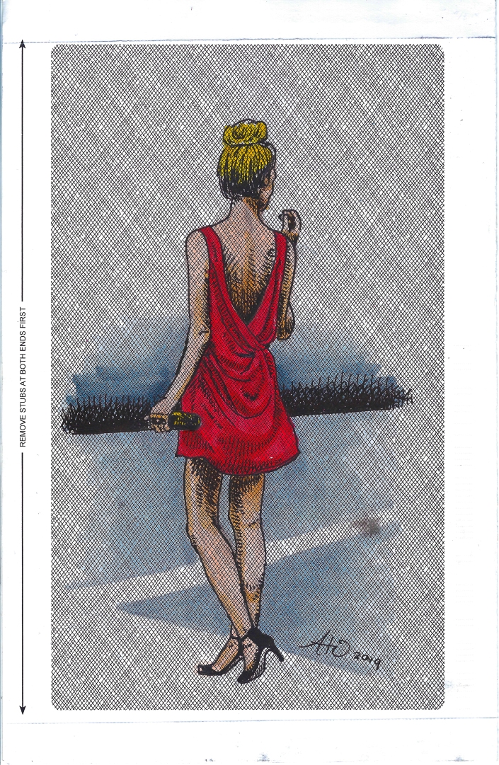
Perhaps one of my favorite drawings in recent months, I found a piece of a security envelope in my apartment building’s recycle bin (I am consistently stealing and hoarding ‘trash’ for art purposes) and the printed pattern on it begged me to draw on it. Hopefully the first in a series of many pieces created with up cycled and found materials.
***
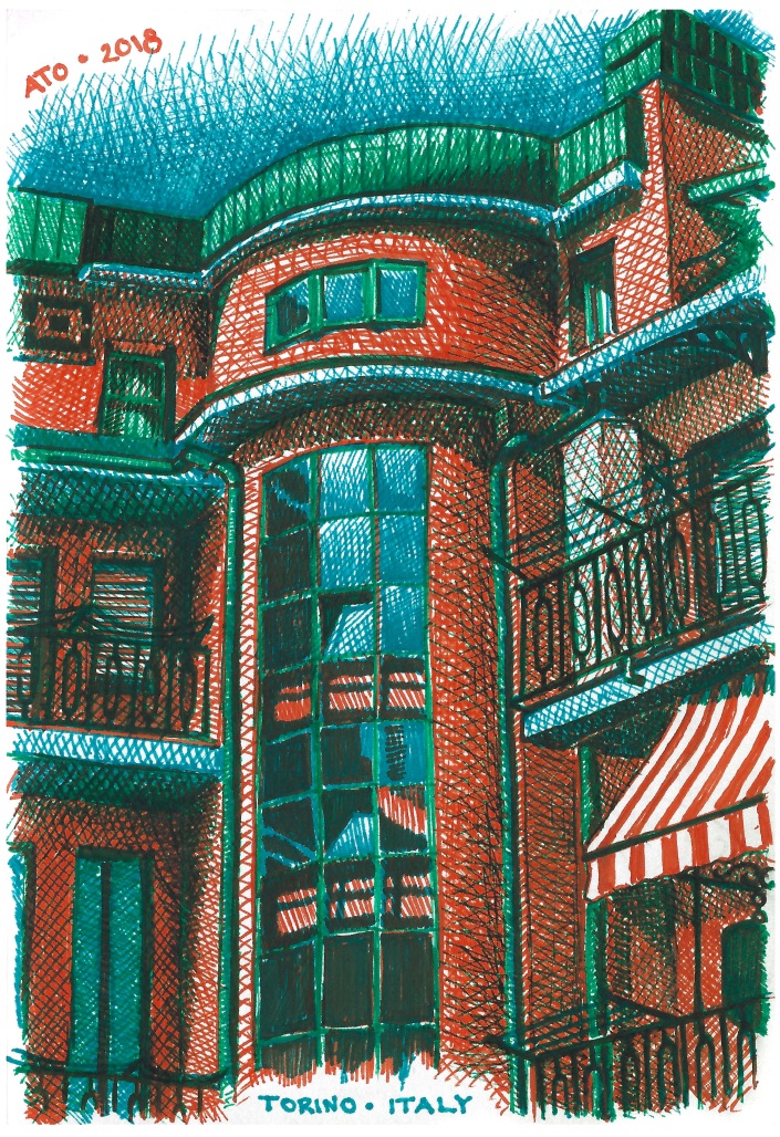
I drew this ink drawing of my hotel I stayed at, in Torino, Italy, (Otherwise known as Turin) while I was waiting for my flight home at the airport. I think this piece was so successful because I used a limited color palette, and the colors all work very well together. The deep tones are made by layering the orange, blue, and green ink. This has the effect of making the shadows read as genuine darker tones of the same colors. If i were to have used brown, purple, or black ink for the shadows, the effect would not be the same. Even though shadows appear as those colors to our naked eye, there are still complex tones that we don’t pick up on. A shadow may be brown, but any brown pen is not likely to be the exact mix of colors, or the exact brown, that you see when a lighter colored surface is in shadow.
P.S. for those of you who don’t know, the series of three asterisks (***) is called an asterism. It’s a typographical symbol used to divide sections or segments of text. I’ve always found it to be an attractive typographic ornament.
***
Thanks for reading!
Claire’s Book

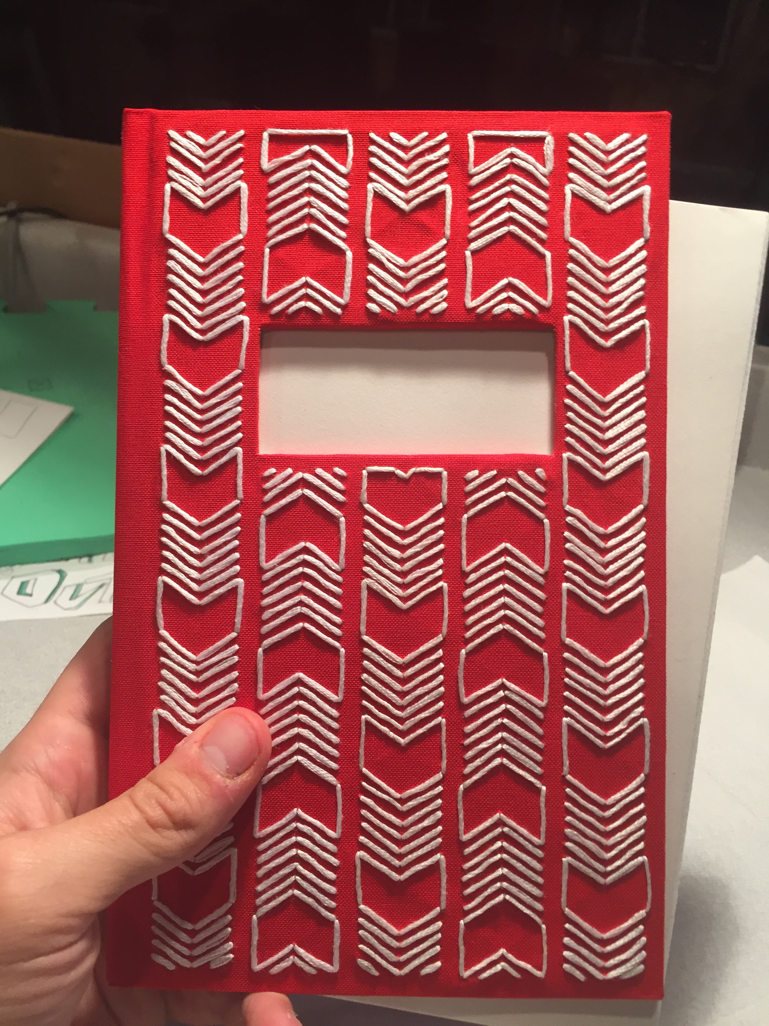
This is, in my opinion, the best and most complex book I’ve ever bound. It was a gift for my girlfriend Claire.
***
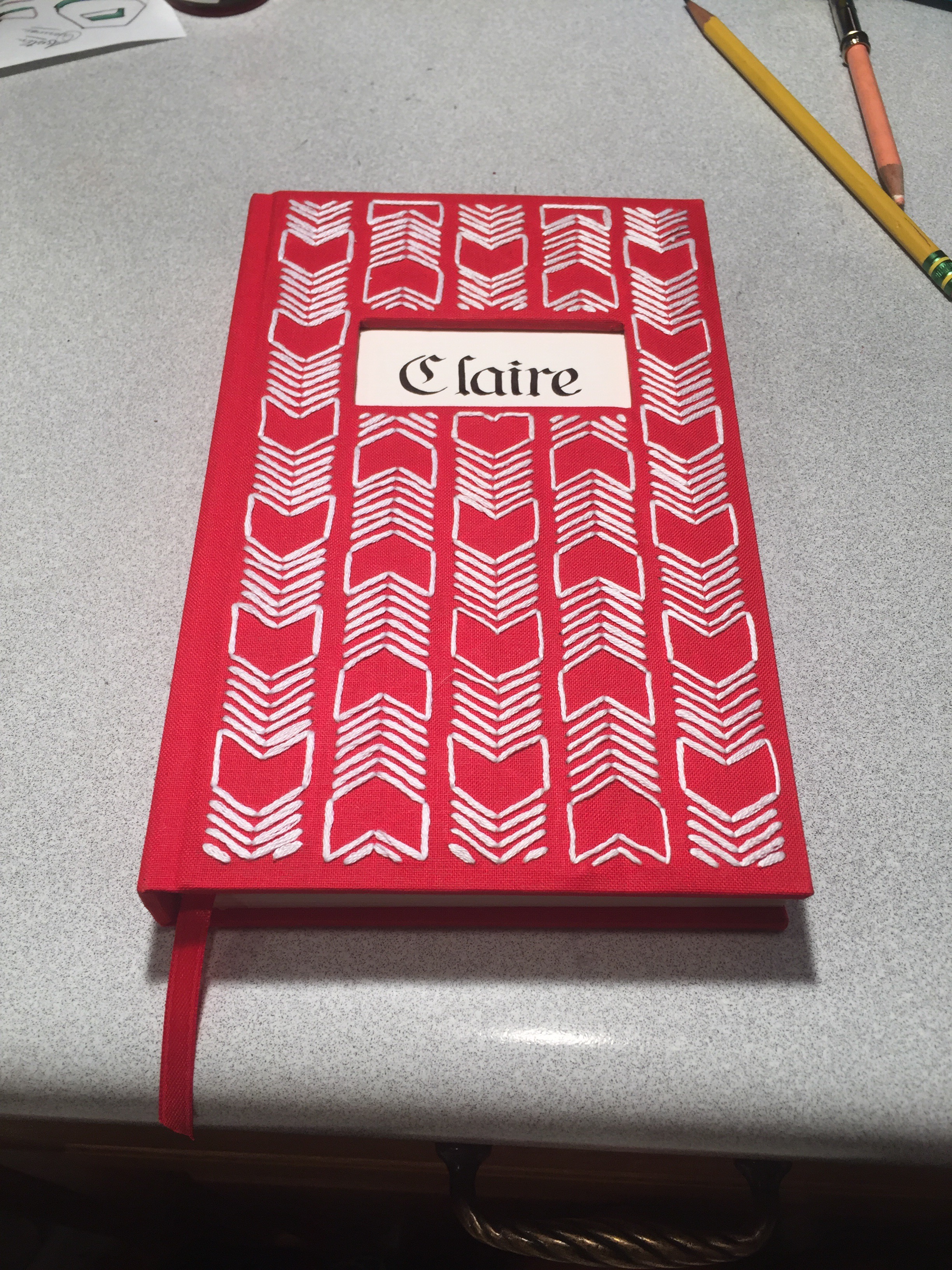
Here is it finished. It’s different from my other books in that I added some new features I’ve never done before. It’s got the window through the front cover with the calligraphy showing through from the end page, and I embroidered the book cloth to make the pattern you see on the front cover.
***
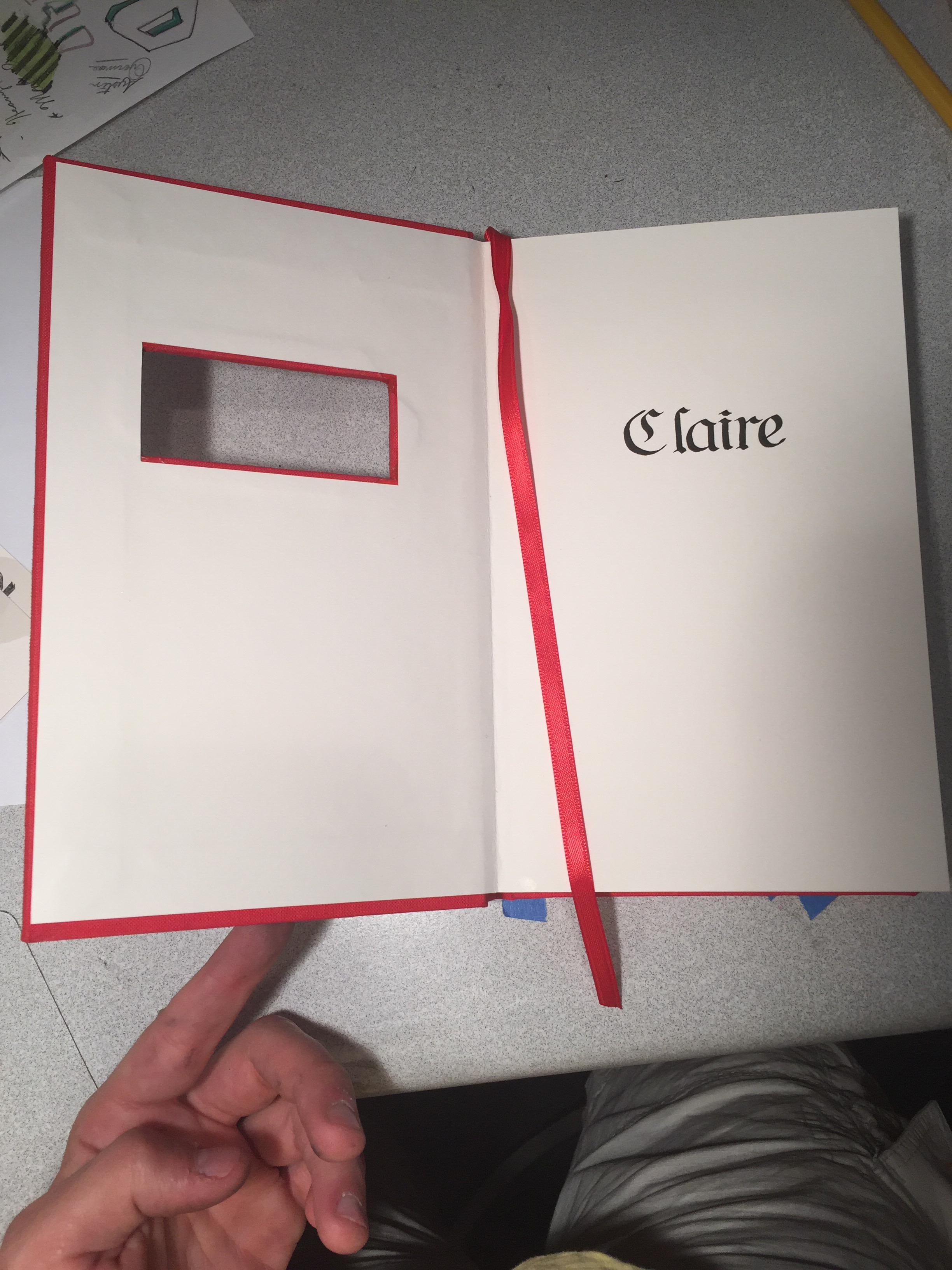
The Window and caligraphy. Writing the caligraphy was nerve wracking because, not only did it have to be perfectly centered and well formed letters, but I only got one chance to get it right.
***
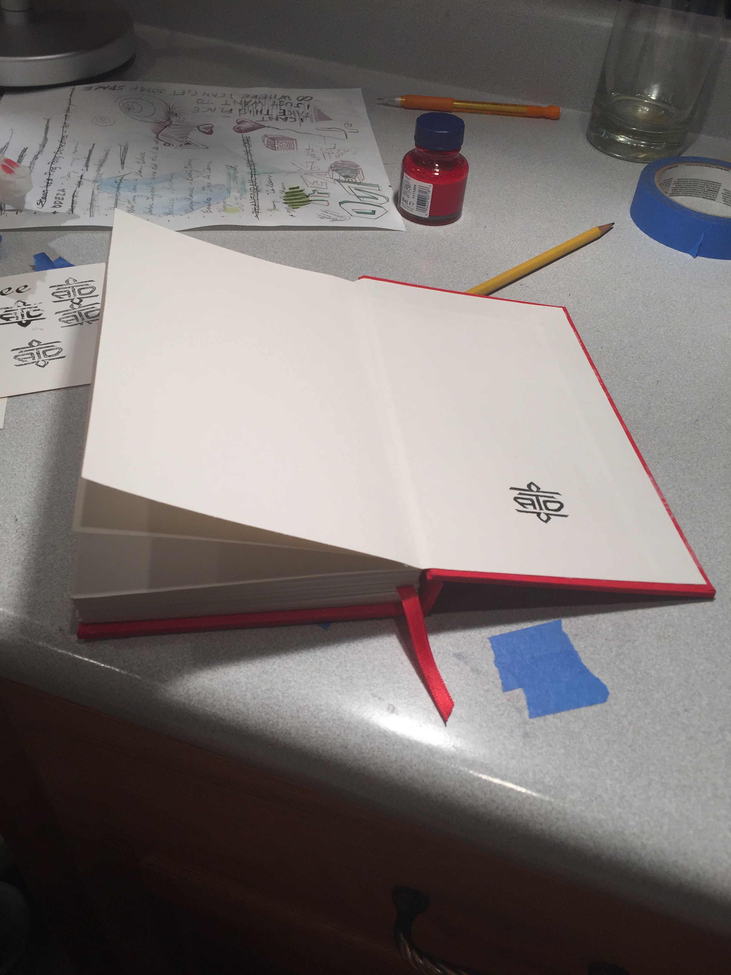
Just like all my books, it bares my bookbinding ensignia. My way of signing all the books I create
***
Here is the finished cover with the finished text block sticking out of it, about to be glued together: One of the final steps.
***
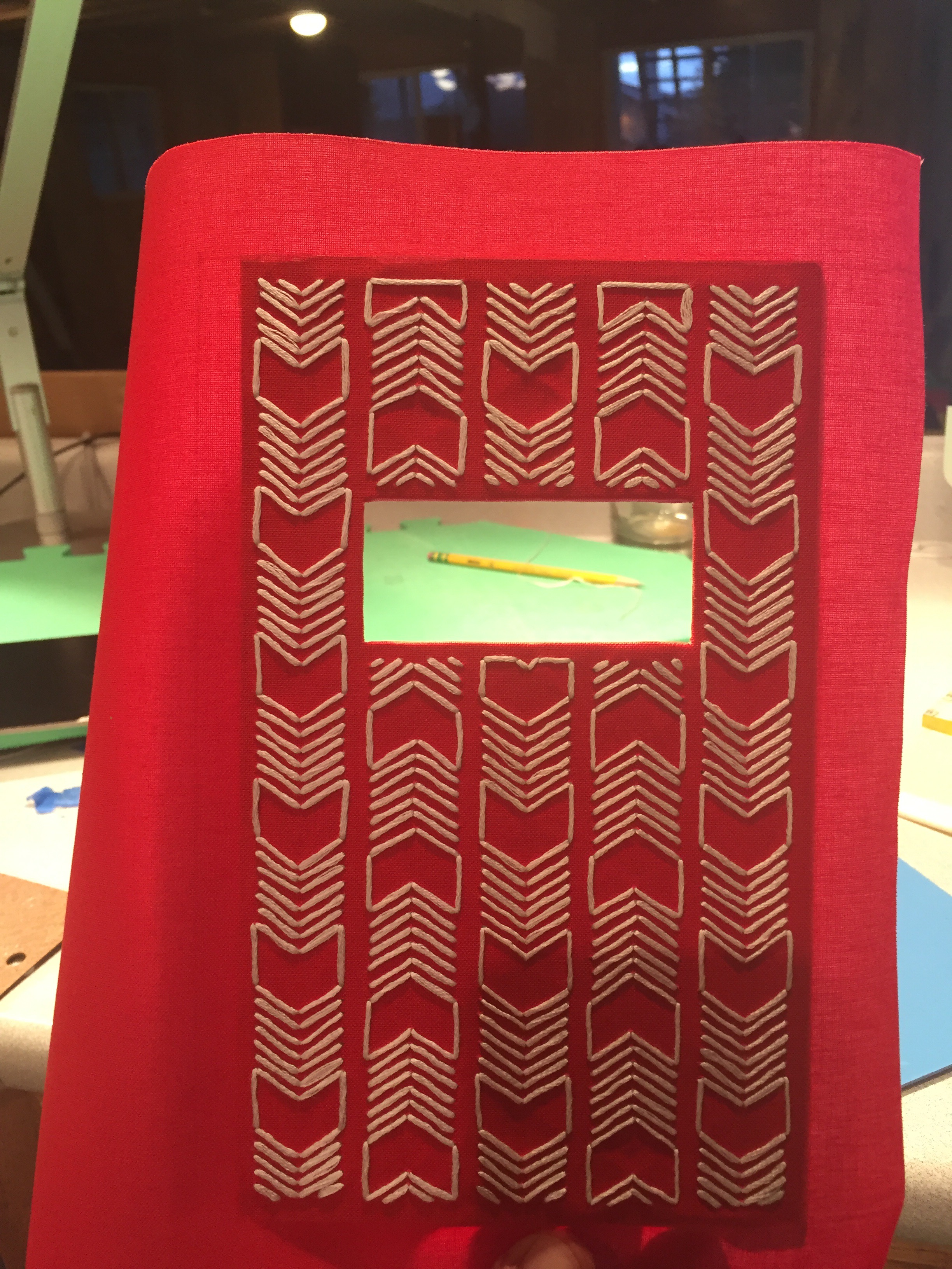
After I finished the pattern, here is the book cloth glued to the front cover board.
***
The cover before being clued to the boards. Notice the flaps of the window that will be folded and glued into the board.
***
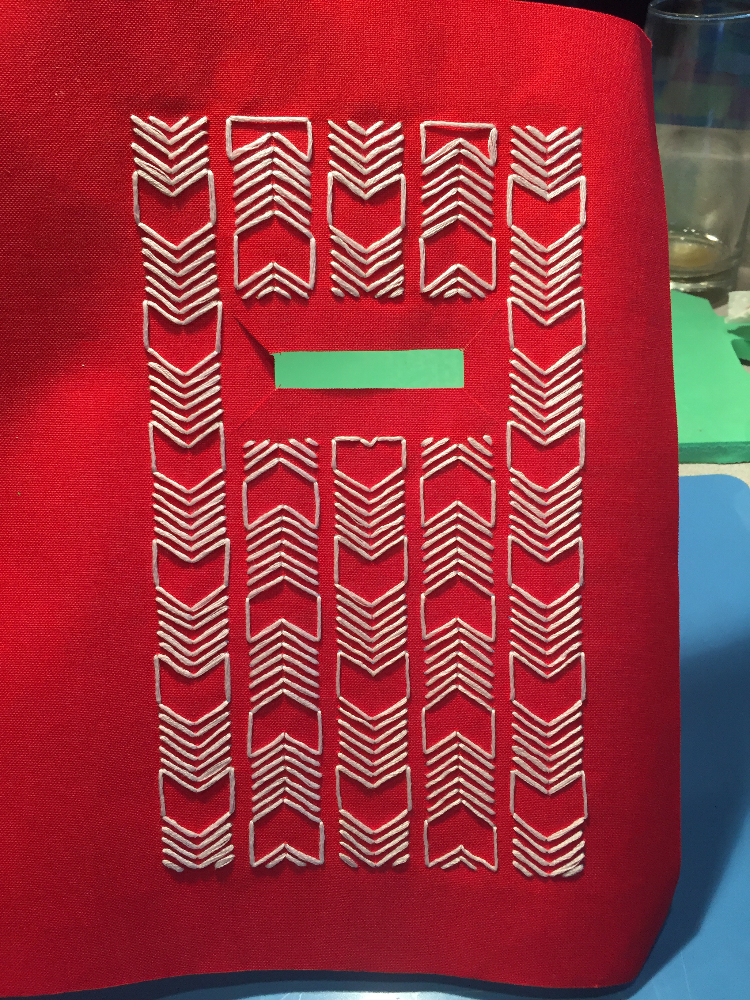
Embroidering the cover.
***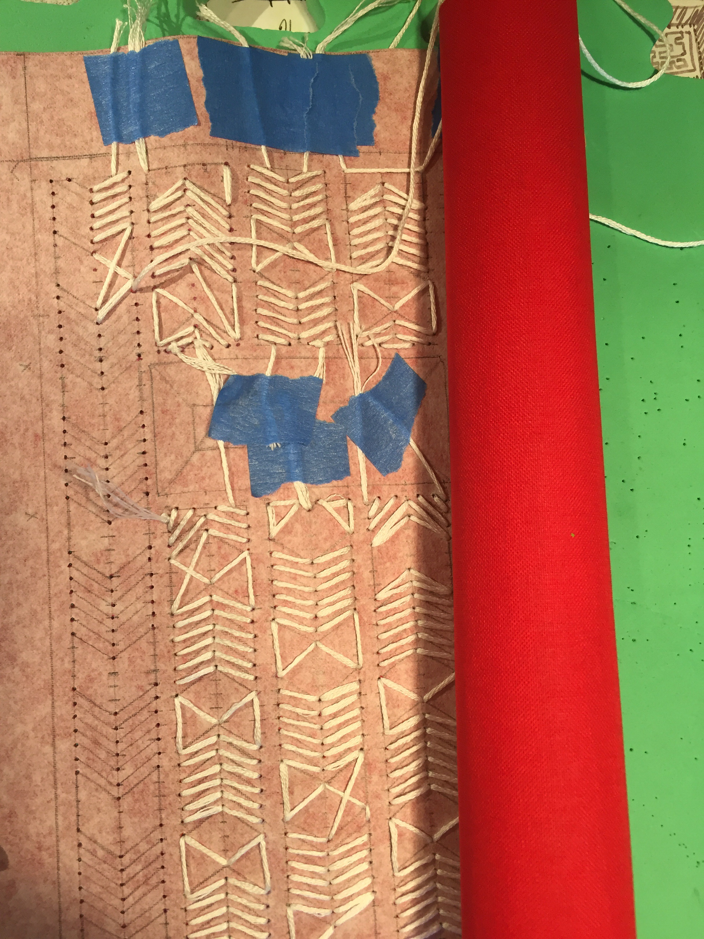
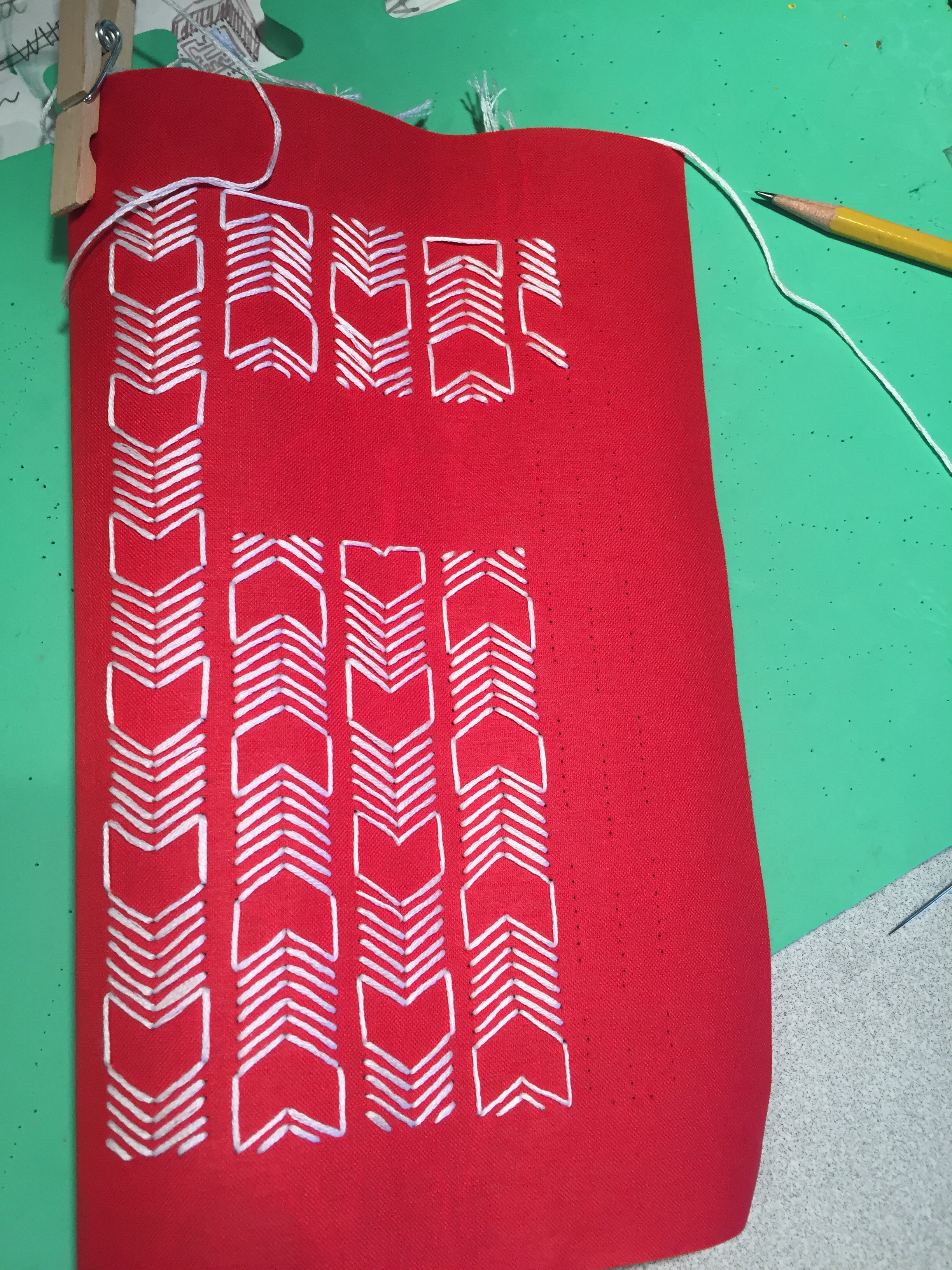
The back of the cover during embroidering. Not very neat I know, I’ve never done this before though.
***
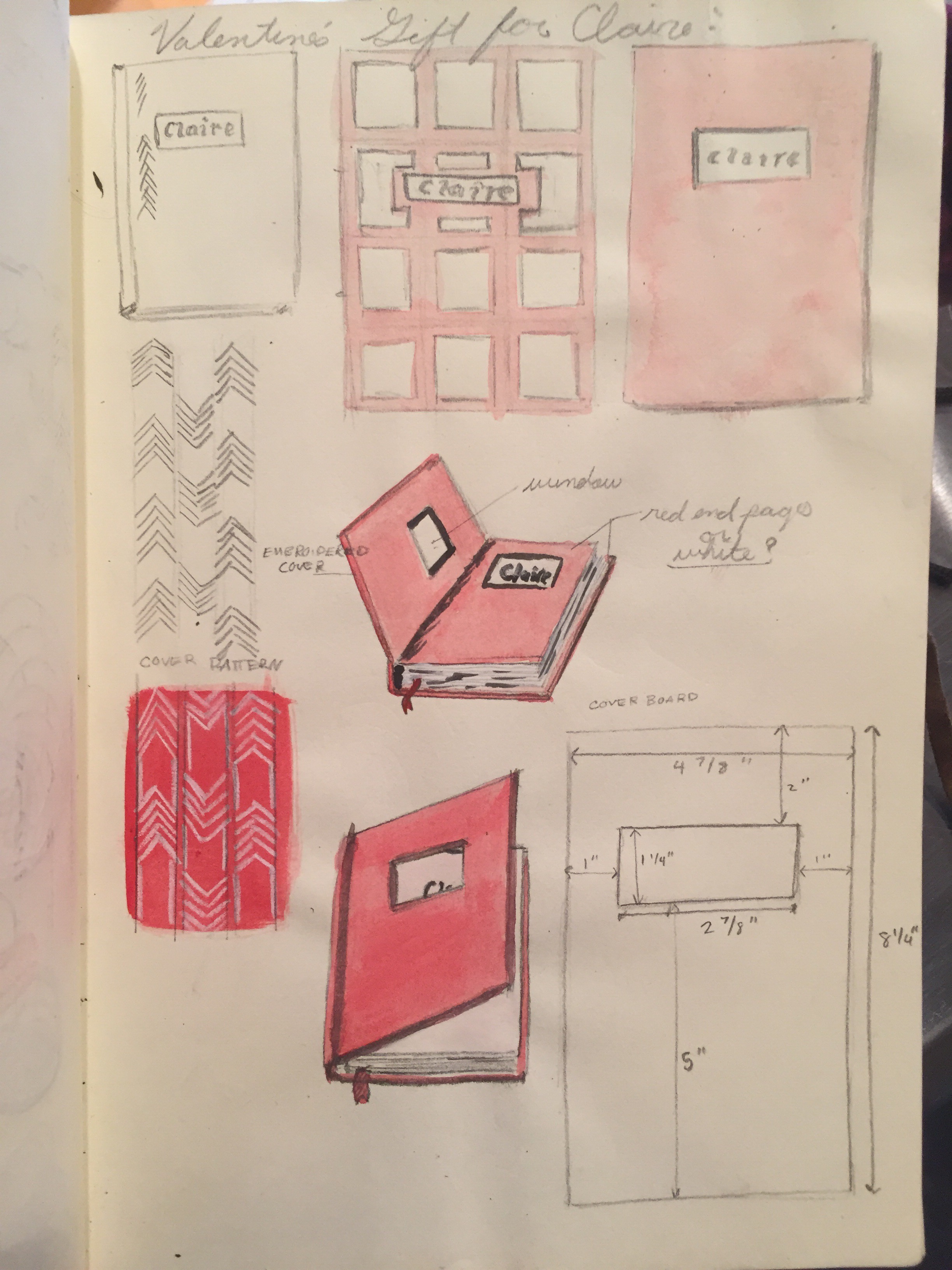
A page from my sketchbook, showing sketches, ideas, and plans for making the book.
***
I hope you enjoyed this post. Thanks for reading!
Newport Beach: Painting on Stone #2
After seeing my post about my Newport Beach Stone Painting, my good friend Anthony, asked me to create a similar rock for him, as a gift for his dad. (His dad lived in Newport Beach area) so here it is:
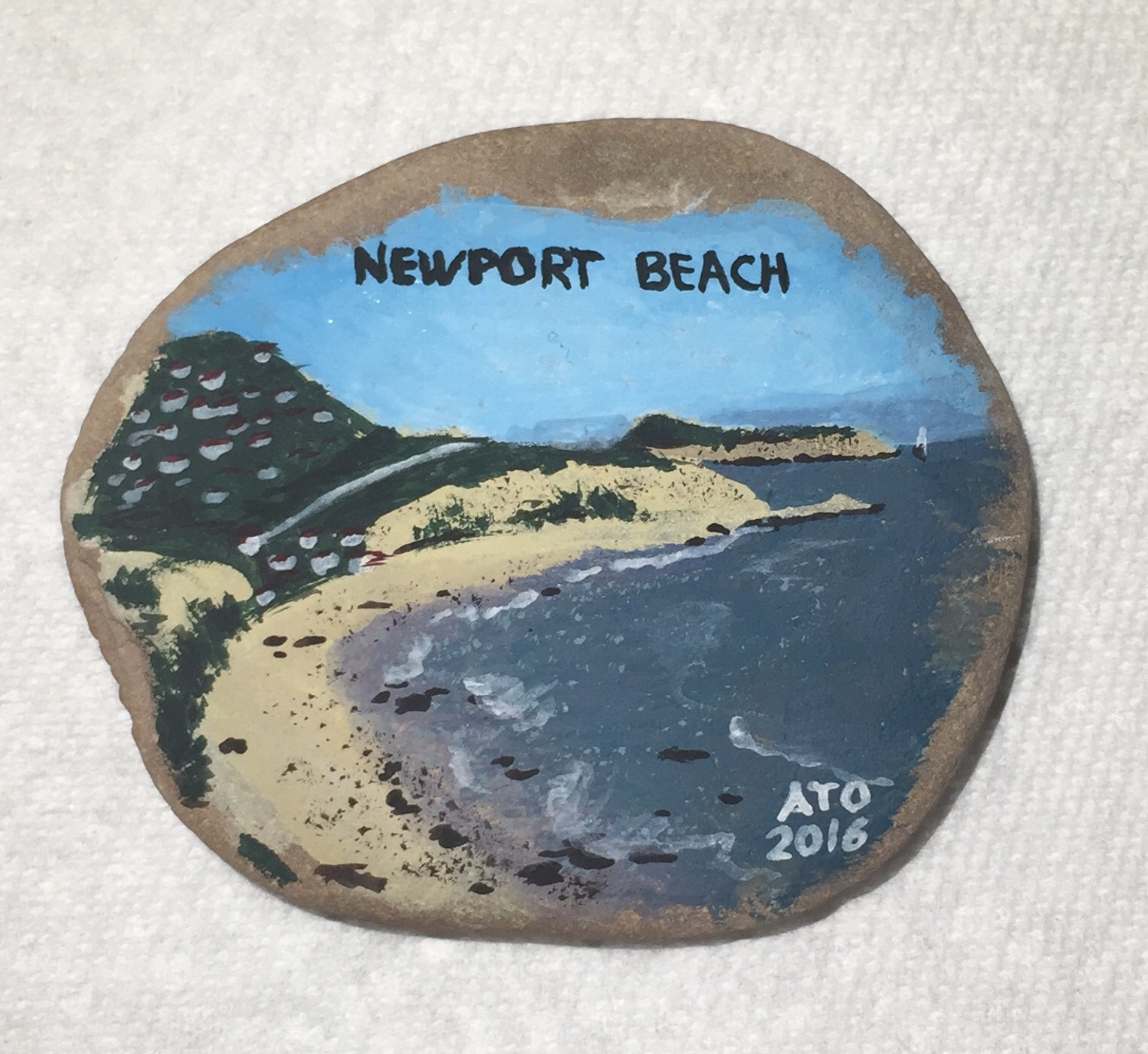 The stone is another of the ones I brought back from my trip. So it is again a painting of the beach on a stone from the beach, however this time I didn’t/couldn’t use water from the ocean.
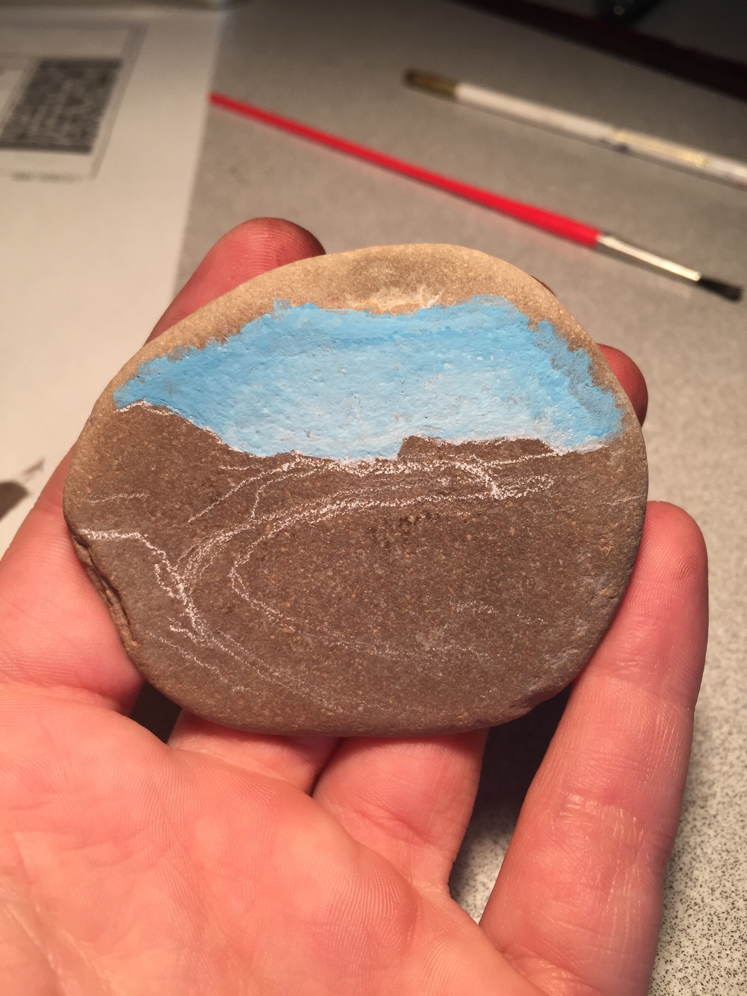 In progress.
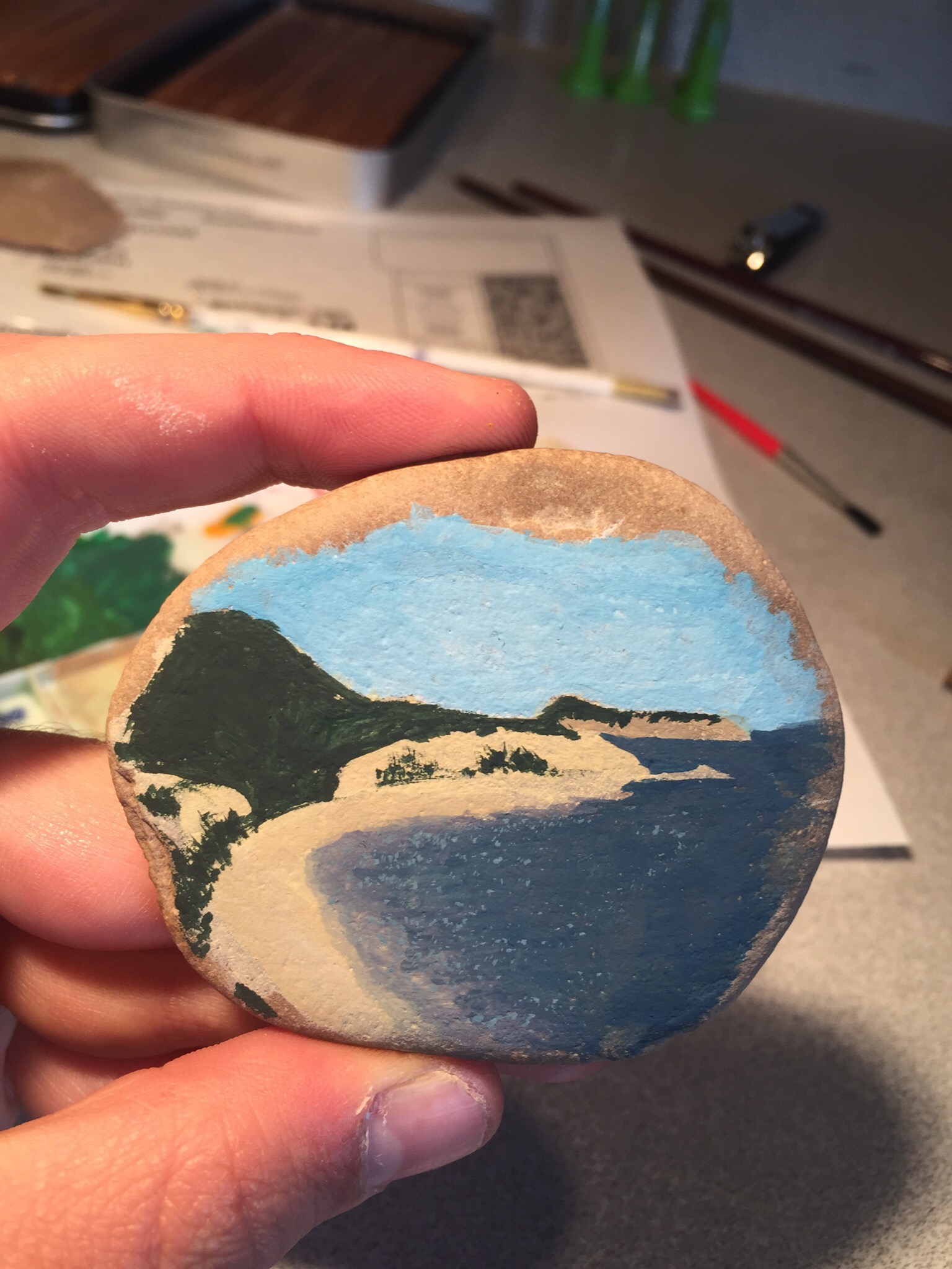 Nearly finished.
Bookbinding Insignia
It occurred to me when I finished the sketchbook for my cousin Camille, that I needed a way to sign or identify myself as the bookmaker.
Just signing the book like a drawing or painting felt off, and I figured a new medium deserves a new signature:

In my sketchbook I deigned this logo. The first pencil drawing included some flourishes, but in the end I settled on the cleaner, straight line version.

After I had the design I miniaturized it and carved this stamp from linoleum and made a base and handle. Here are the first tests of the stamp.

It isn’t perfect but here is the first ever use of it in action. I used it to “sign” the back endpage of the book near the bottom.
Soon I’m going to give the book to Camille, I think she’ll like it.
Enjoy Choke
Here’s a t-shirt I’ve been meaning to make for ages. “ENJOY CHOKE”. My concept drawing for this shirt is on one of the very fist pages in my sketchbook that I’ve had going for over a year now. (Above: t-shirt still stretched on the spraying board)
After I stretch the fabric over this board, it essentially is the same process as doing stencils on paper. You just have to be very careful with registration

(Above: me trying on the new shirt)

(Above: concept in my sketchbook)
This design is just intended to make people think twice and look twice when they see it. I think it’s rather clever and I also don’t like coke so it’s perfect.
Camille’s sketchbook
While on a family trip to Norway this summer, I saw my cousin Camille writing/drawing in a cool notebook, she said she got in Mexico. I told her I do bookbinding and offered to make her one when we got back…well we’ve been back for a few weeks and here it is.
The paper I used for the cover is handmade that I bought in a boutique while we were In Norway, so in addition to just looking cool it’s a good momento of our awesome trip. Below are some pictures of the book while in different stages of making it.
 (Above: the text block and wrapped cover before joining them)
 (Above: text block with endpages and bookmark)
 (Above: spine of the sewed text block)
New Block-print T-Shirt
 A design on a t-shirt I did recently. I don’t’ know how I came up with the design or why there’s a toucan, but regardless I’m pretty happy with the end result. I made one on white and one on grey.
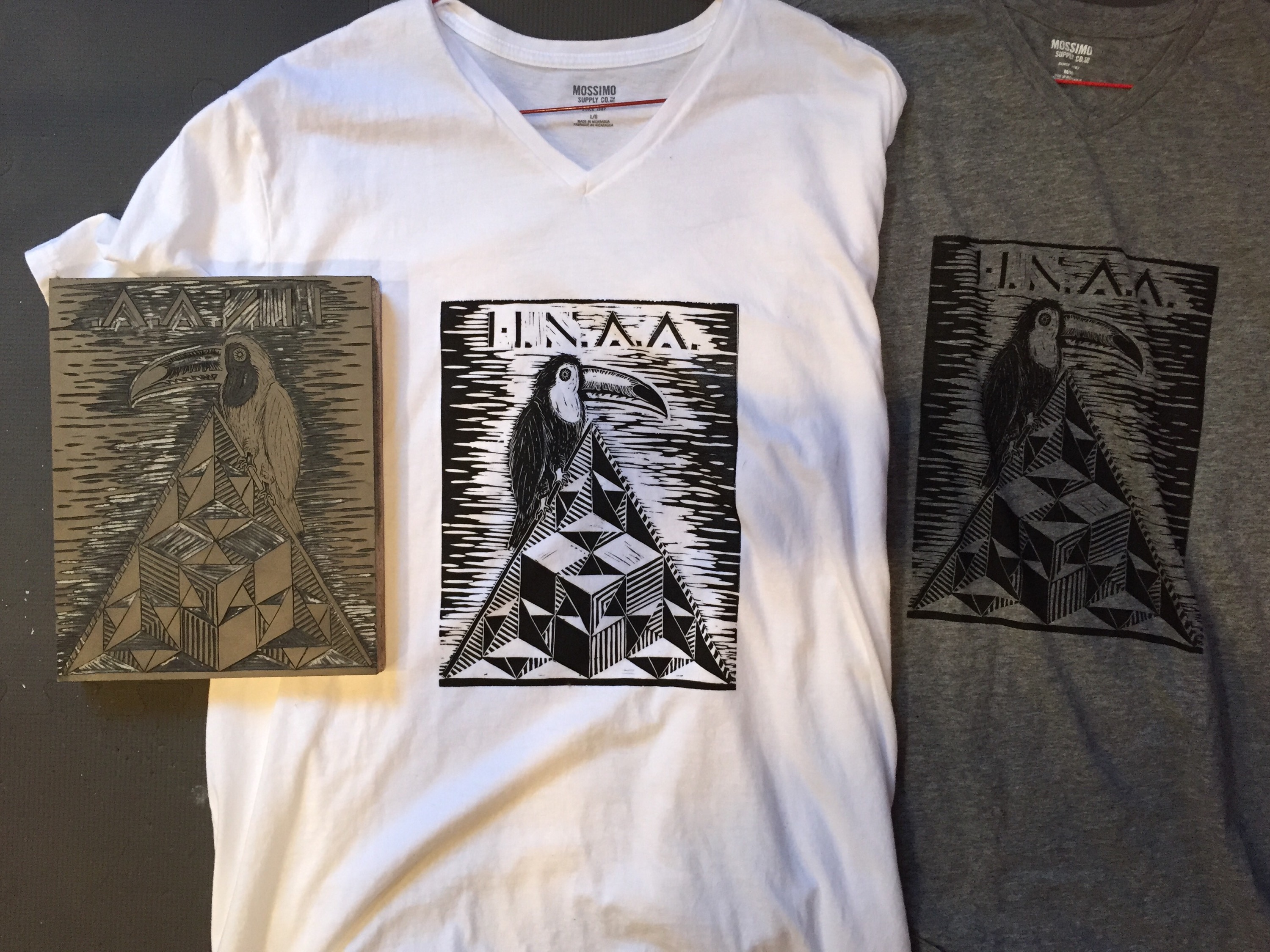
These are both the shirts (middle and right) and the linoleum block I cut and used to print them (left)
