2017
Julie, Colored Pencil Portrait, 2017
I’m excited I’ve finally finished this portrait that my Uncle Scooter commissioned me to do over a year ago.
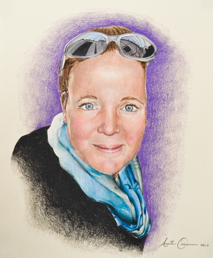
This portrait is of his wife, Cory’s, sister Julie, who unfortunately passed away. I believe it’s to be a gift for her mother. I was touched that he asked me to do it, as a way to commemorate her. A portrait is always a high pressure piece, because there is really not a ton of room to leave it up to your interpretation. When you draw someone, it either looks like that person or it doesn’t, for the most part. Whereas if you draw a landscape, for example, the scene changes, the weather changes and the specific place you draw it from is so specific that it would be hard for someone to find that exact spot to compare. So the little mistakes you make are more forgivable, because someone can’t be for sure that a building or landscape doesn’t look the way you drew it (Unless they are intimately familiar with how it looks, they way we are with faces). So, the fact that this portrait was to commemorate someone who has passed, made it even more high pressure. You’ve got to get it just right or else feel like you aren’t doing justice to their memory. This is the main reason why it took me over a year to finish. Immediately after he commissioned me I got to work right away and I particularly enjoyed drawing her scarf, but soon when I started on her face, I just felt that it wasn’t going well, that I was making it worse with every pencil stroke. I wouldn’t say I gave up or abandoned it, but I just kept putting it further and further back on my current projects list. He never gave me a deadline either, told me to work on it whenever I felt like, which enabled me to put it off for sometimes months at time. The first four in-process images below are from when I woke on it consistently at the beginning. The last three, which obviously show a huge jump in progress, are from the past two weeks. I took it home with me to Salt Lake in my portfolio, over winter break and decided it was high time I just finished it, even though I wasn’t happy with it. My goal was to not bring it back to Seattle with me. Mission accomplished. Scooter and Cory really liked it, Cory even cried a little bit.
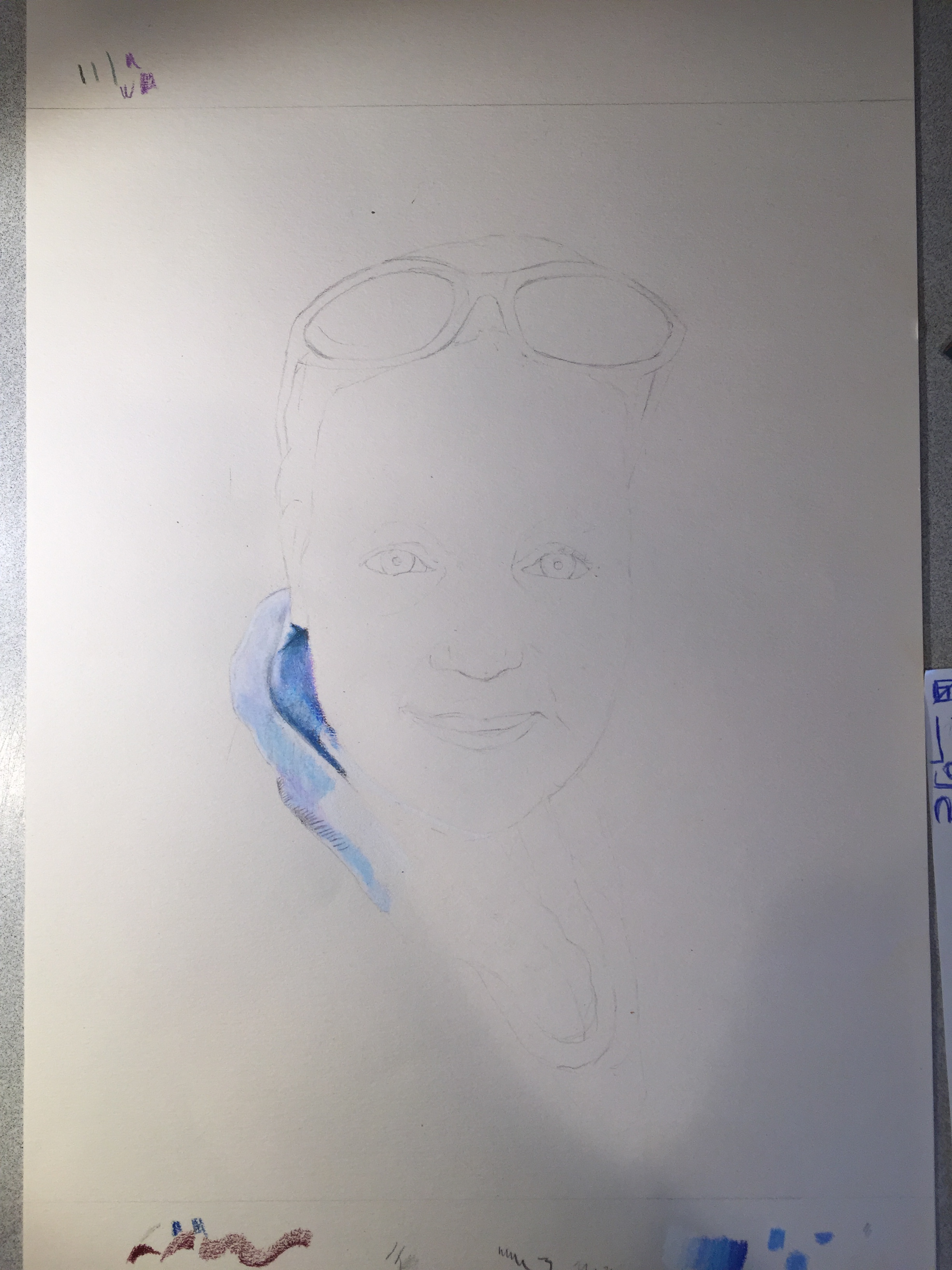
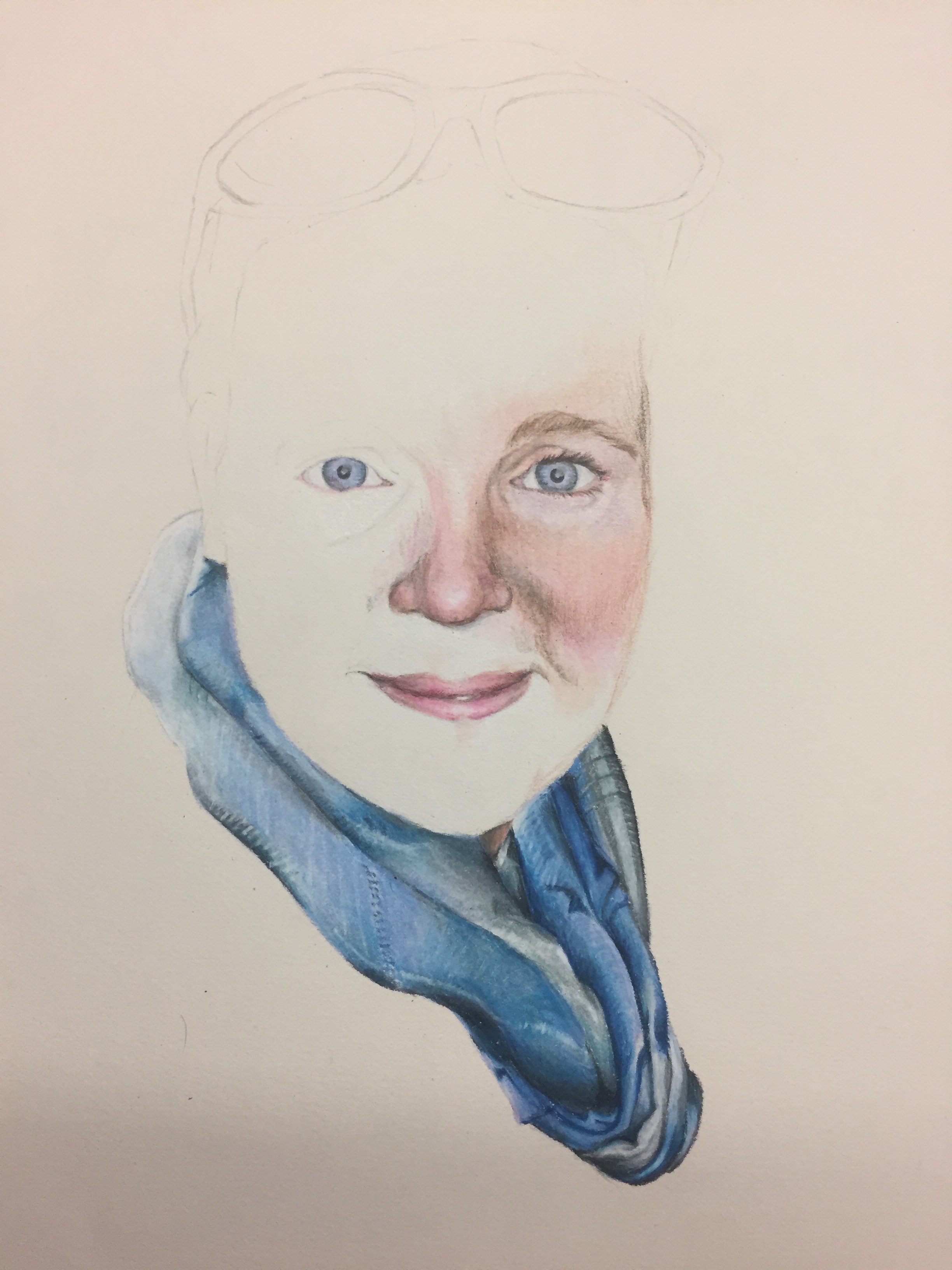
(1 of 7) – Just starting, late December 2015
(2 of 7) – I remember sending photos back and forth with my aunt at this stage of the piece. I remember commenting that it rather looked like I was drawing a large blue vagina. Maybe that’s the reason why I liked drawing the scarf so much.
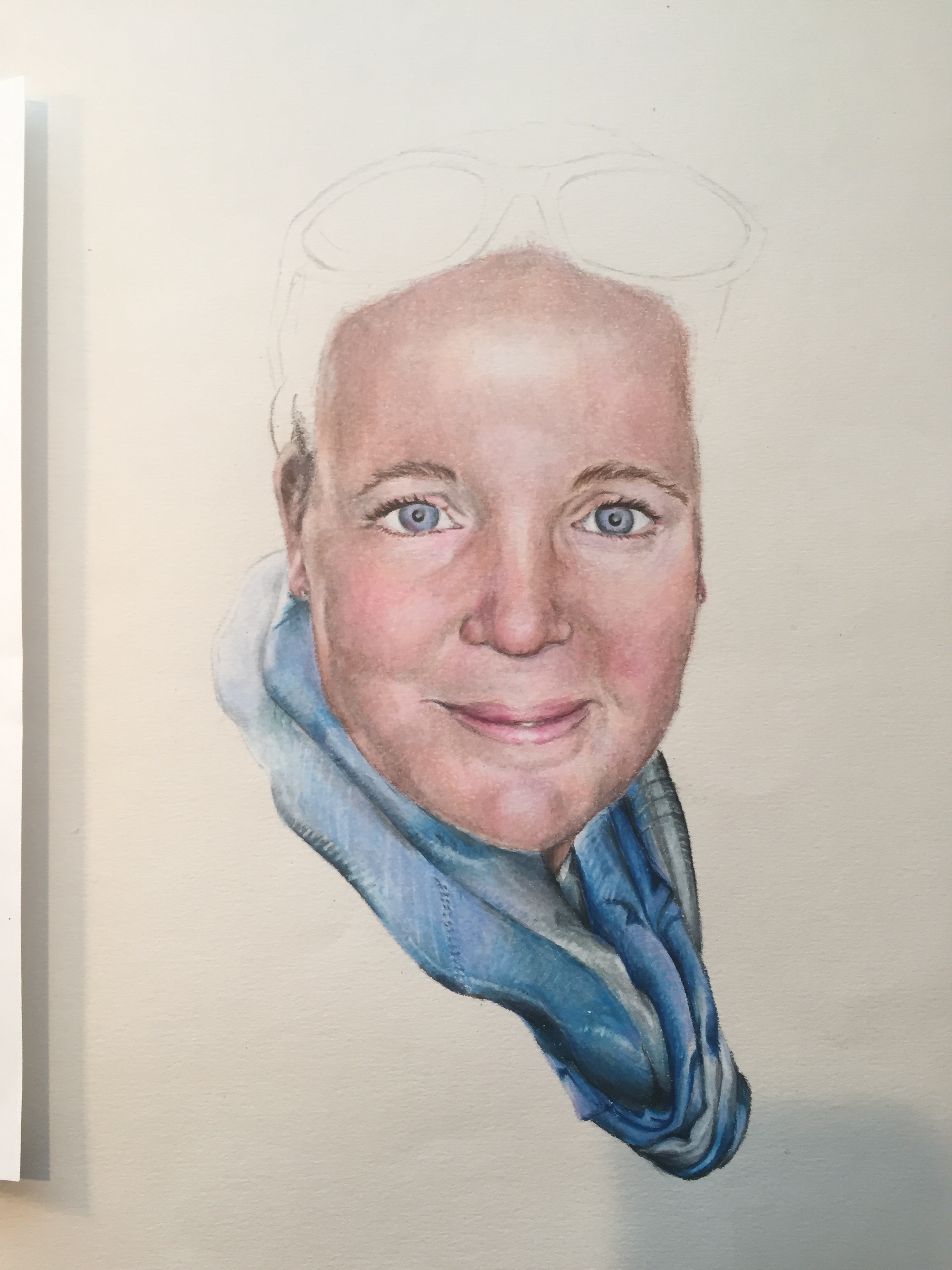
(3 of 7) – I usually start faces with the eyes. They always seem too far apart without all the stuff in-between, when actually they are the correct distance. It’s easy to accidentally draw them too small or too close together for this reason. Your mind over compensates for the lack of other facial features.
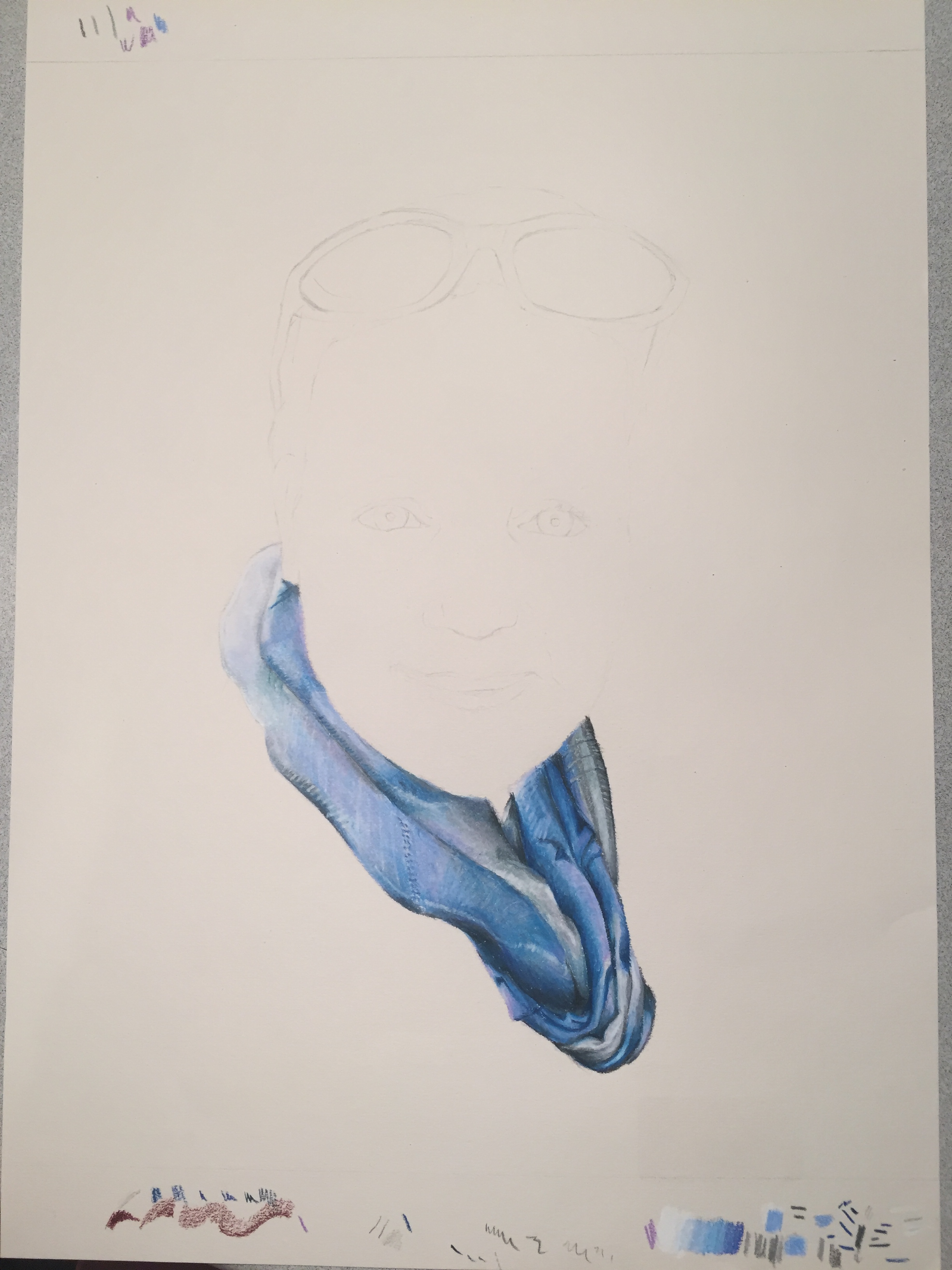
(4 of 7) – Pretty much at this point I stopped working on it for the better part of 2016. The straw that broke the camel’s back, as far as mistakes that caused me to give up for the time being, is the heavy brown shadow under her cheek. I added too much brown and couldn’t blend it out. The color pencils I work with are very blendable, but after a certain point, the reach the most amount of pigment that can be on the paper, and it will start to scrape off if you try to add more or blend more, so I felt it was ruined.
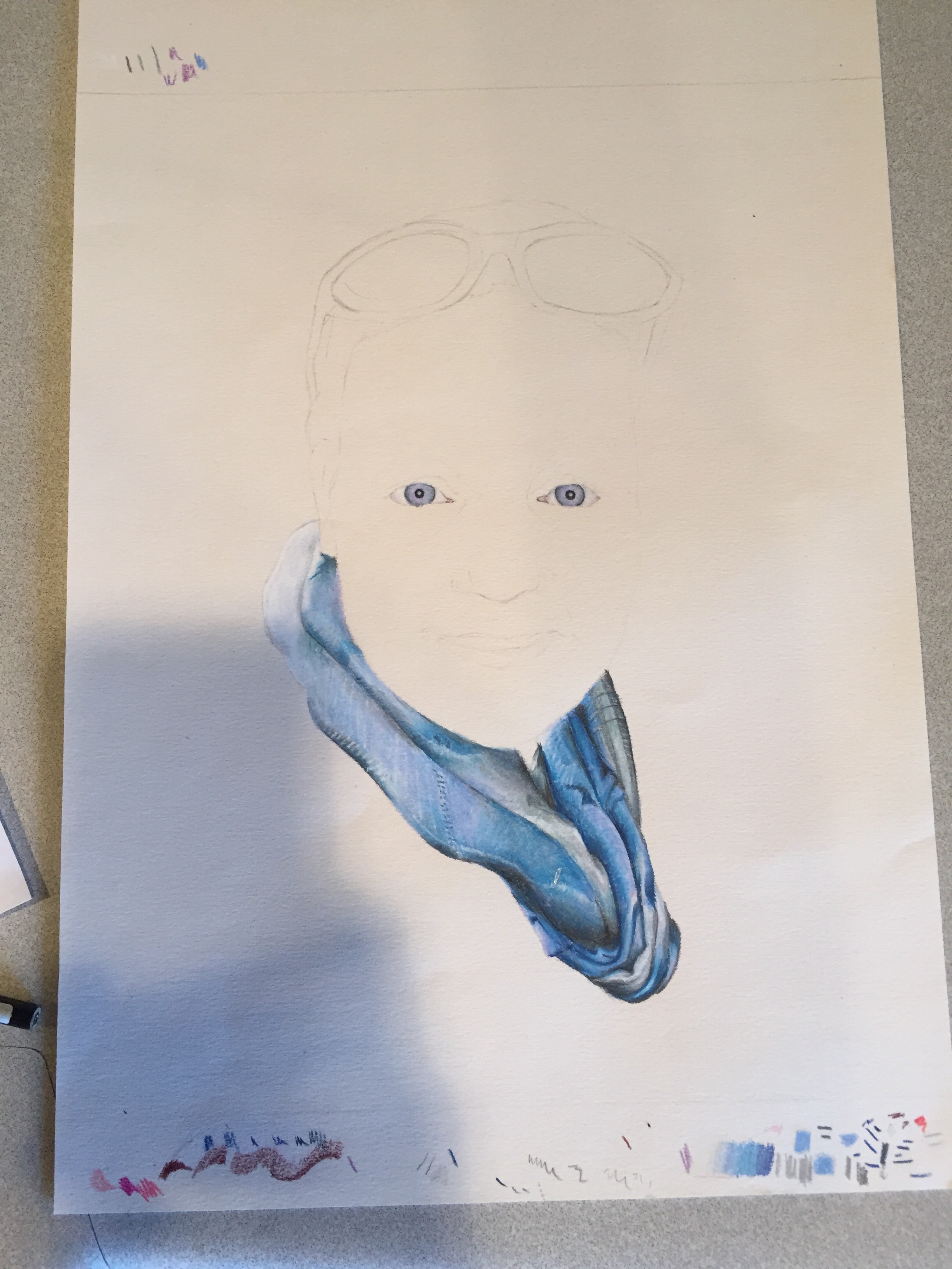
(5 of 7) – It wasn’t till I discovered that you can use a kneaded eraser to take of some top layers of ‘over saturated’ color pencil that I realized I could fix some of my mistakes and started to work on it consistently again.
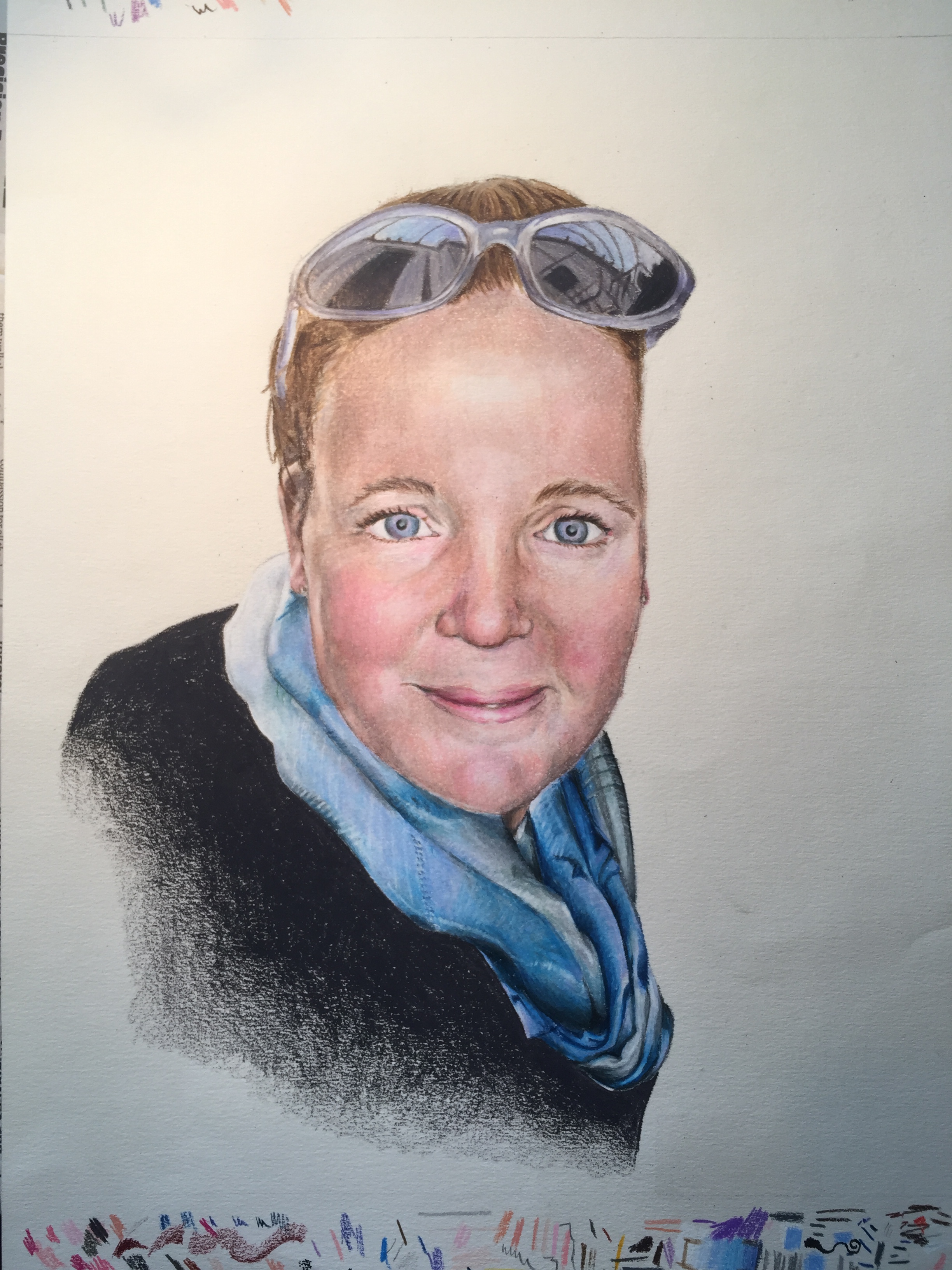
(6 of 7) – Luckily that discovery happened just a few weeks before I had two weeks off from classes for winter break. Plenty of time to finish it. Here it is just as I finished the portrait and added her shoulder and side in dark grey.
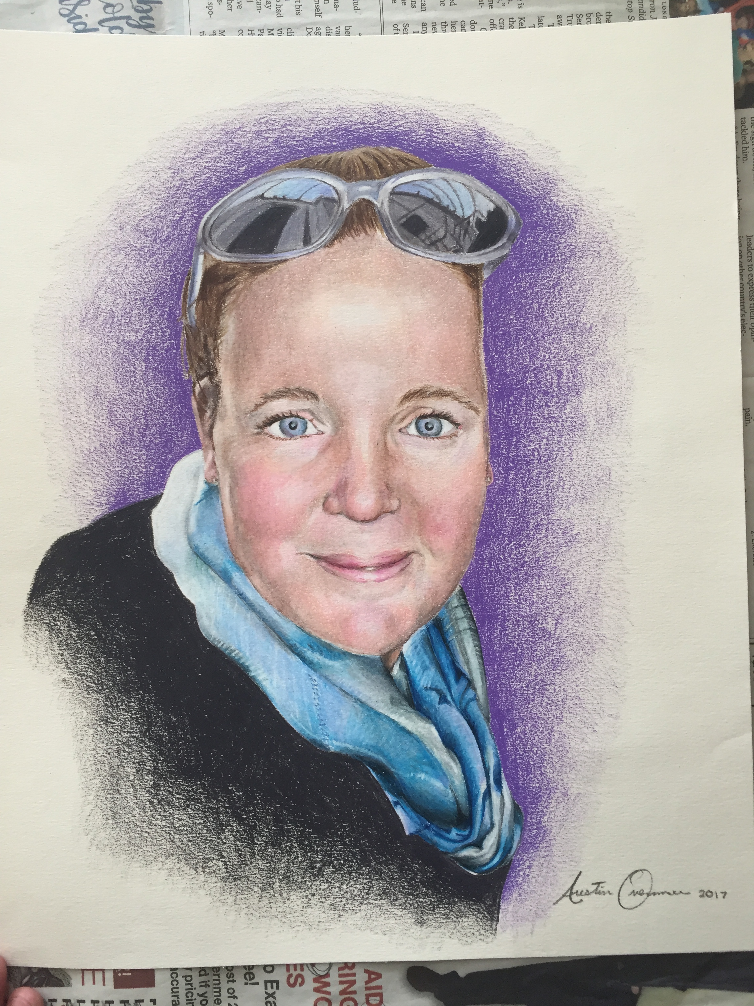
(7 of 7) – finished. This was the first piece I signed 2017. I tried to finish it in 2016 and make it my last major piece for the year, but it didn’t happen. I still am not entirely happy with it. I certainly don’t love it as much as Scott and Cory seemed to, but seeing their reaction definitely made me feel better about it. It definitely turned out better than I thought it would from the standpoint of where I was on it at the time I set it aside.
There are a lot of pieces or drawings that have a special meaning to me beyond what the final piece is. Drawings that I think of as key learning points in my art. Usually these pieces are where I figured out some specific aspect of technique, like “I remember this, this is the drawing where I figured out how perspective works” or “This little piece is when I realized how to draw circles skewing toward a vanishing point” This piece taught me an incredible valuable lesson, but not about artistic technique. I know now to always ask for a deadline. From now on I’m going to insist on a deadline on my commissions, so that I don’t end up leaving something un-done for more than a year.
Thanks for looking.
Inktober Part…Four ?
I wouldn’t say I gave up on Inktober, I just got off track and after that it wasn’t my main focus any more. So it’s taken me until now to accumulate enough drawings, that I just happened to do in pen and ink, to finish the 31 drawings for Inktober. Hope you enjoy:
Drawing #31
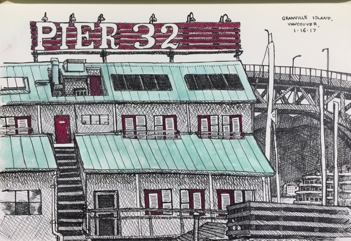
I drew this on my last day on my trip to Vancouver over MLK weekend. It feels a bit flat, but I still love the way it turned out. Faber-Castel Black SX Pen & Gouache Embellishments.
Drawing #30
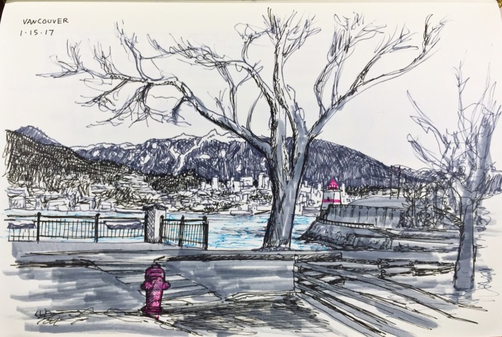
I took advantage of the long weekend and rode the train up to Vancouver for three days to do some drawing and photography. This was my first drawing I did…It was so cold that it was hard to stay outside to finish it.
Also, look for my photographs from Vancouver on the Photography Collections page, coming soon.
Drawing #29
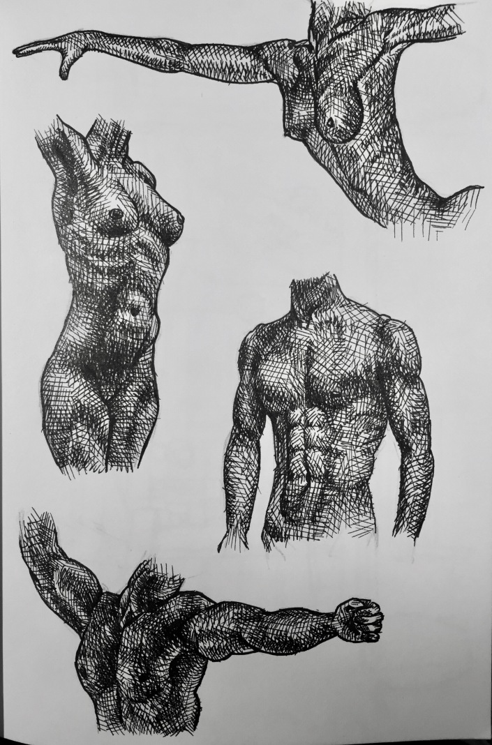
Male and female torso and arm studies. I love the way the whole page of them looks together, but here are closer pictures of each one, below:
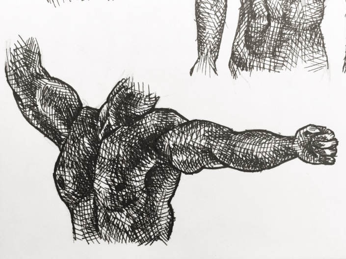
(1/4 – Male torso with arms extended)
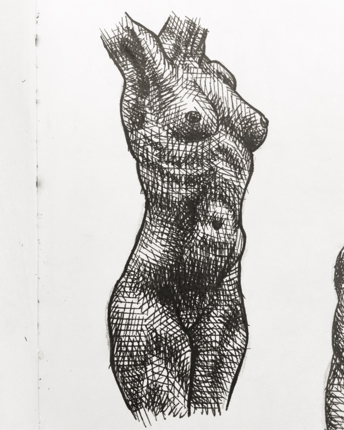 (2/4 – Female Torso)
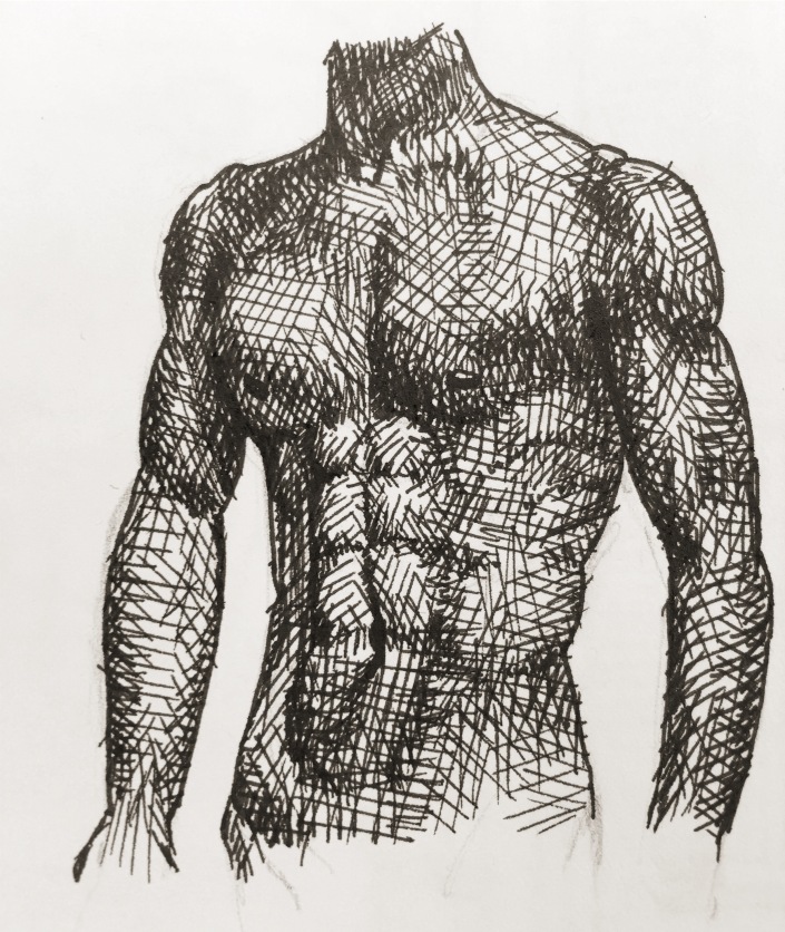
(3/4 – Male Torso)
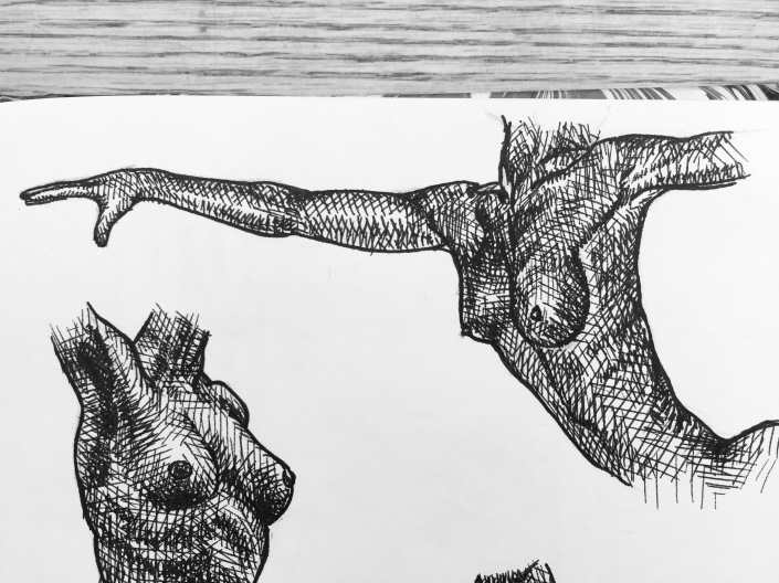
(4/4 – Female torso with arms extended)
Drawing #28
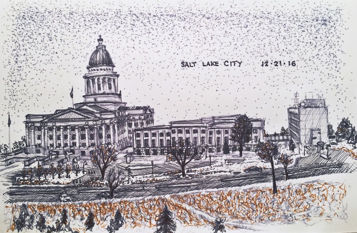
A drawing I did of the Utah State Capitol Building, when I went home for winter break. My buddy Esteban and I drove around for a while, ended up at the capitol, drew it in the freezing cold, and then went to Siegfried’s german deli to eat when it started snowing and we had to stop drawing.
Drawing #27
Nothing more than some doodles really.
Drawing #26
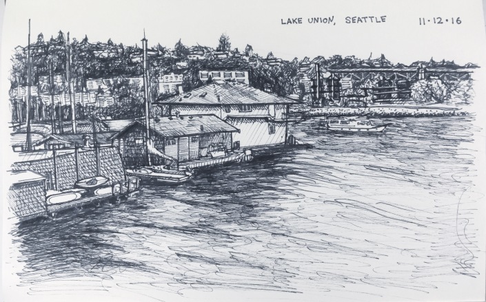
Lake Union, Seattle. I love this one.
Drawing #25
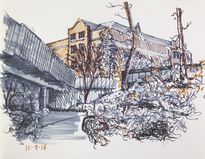
The seam in the cement, the shrub at the base of the walkway pillar, and the black and grey scribbles in the foreground on the left…look like a man sitting with a fishing pole…or so my aunt tells me. (That’s called apophenia)
Drawing #24
Drawing #23
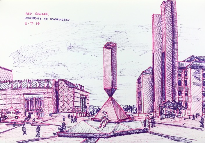
Red Square on UW campus. Perspective is really off…just keep moving. Nothing to see here.
Drawing #22
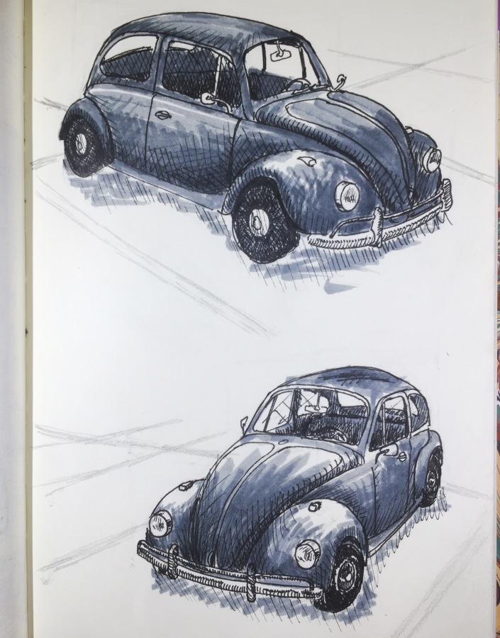
These were really fun to draw. A VW bug in the parking lot next to my building, from two different angles.
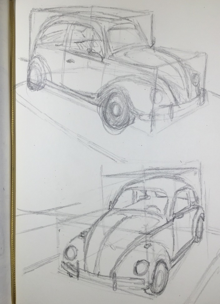
I actually liked these more before I inked them, when they were just pencil. Here I tried something new. I used these box grids to help me visualize how the cars would fit in there. It helped with getting the perspective (almost) right.
Thanks for all your support! Its been a fun project. I’ll try again in October.
